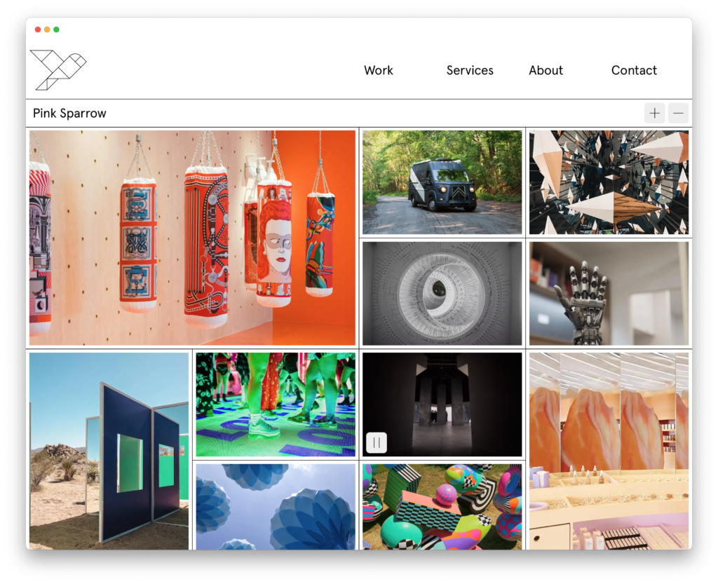
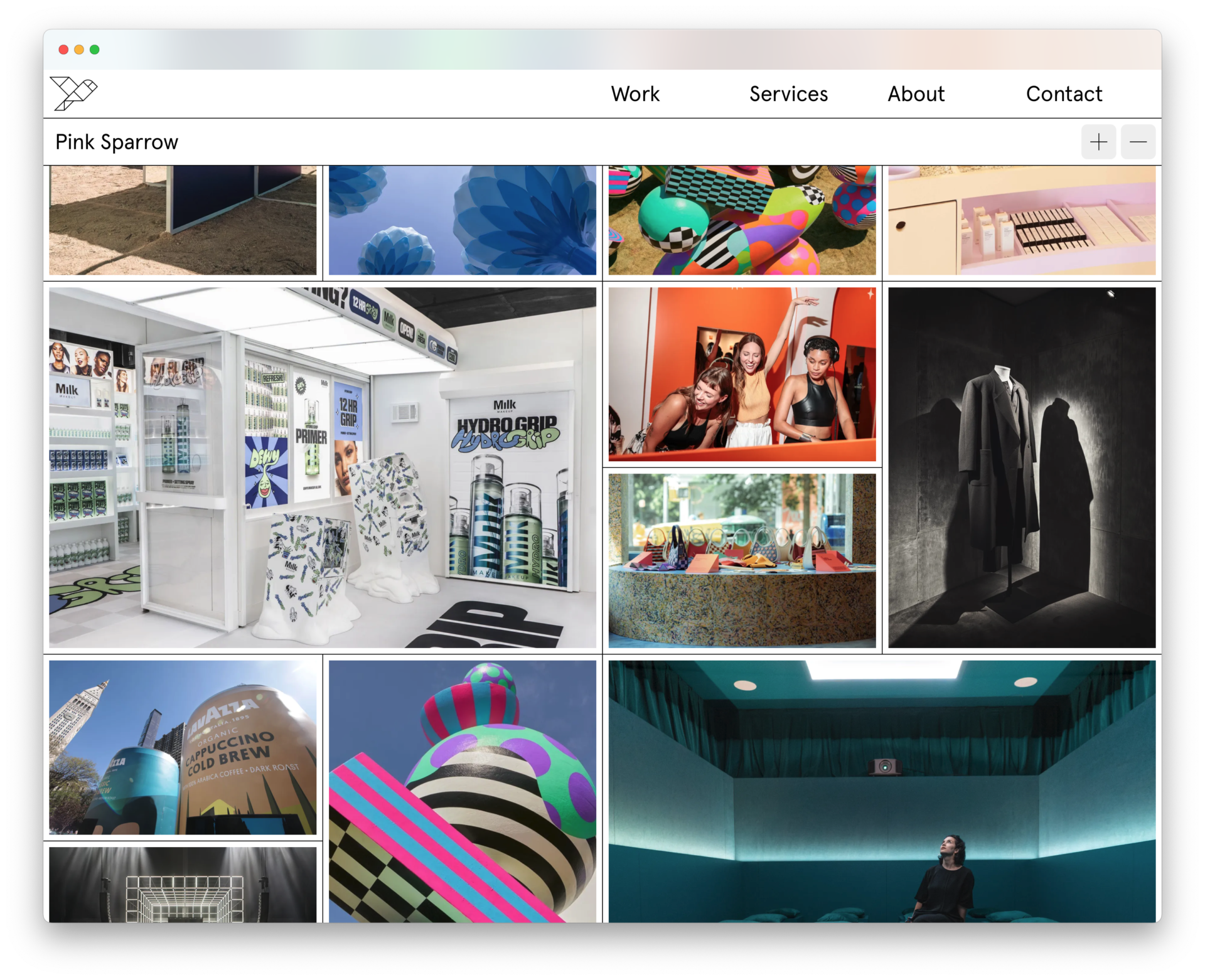
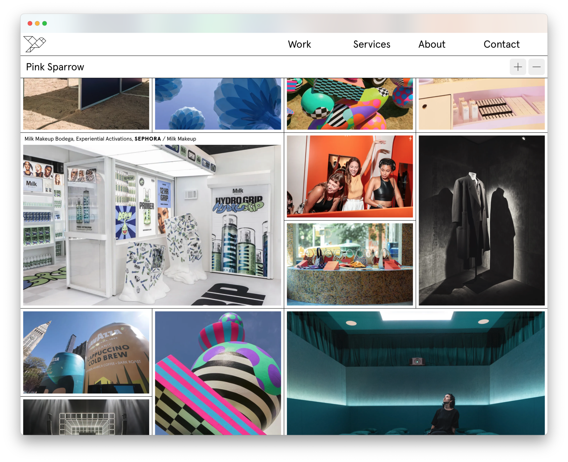
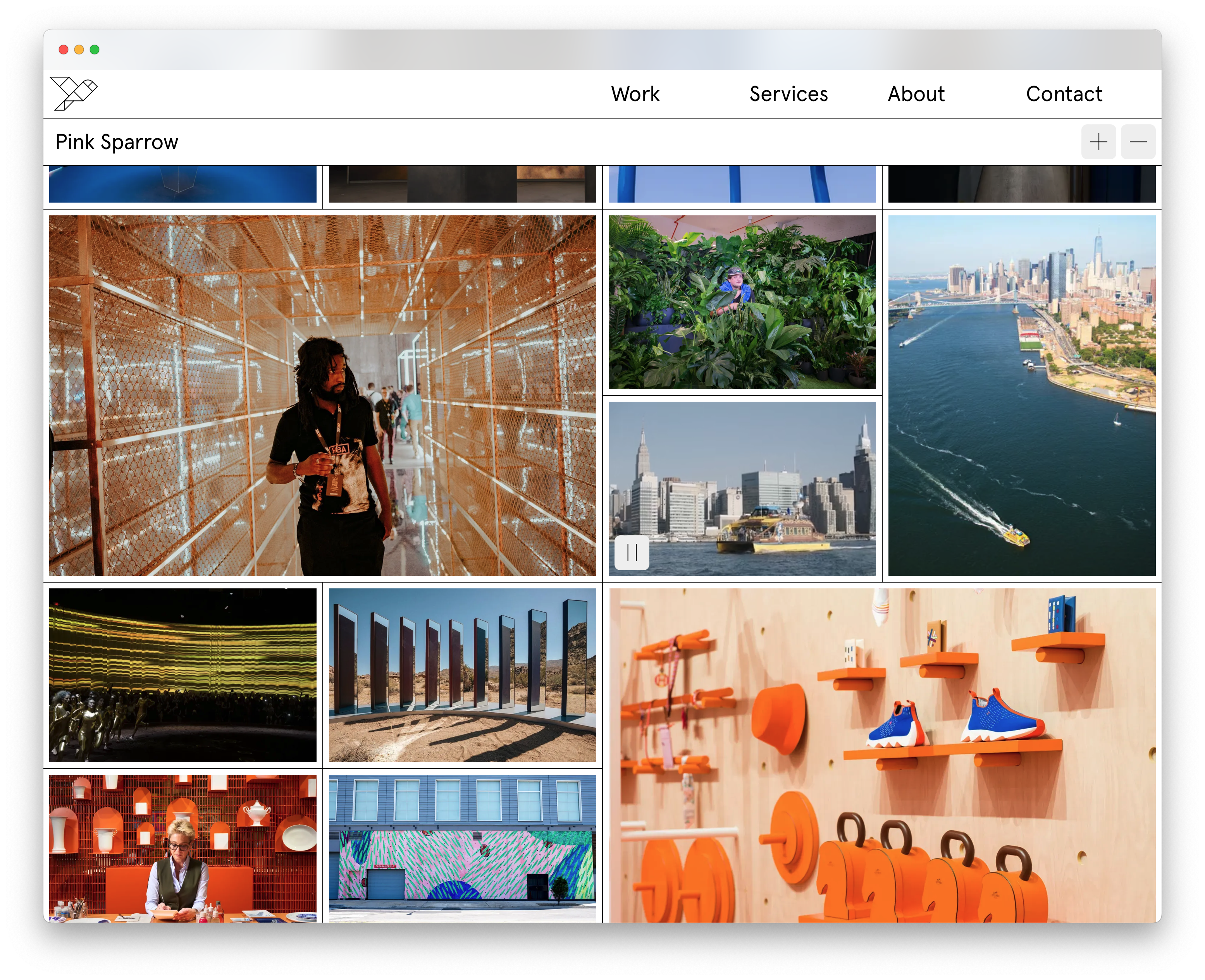
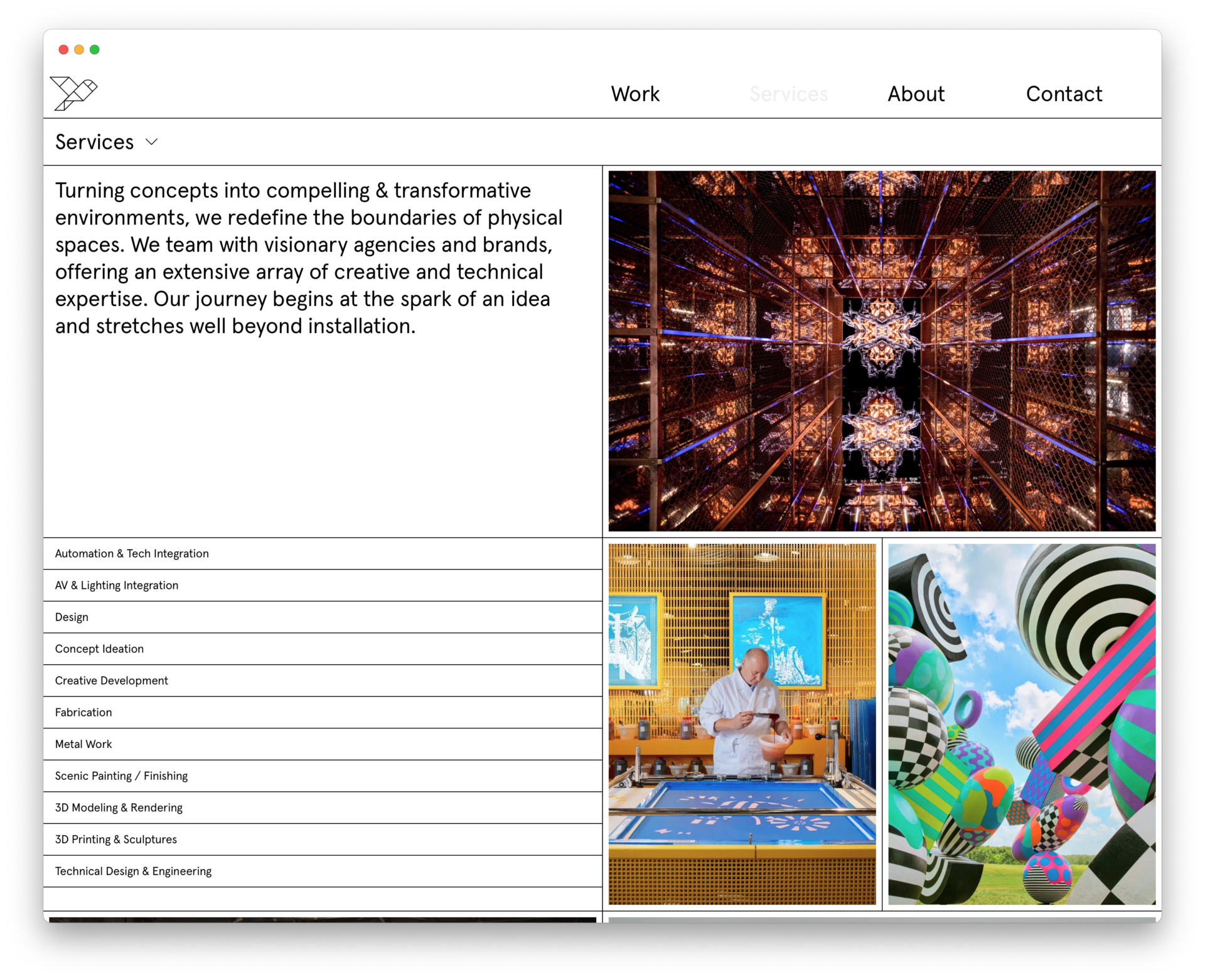
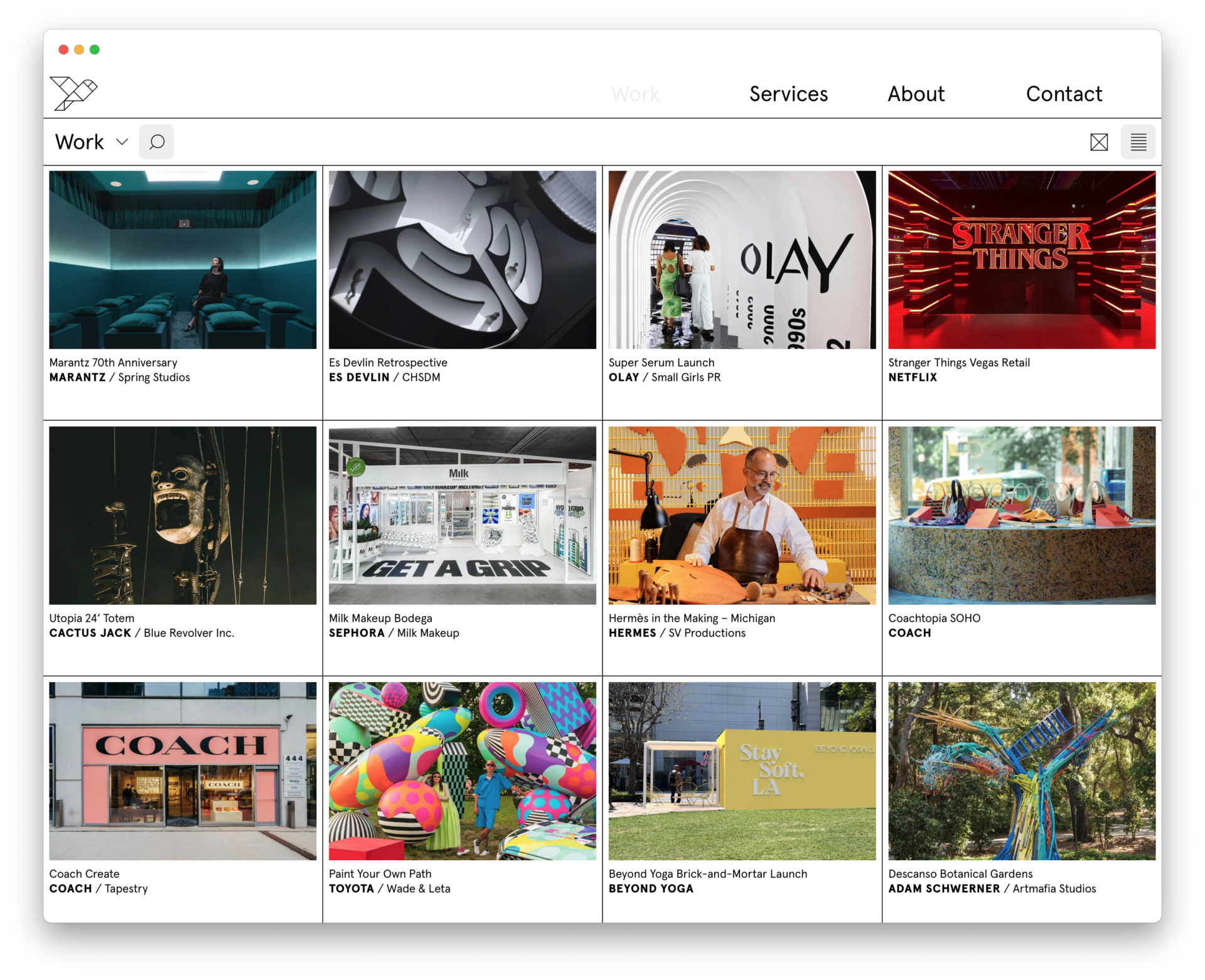
Pink Sparrow’s new identity system centers on a line and the shapes it delineates. The visual system was inspired by kintsugi, the Japanese art of visible mending; Tangram, a Chinese game played by reconfiguring blocks into different forms; and murmuration, the coordinated shape-shifting of starlings in flight. In exposing the seams, we point to the many team members (and their many disciplines) that form the whole of this bi-coastal, interdisciplinary design and fabrication studio.
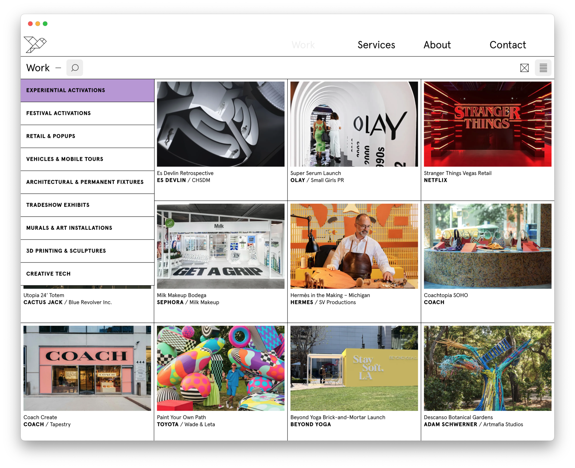
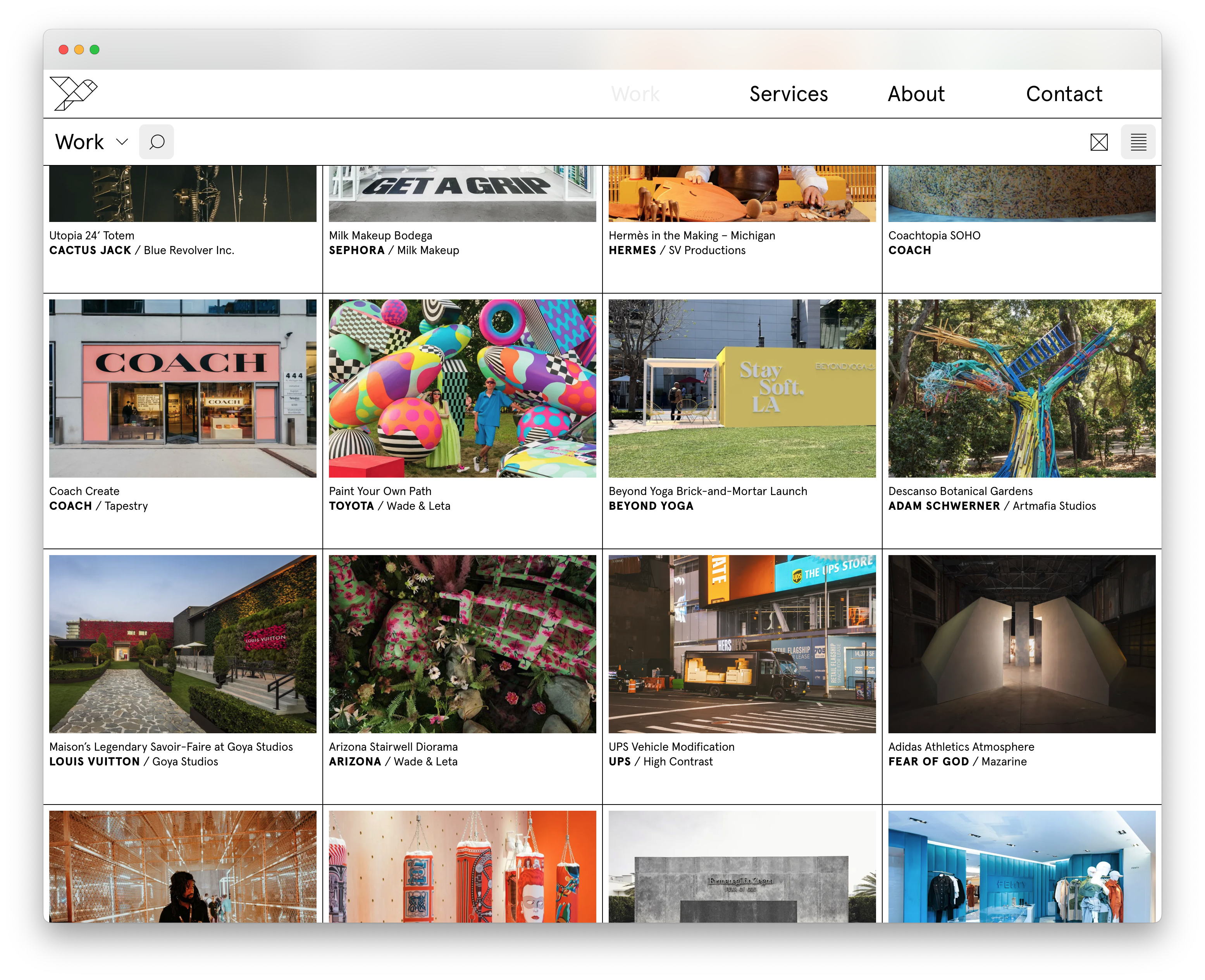
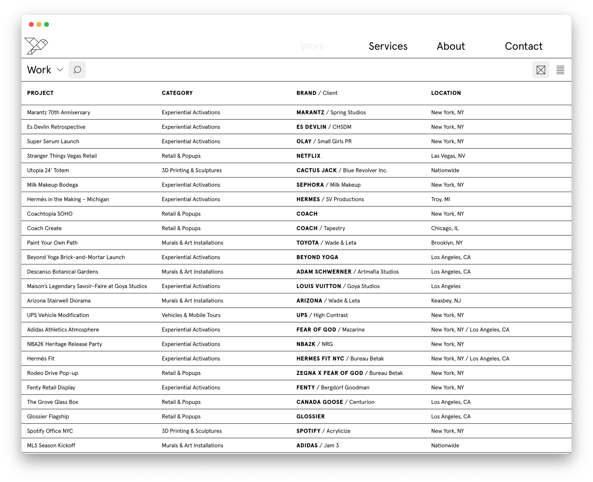
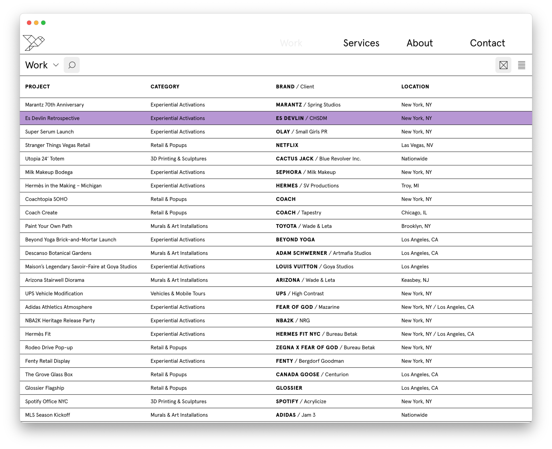
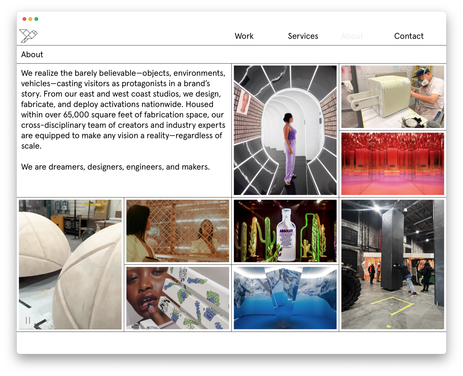
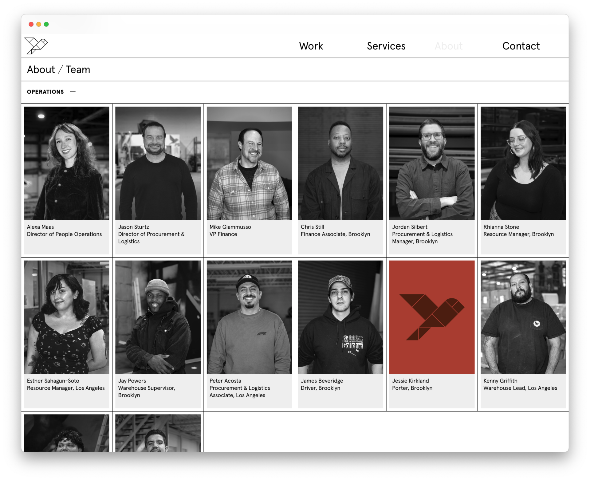
The website leverages the line as both an organizational device and unifying visual element. The line creates cohesion as the user jumps between dynamic visual mash-ups of wildy varied project imagery and data driven indices and lists. A sense of play pervades, holding the visitor’s attention. Potential clients are served by the many click-able data points that filter and sort via category, service, client, and brand. The flexible gridded system, supported by an accessible content management system, enables the Pink Sparrow team to add and edit as future growth demands. -
Pink Sparrow logo and identity system +
Pink Sparrow approached us on the cusp of their ten-year anniversary. They needed a new visual identity that reflected the caliber of their work and breadth of their capabilities, while maintaining continuity with their roots. They were attached to the bird in the company name, and many stakeholders, to its image.
Whatever we did, it had to start with the bird.
The single bird and the vast team behind it reminded us of murmuration—the shapeshifting form of many birds moving in unison. In considering design analogues, we looked to kintsugi, ‘golden joinery,’ the Japanese art of mending pottery which glorifies the seams between shards. Tangram, the Chinese puzzle game involving reconfiguring seven shapes, ‘tans,’ into different forms, also informed our work.
We redrew the company’s beloved mascot as a single form made of many shapes. The bird morphs across applications; sometimes appearing as solid blocks pushed together, sometimes as a wireframe, and sometimes as a fleshed out cartoon. The lines articulating the bird are extended into a system of rules that scaffold the website and other collateral. -
Ringo Studio capsule collection and online store +
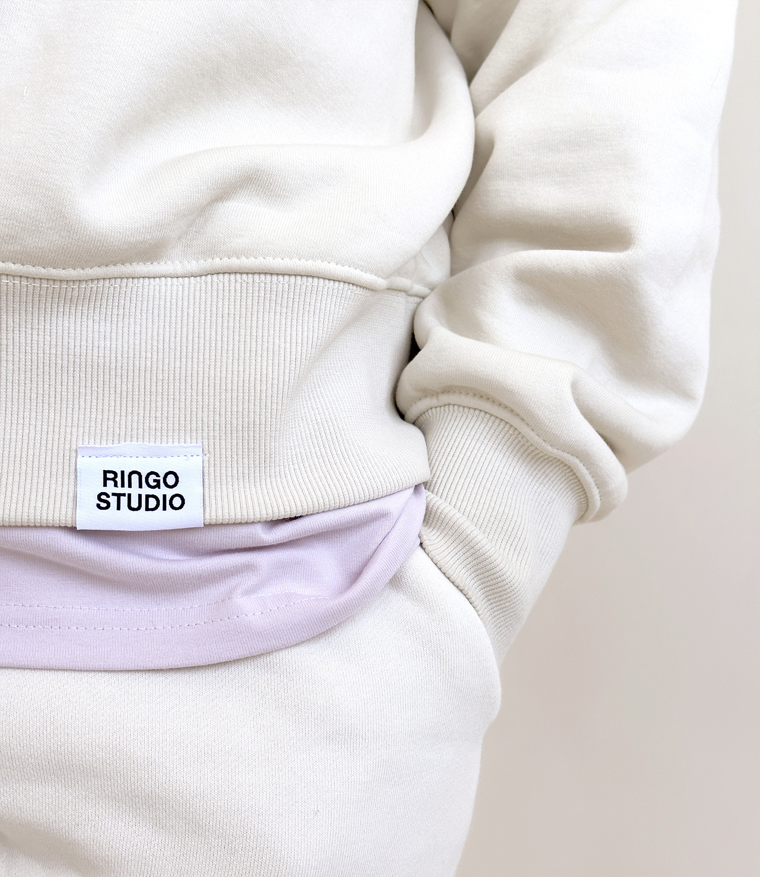
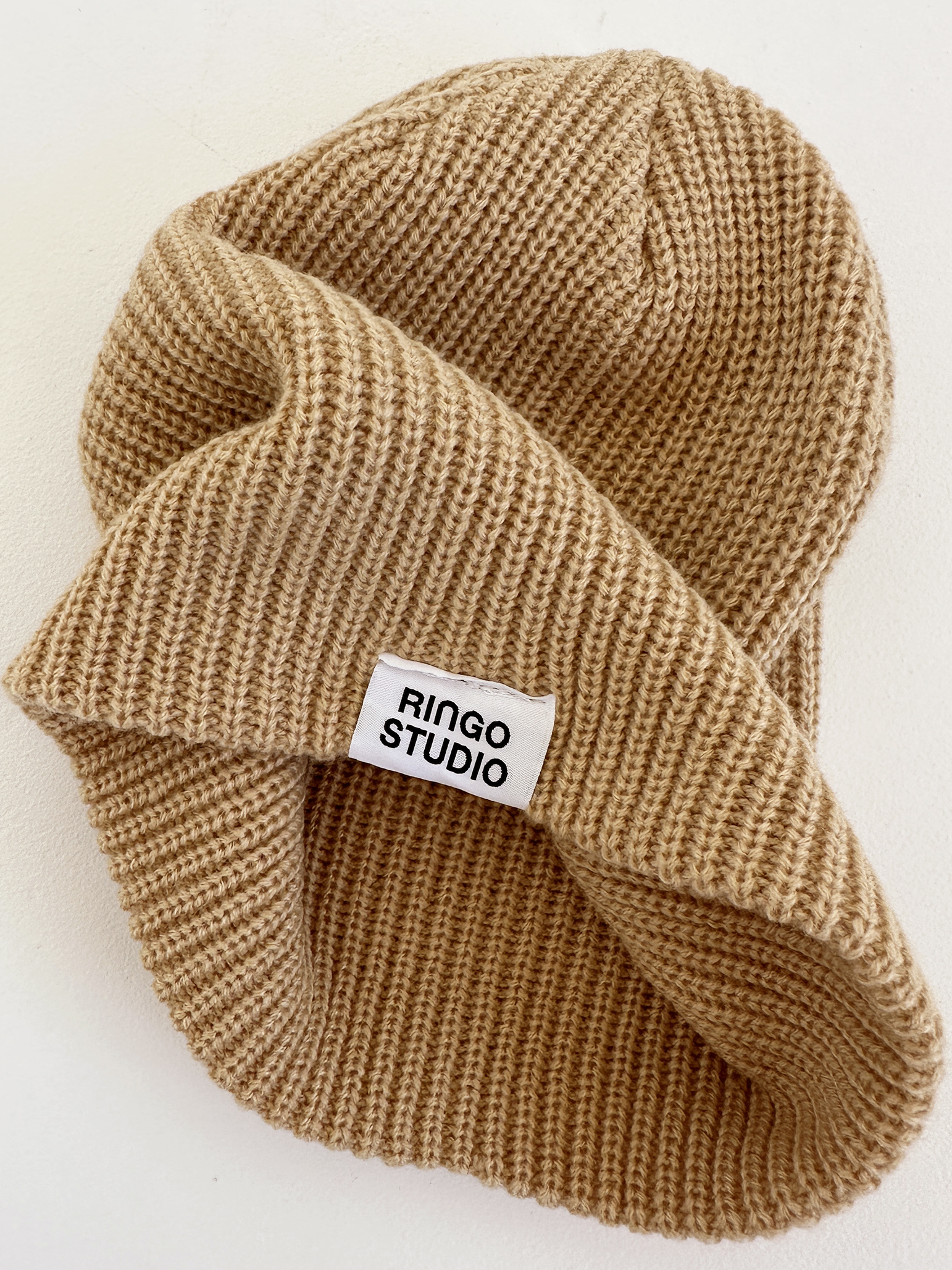
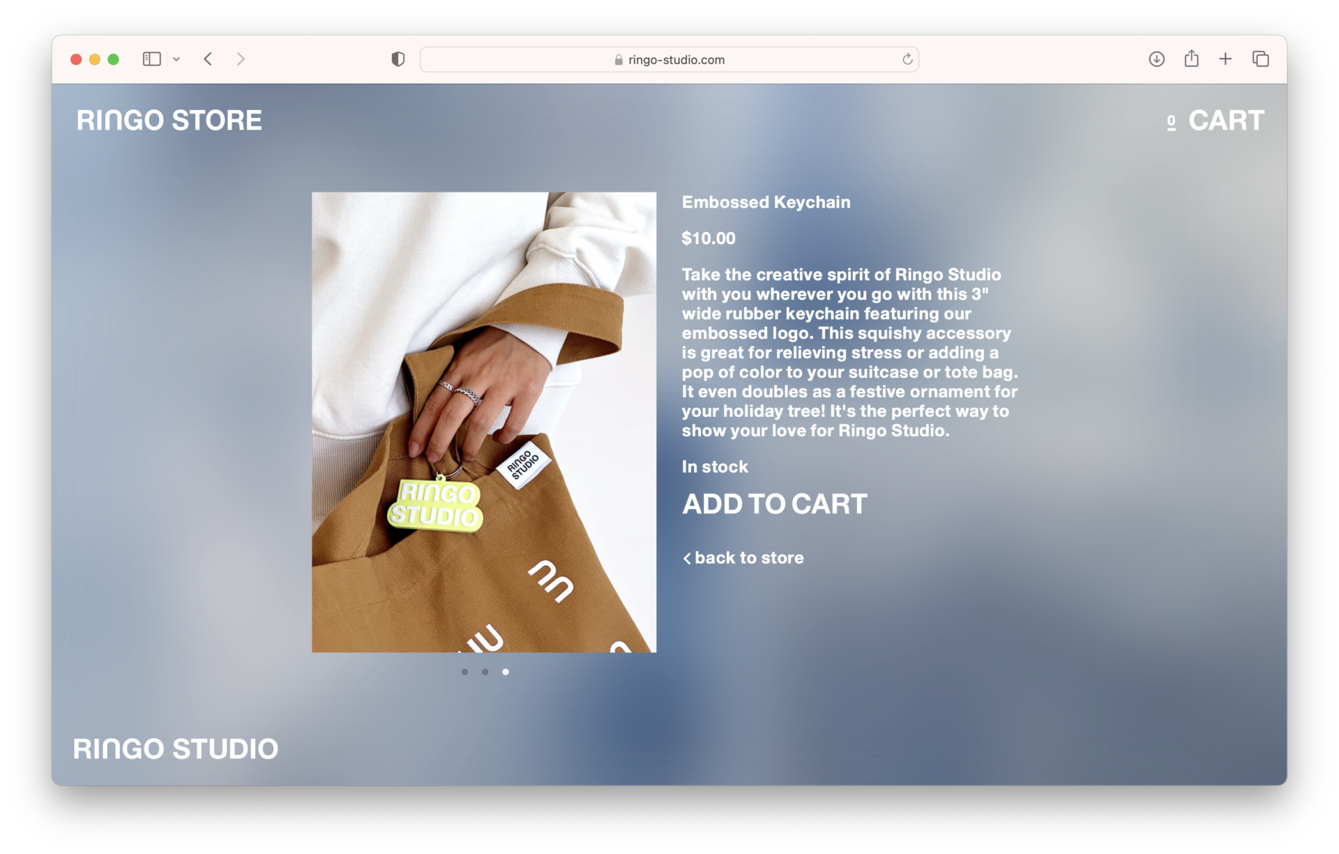
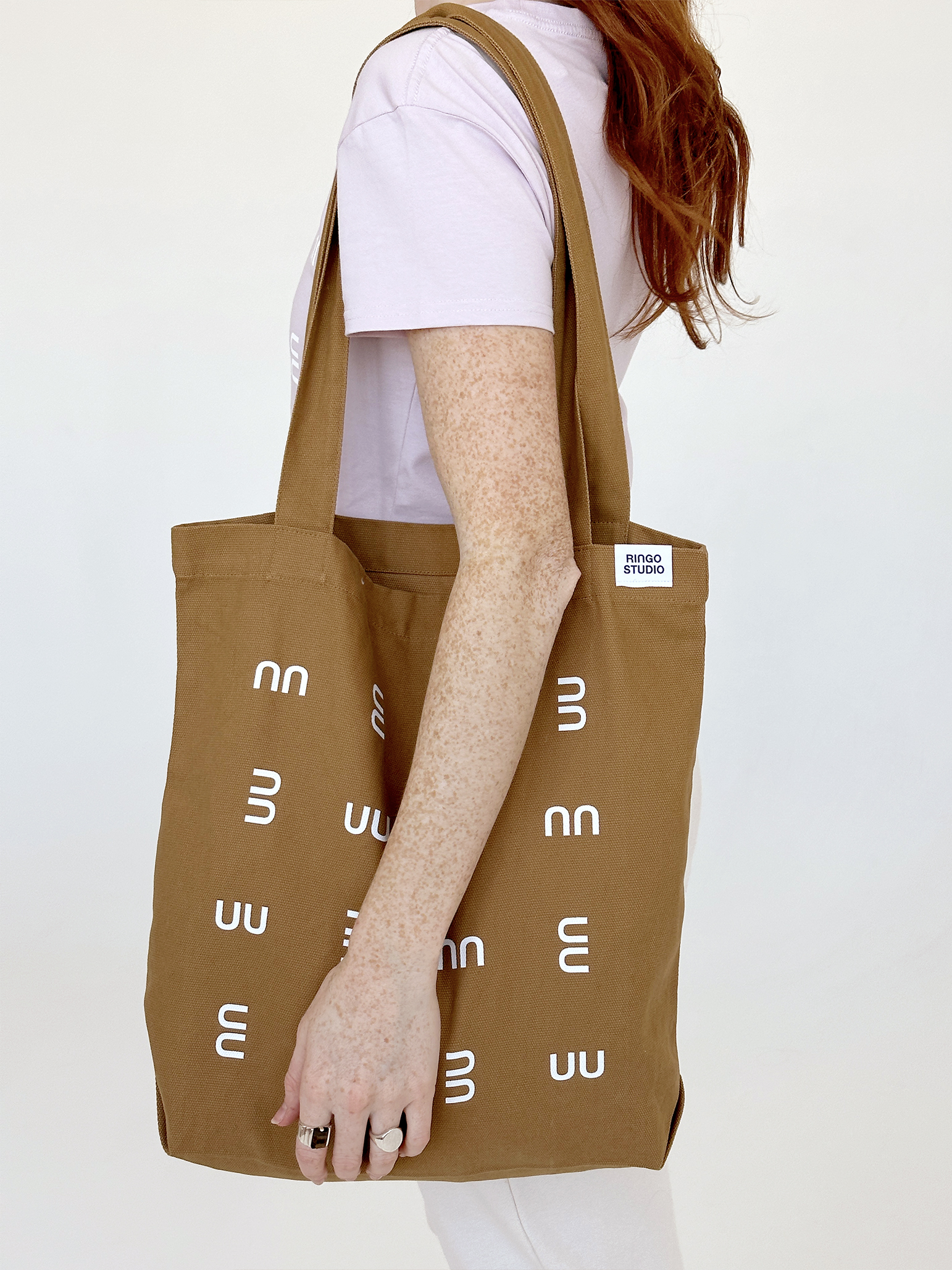
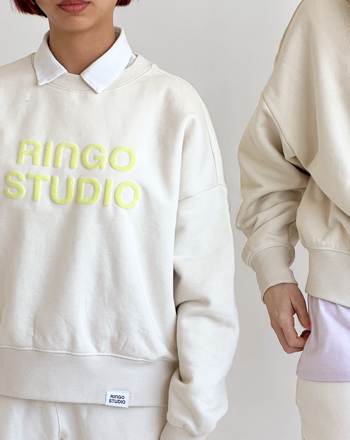
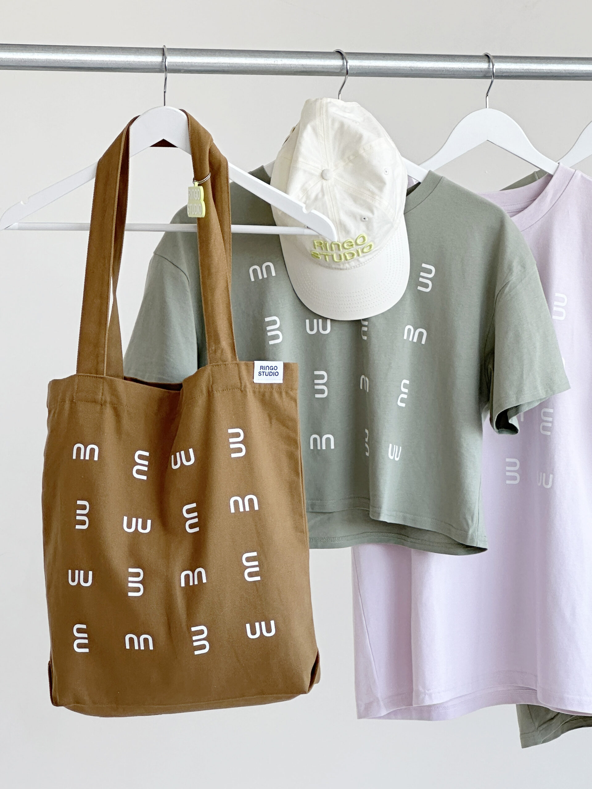
After completing branding and web design for this highly tactile architectural practice, Meehan Spinat worked closely with studio founder to extend the visual identity into a capsule collection and an online store. The monogram becomes a pattern that spans Ts and totes. The wordmark puffs up and glows on chests and foreheads. Meehan Spinat sourced supple, high-end cotton garments and worked closely with a fabricator to match the studio’s material sensibility in the materiality of goods. -
Ringo Studio website +
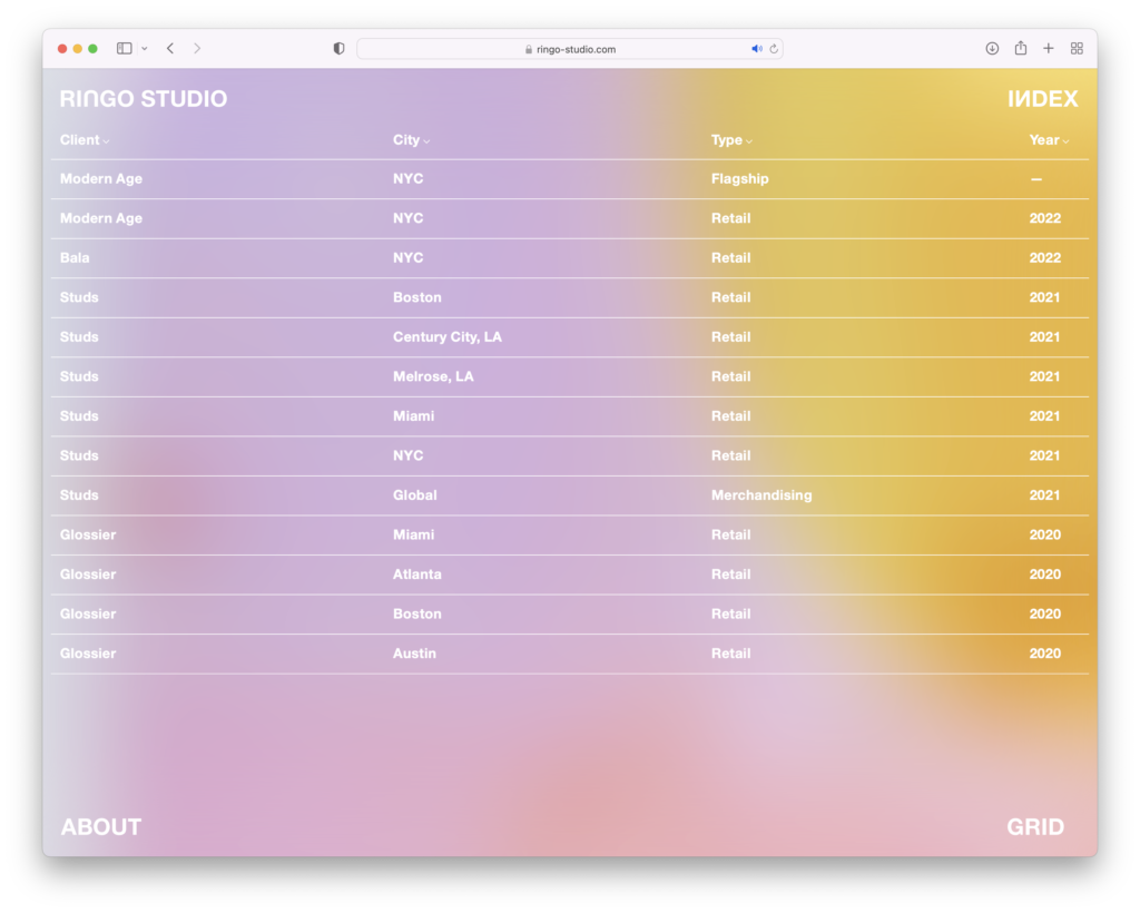
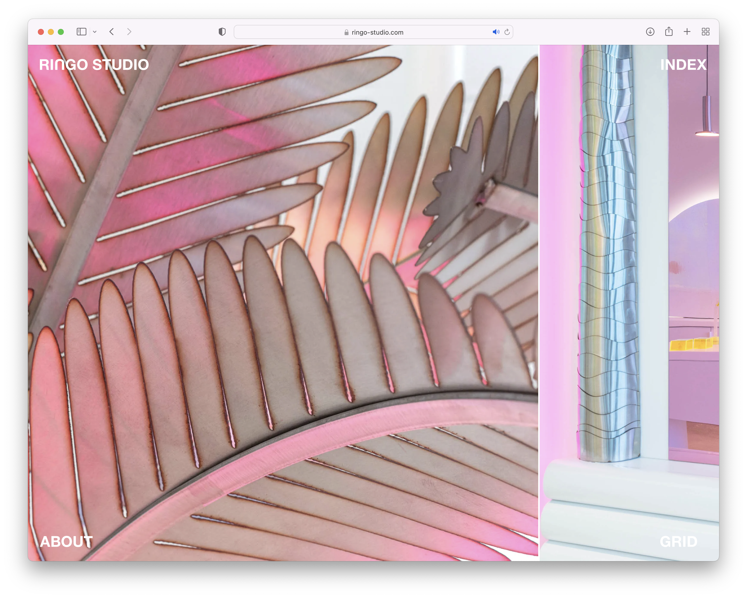
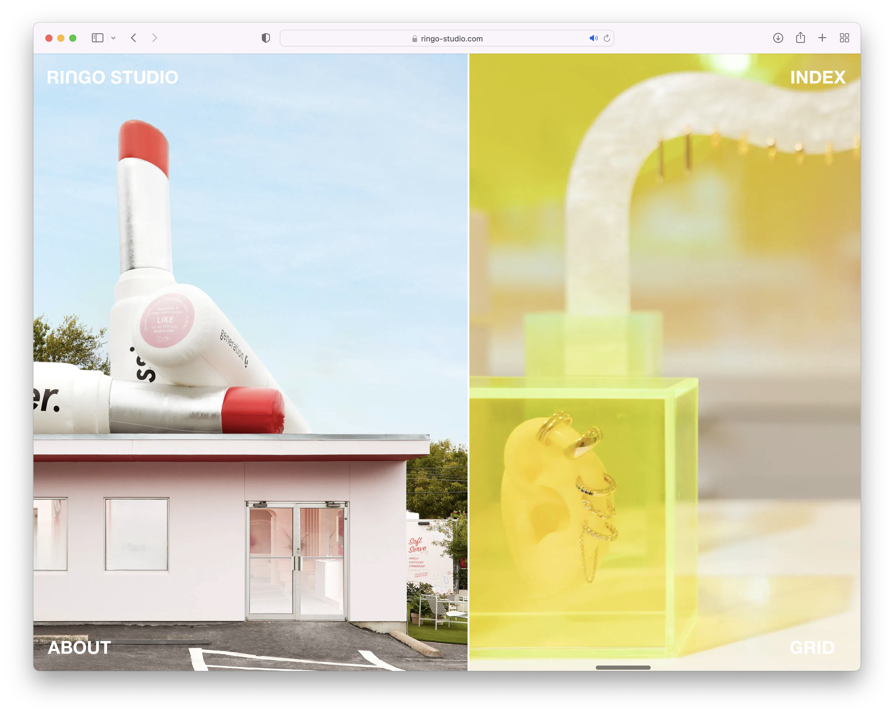
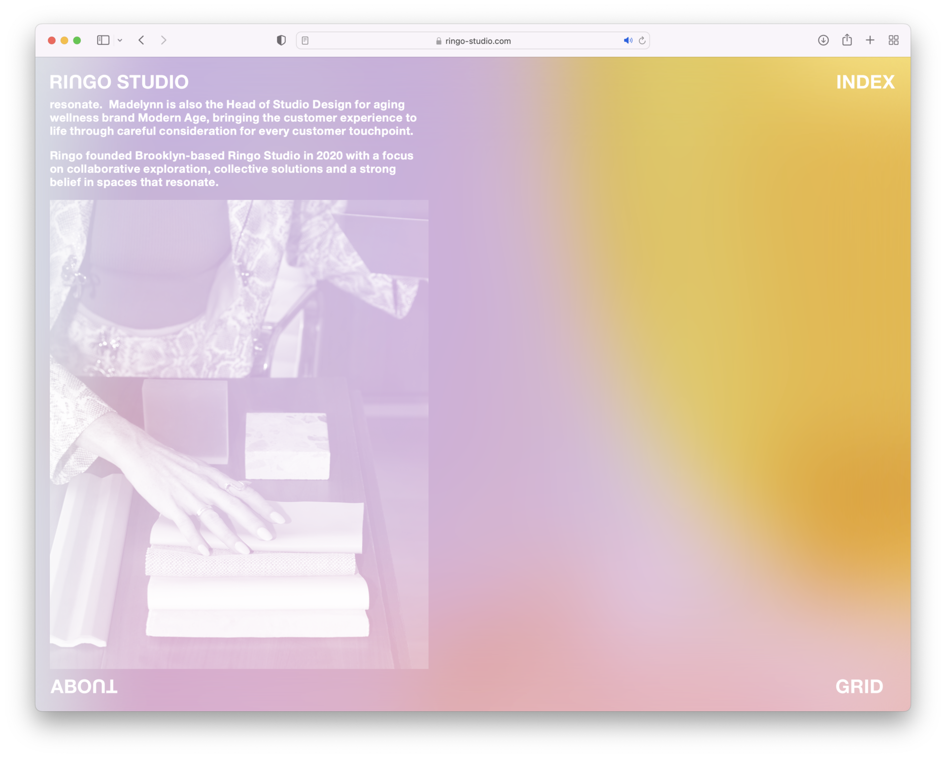
The website for this hip, vibey architectural practice derives color from the studio’s work. All additional content is white, a scrim made legible by the color beneath. This is Ringo World.
We worked closely with Madelynn Ringo to understand audience, upcoming projects, and available media to assess how best to convey work on the web. A panning lens immerses the visitor, place by place, and a matrix of photographic details showcases the breadth of the studio’s work. Meehan Spinat crafted project descriptions to round out the visuals. -
Ringo Studio identity +
We created a robust identity system for Ringo Studio, developing a logo, monogram, typographic treatment, color system, and content strategy extending to the website, marketing materials, and social media. -
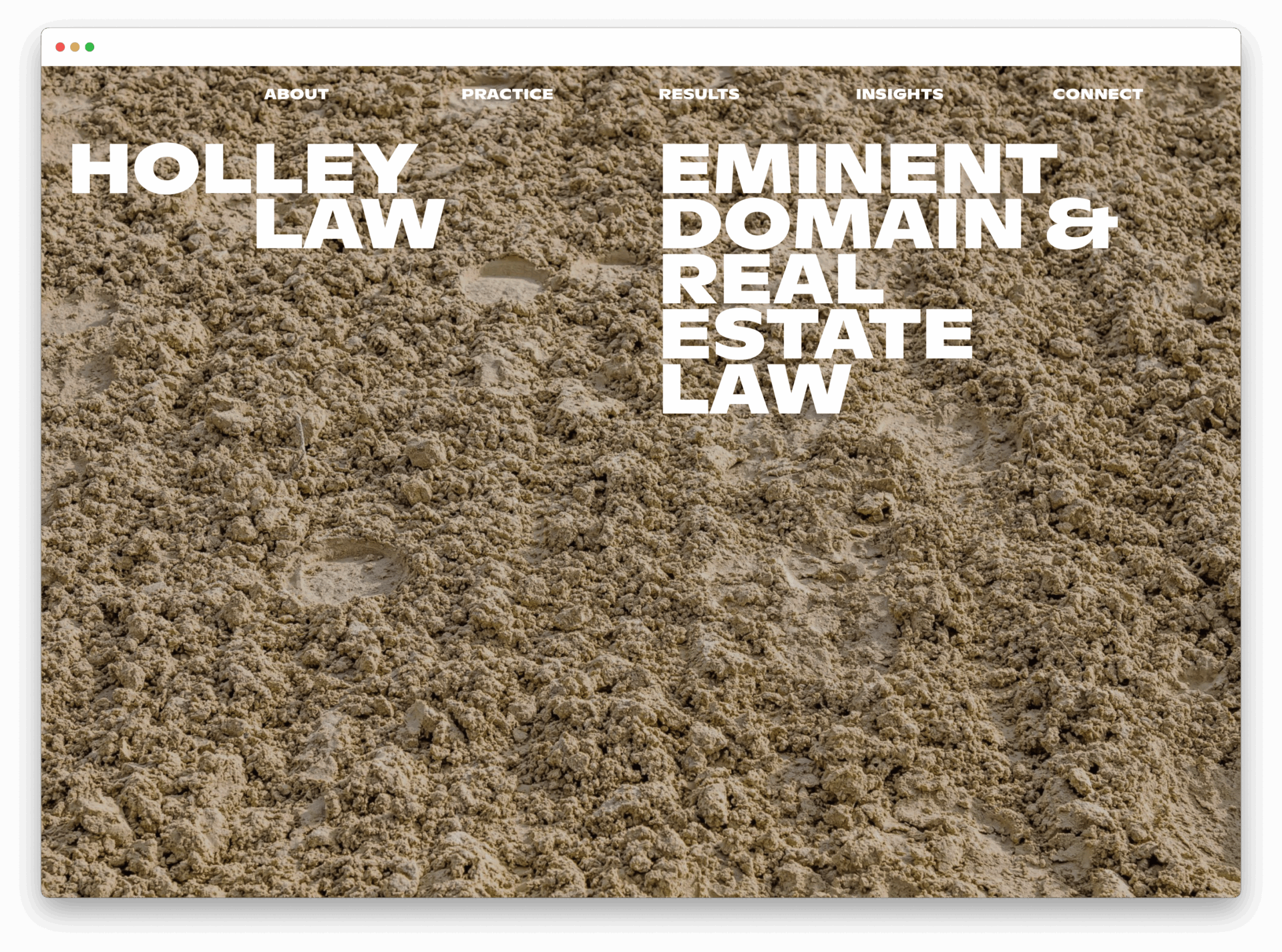
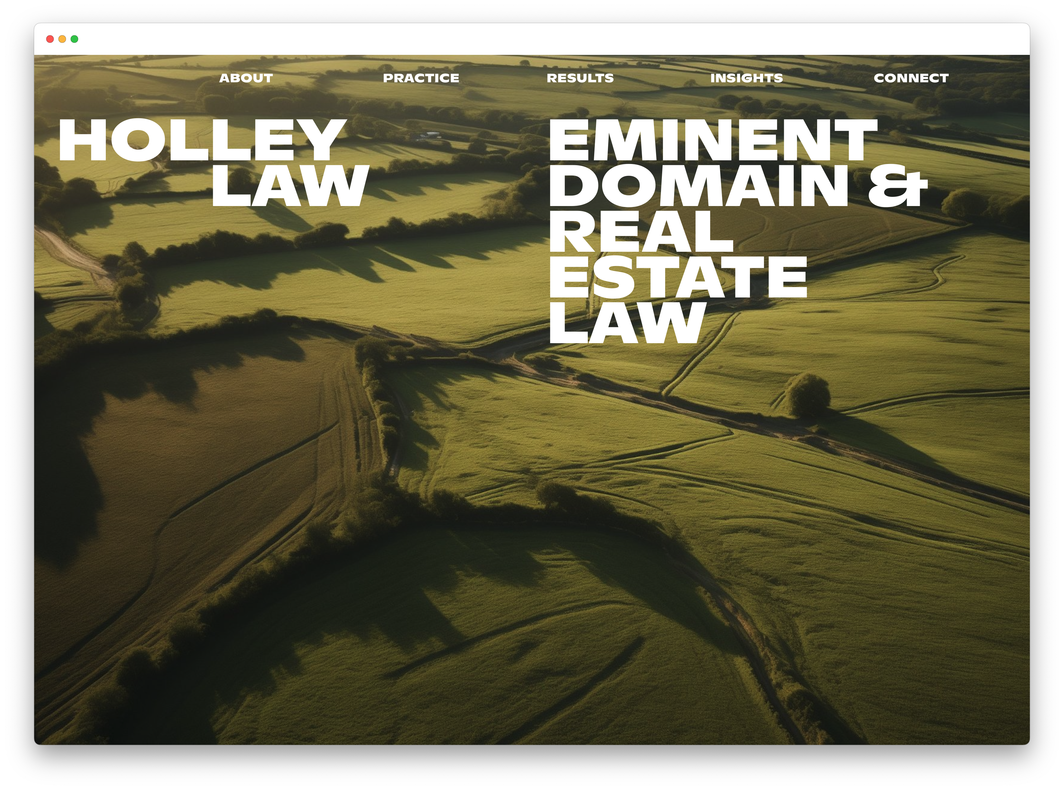
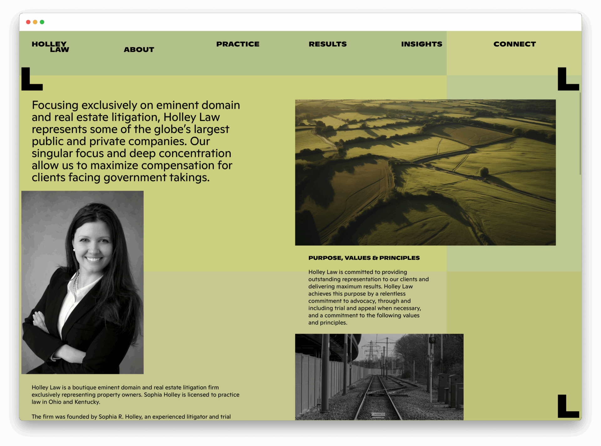
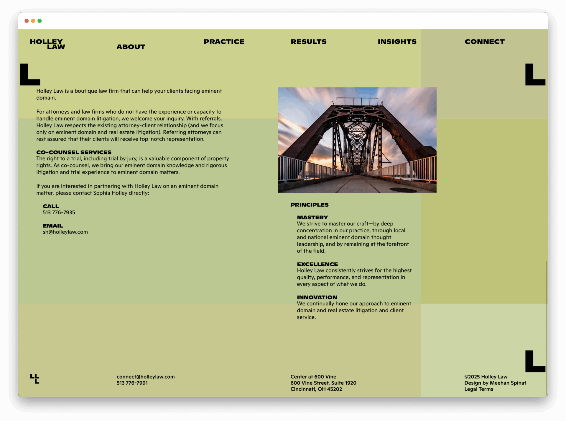
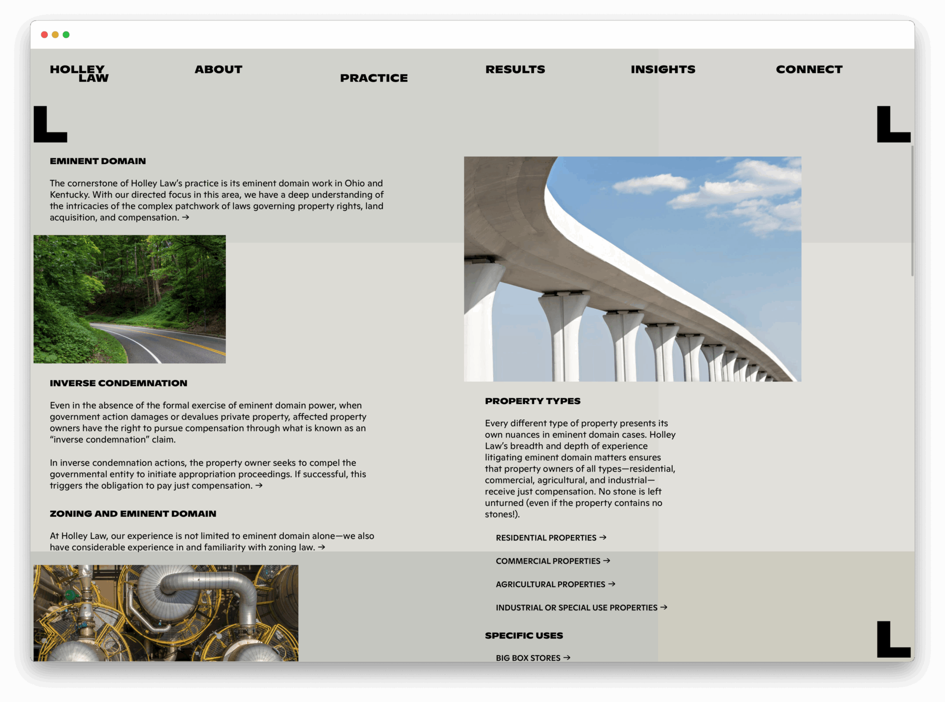
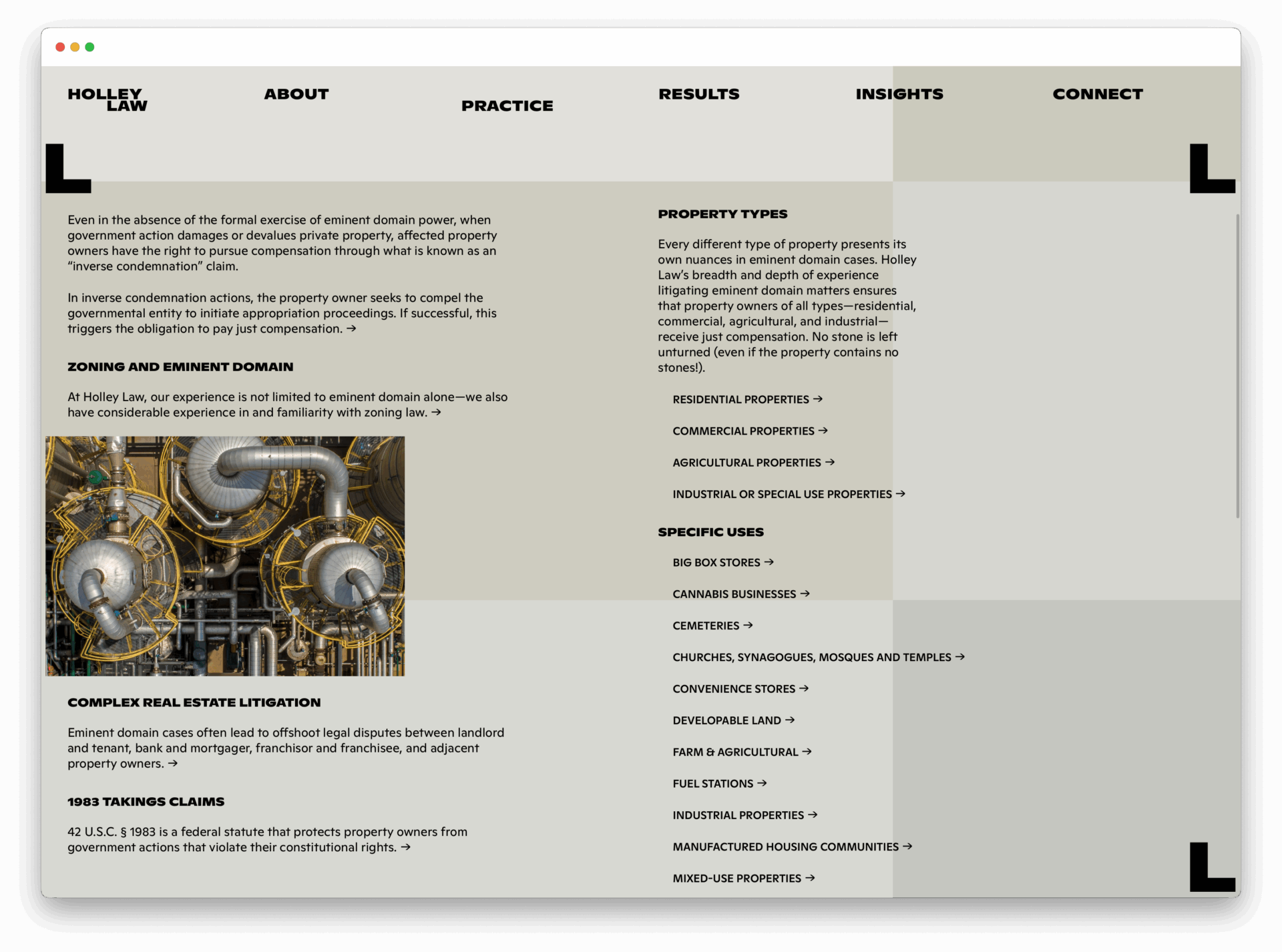
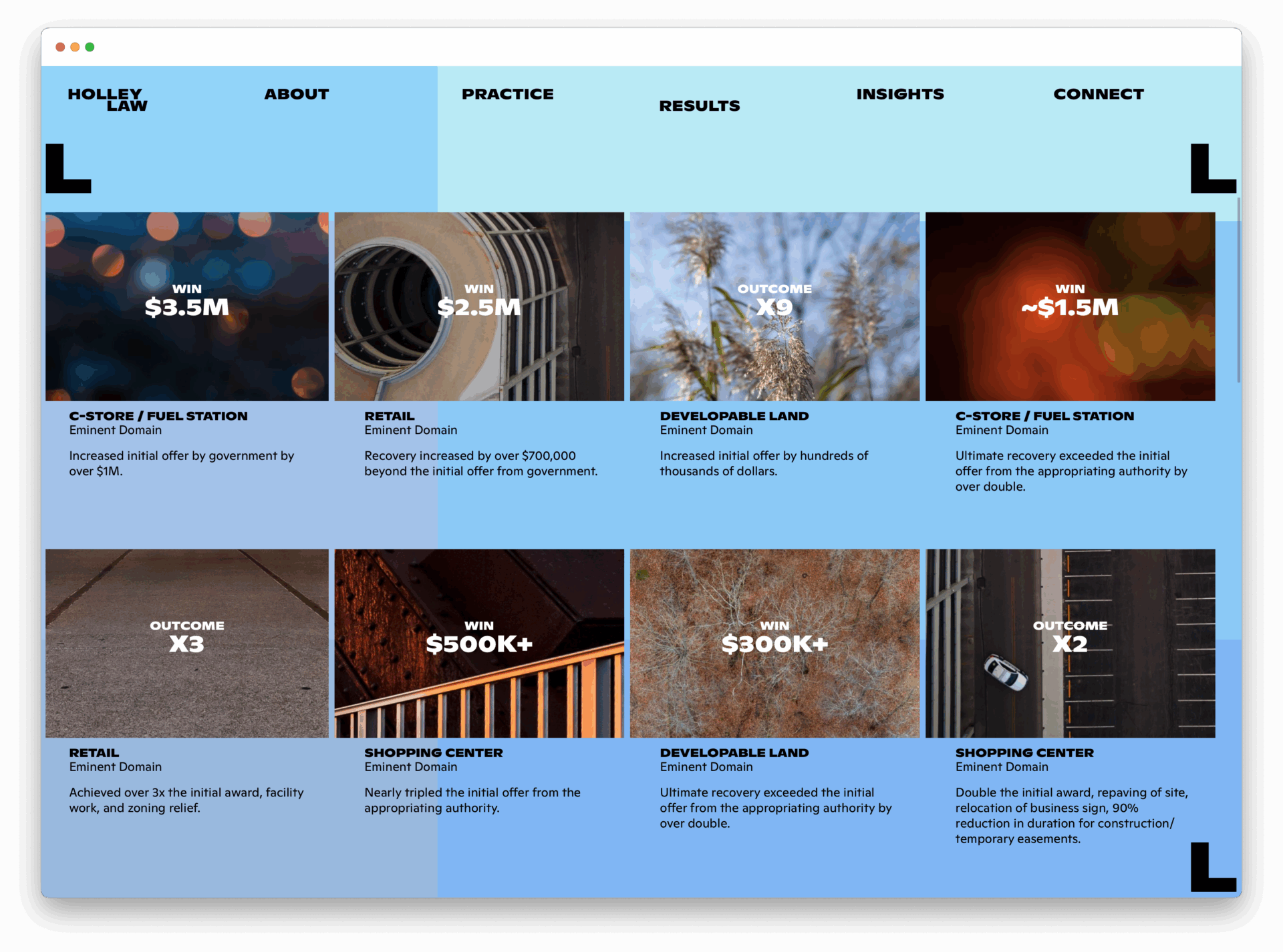
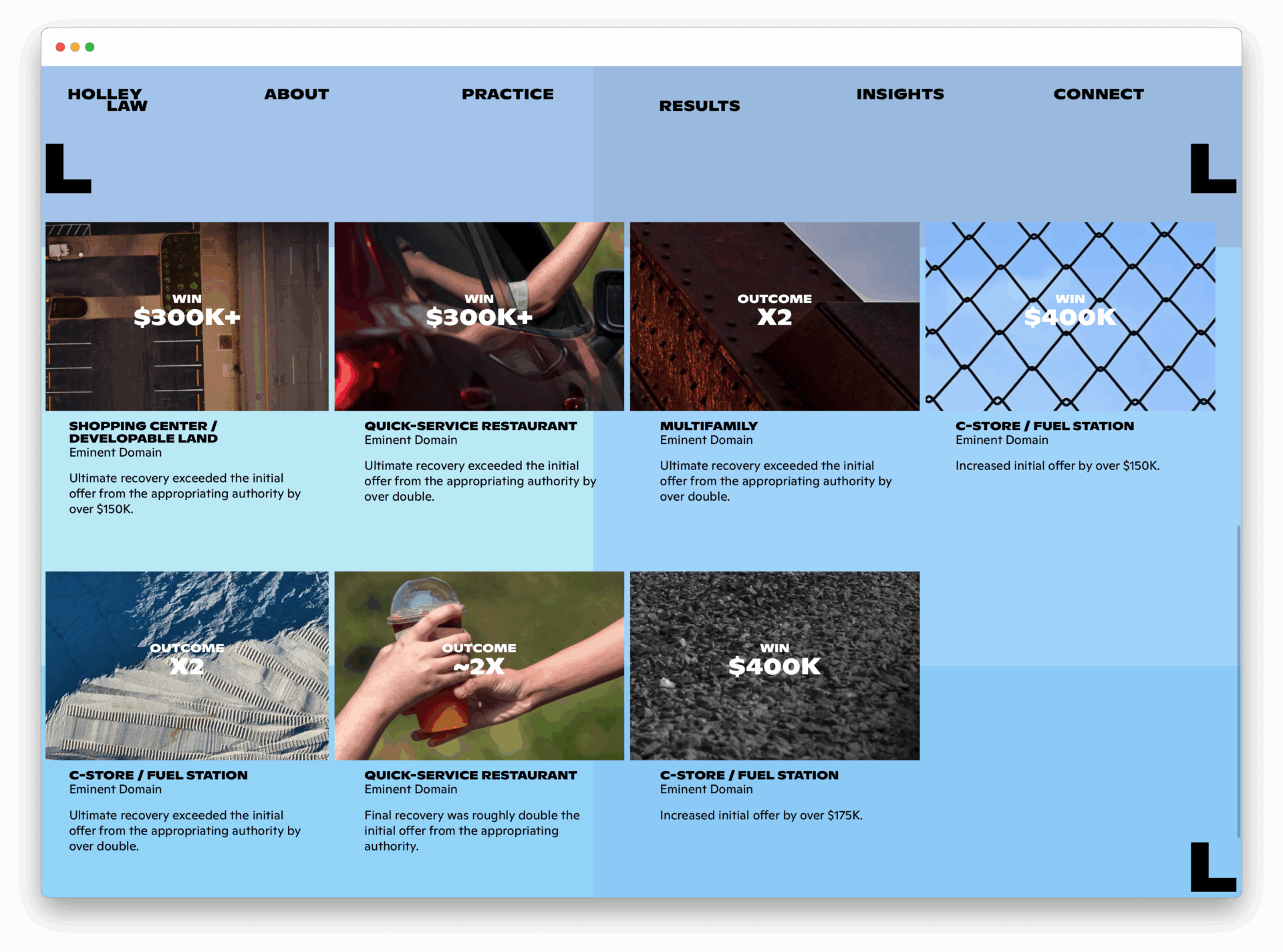
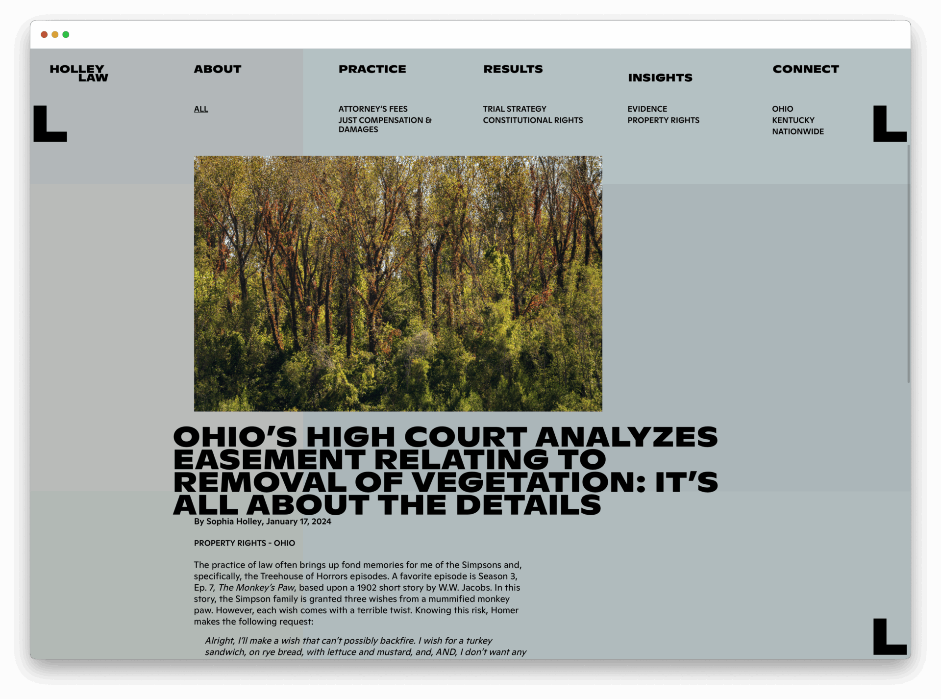
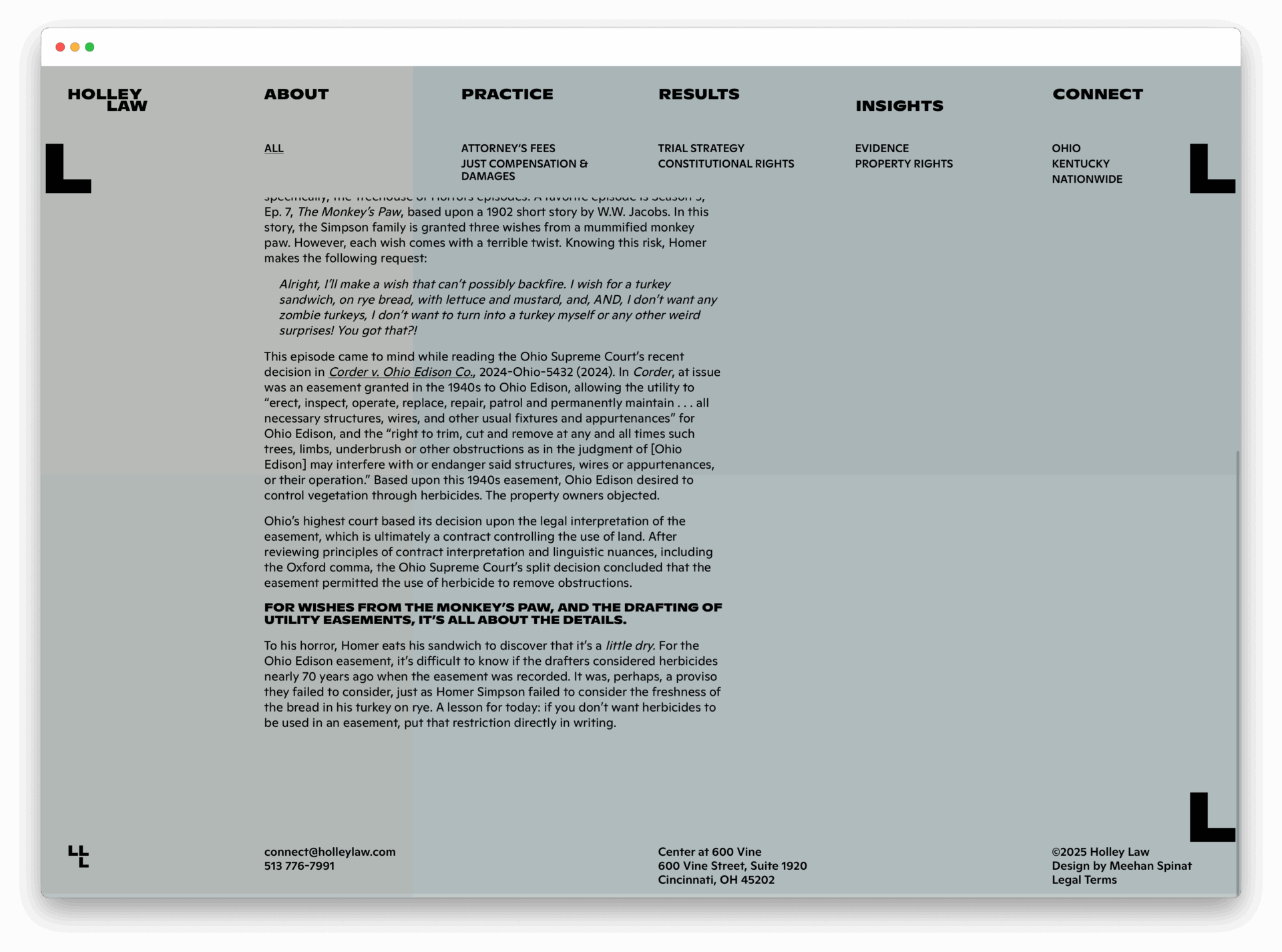
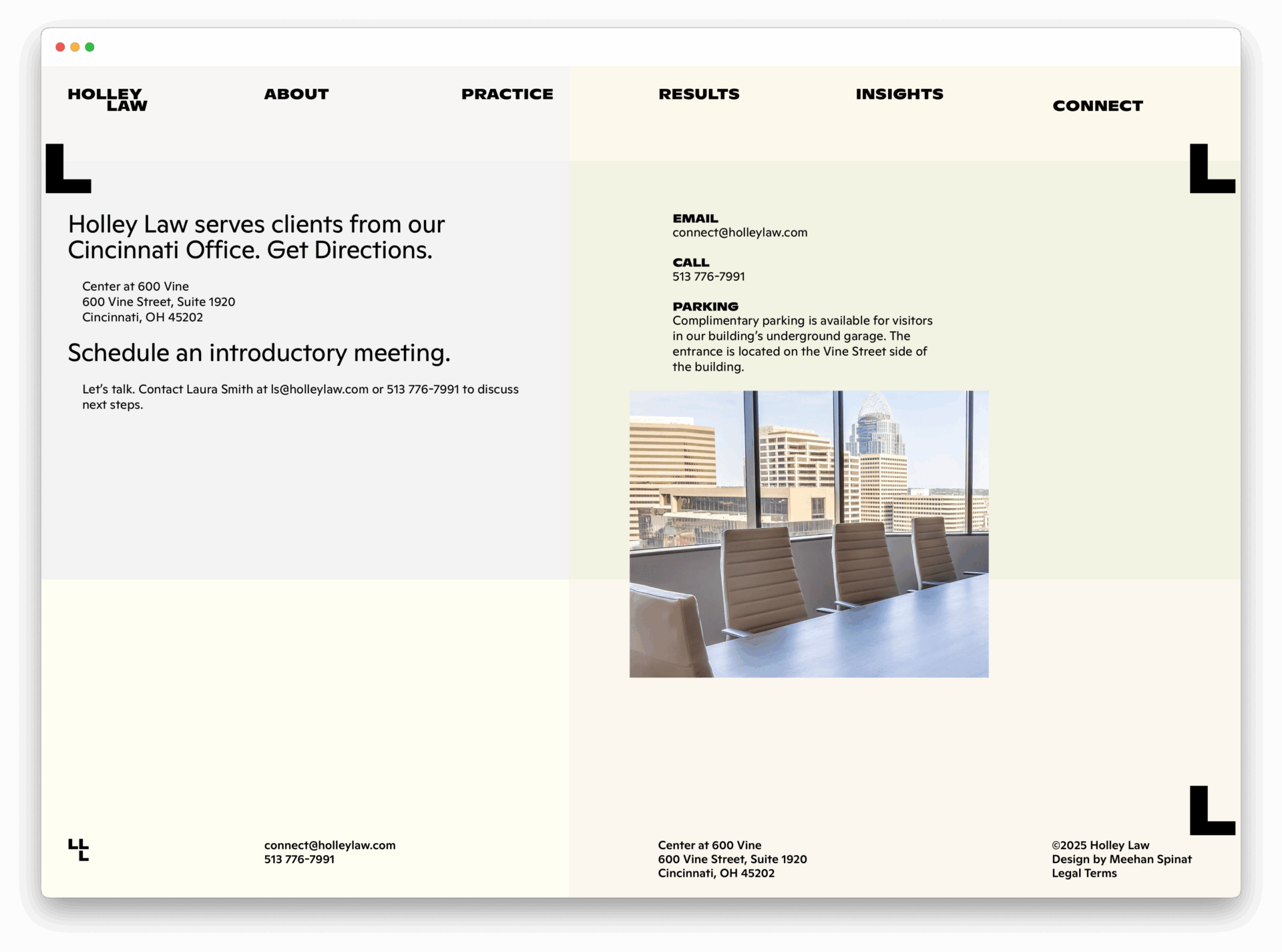
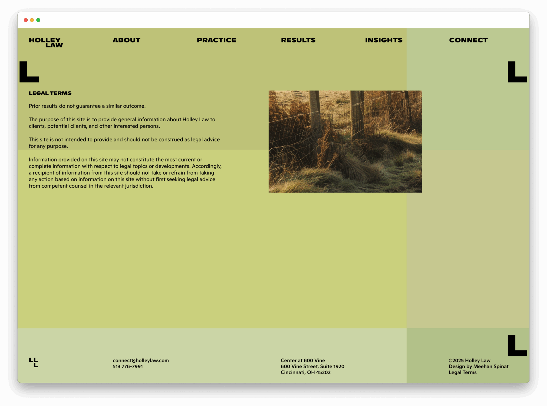
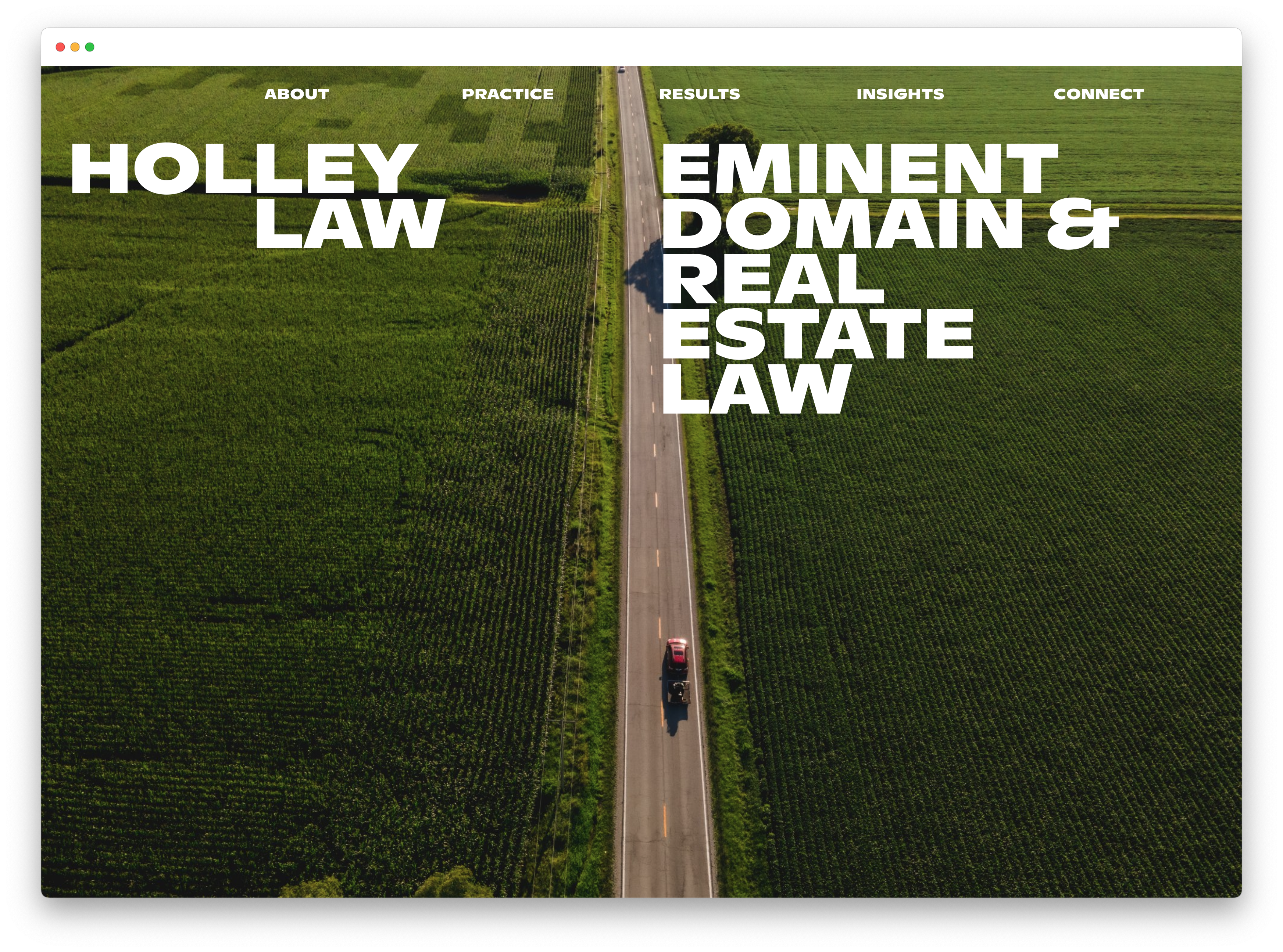
The Holley Law website + exists because founder, Sophia Holley, believed an eminent domain litigation firm should have a beautiful and meaningful online presence. An extremely successful litigator, Holley knew what the site should say in words, but needed shape, sequence, visual language, and imagery. Inspired by microfiche, zoning maps, aerial views of plots of land, and the textures of the Kentucky-Ohio region, we created a place online that feels like Holley Law and its clientele. -
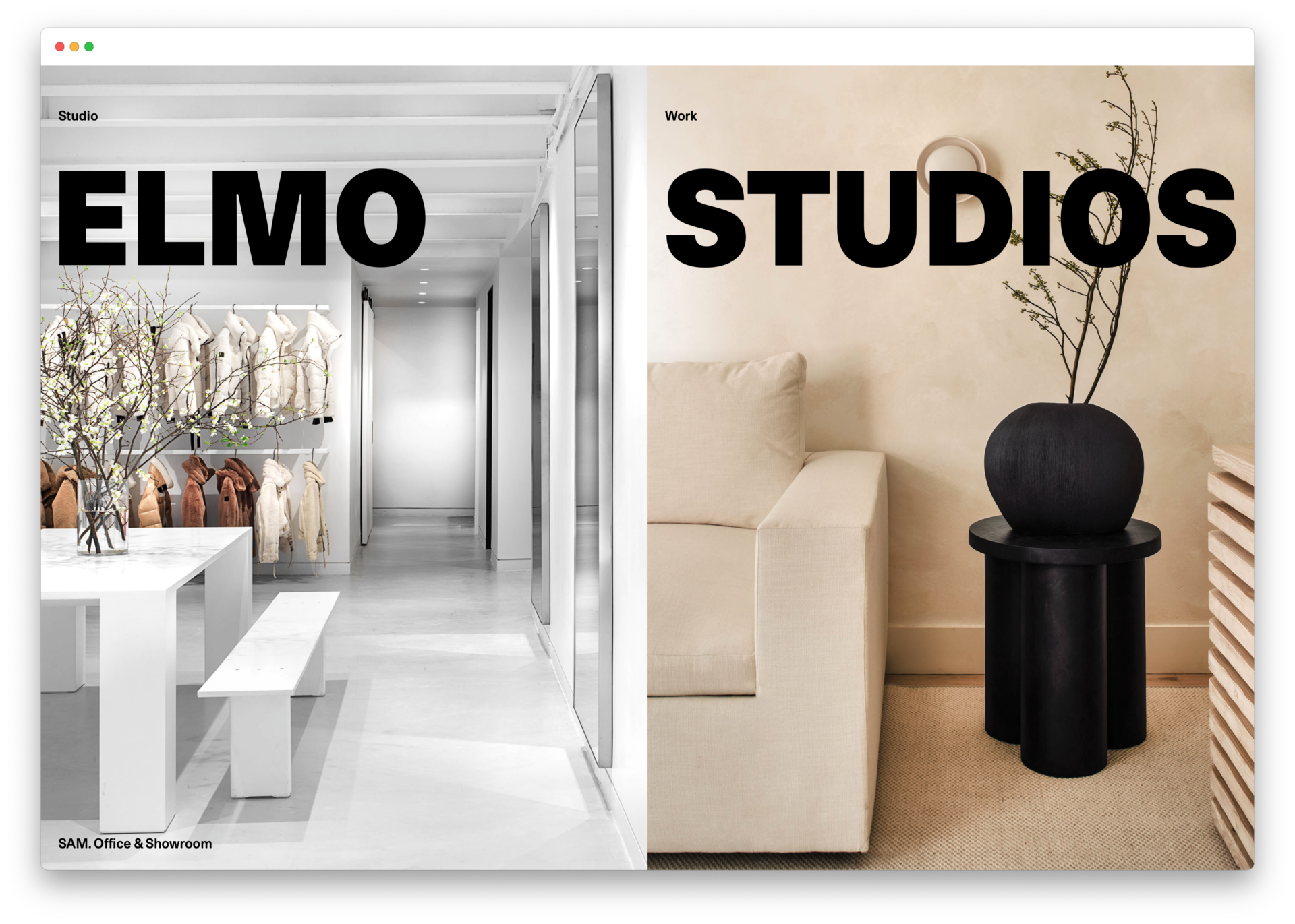
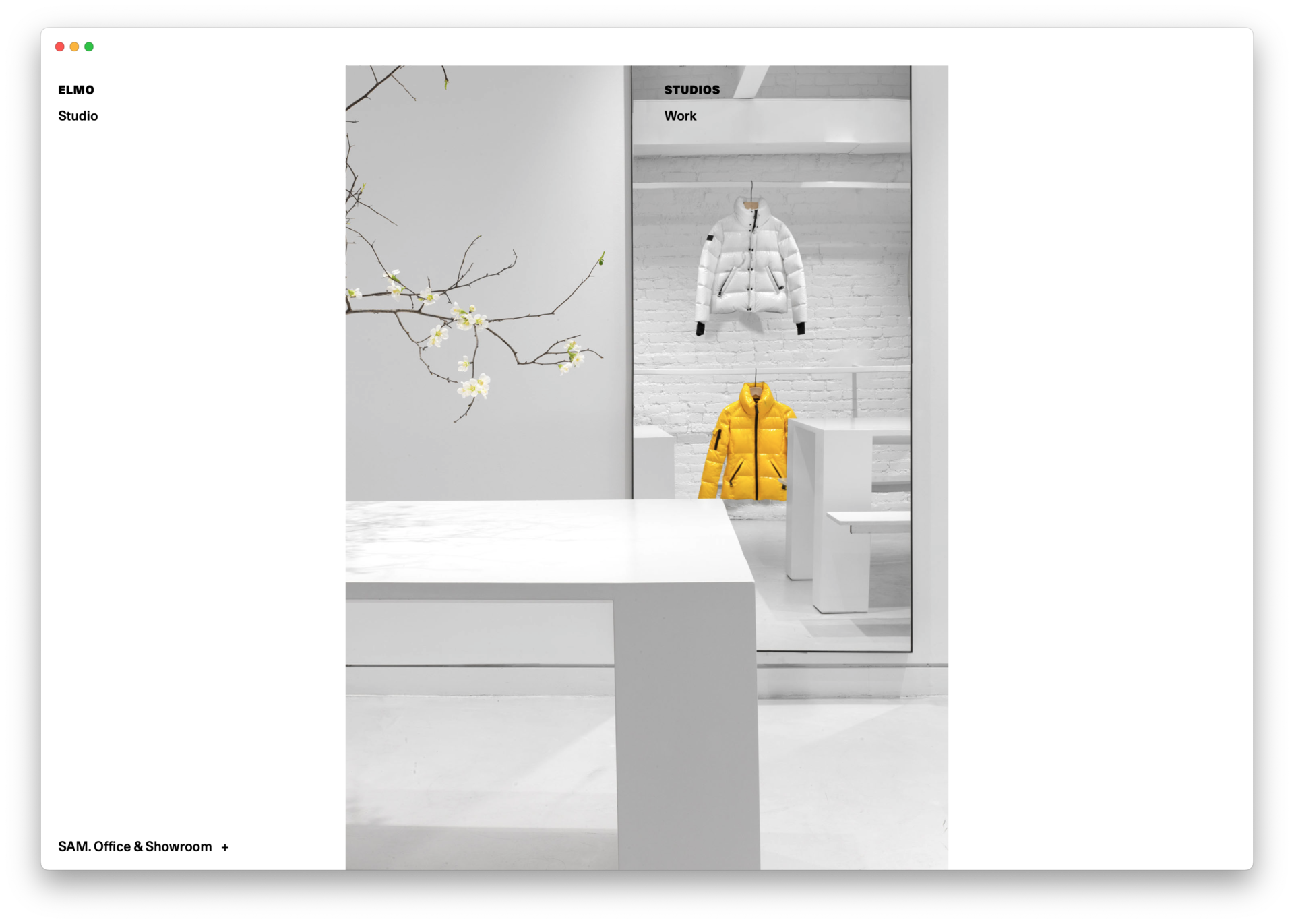
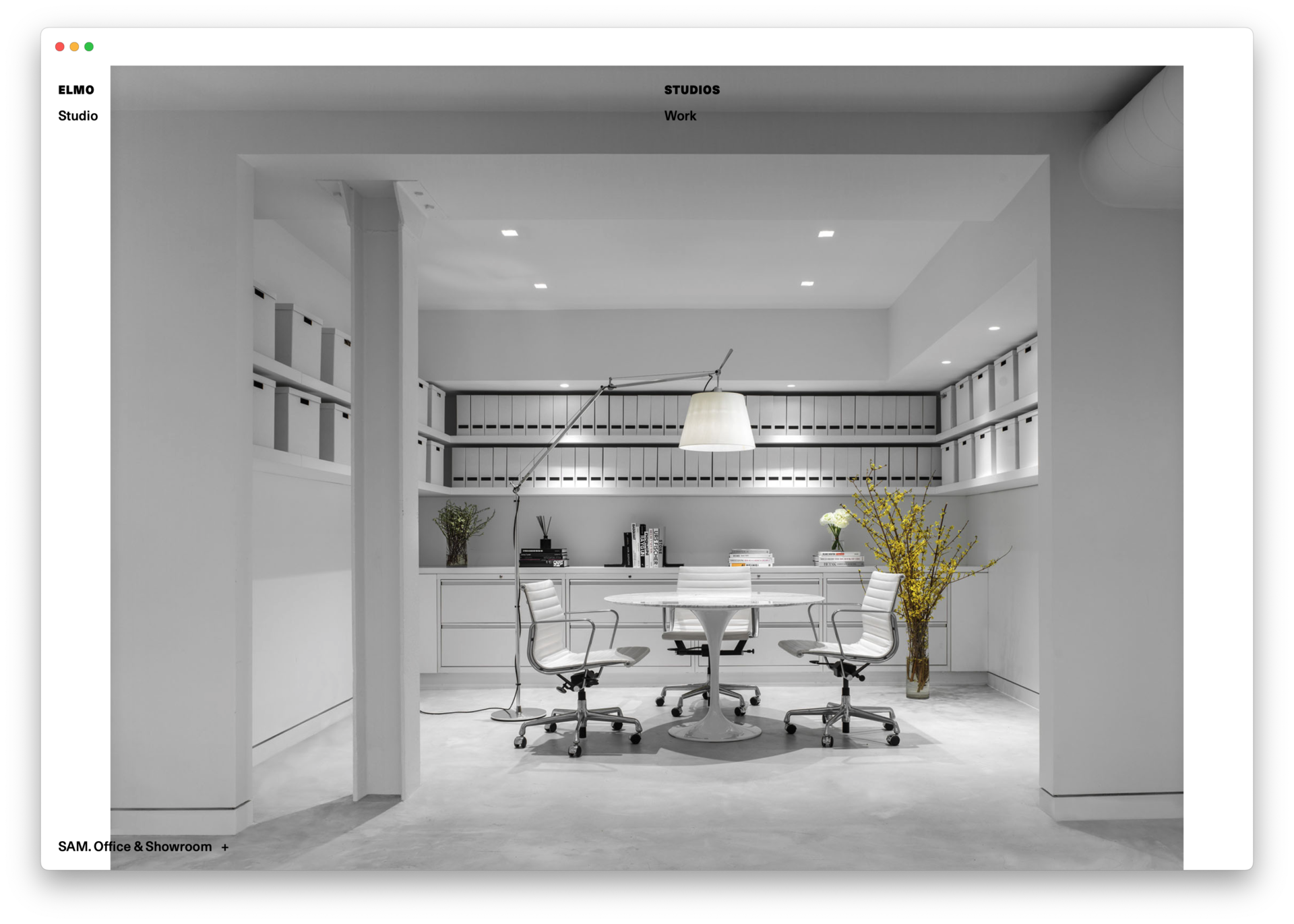
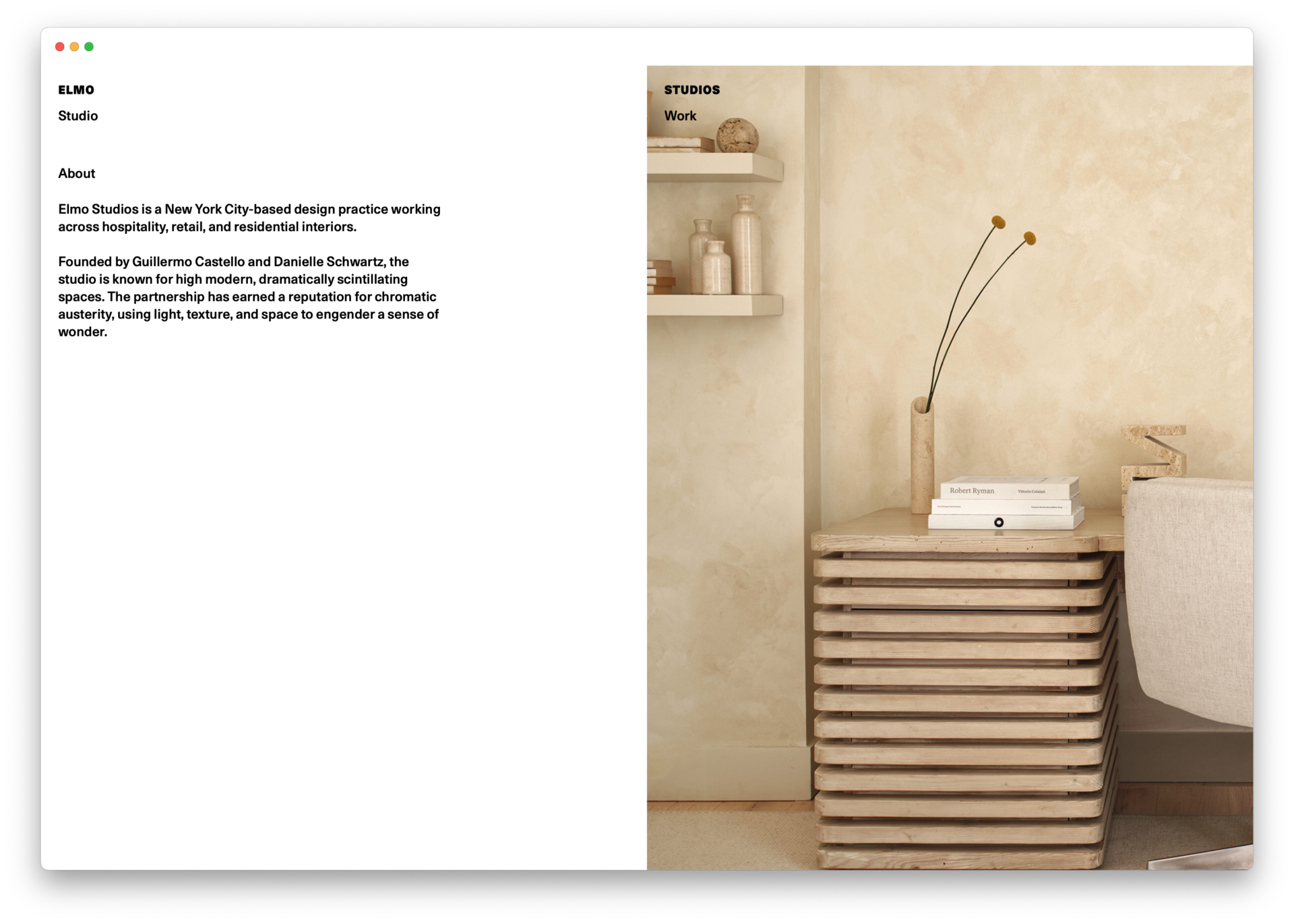
Elmo Studios brand identity and website +
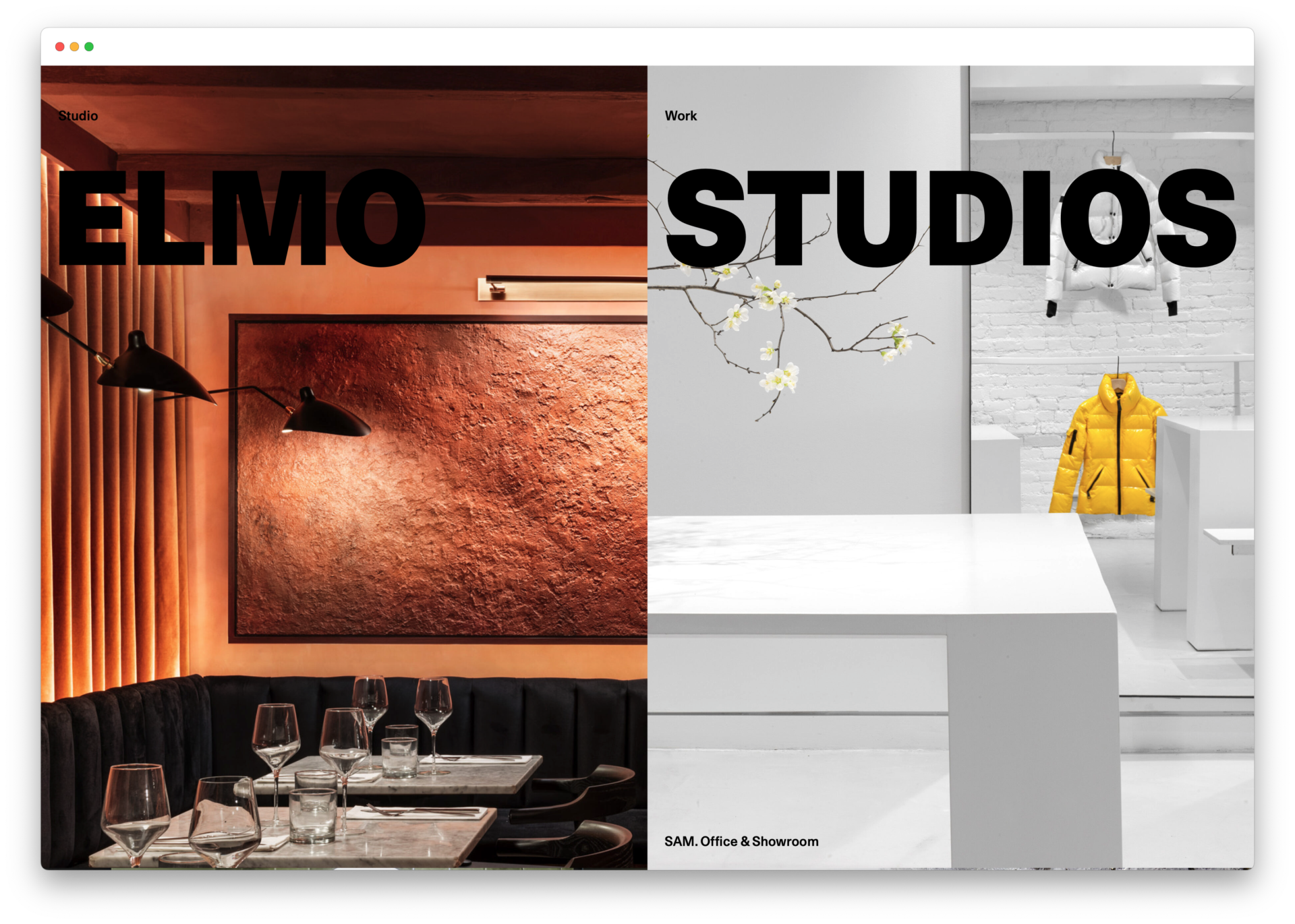
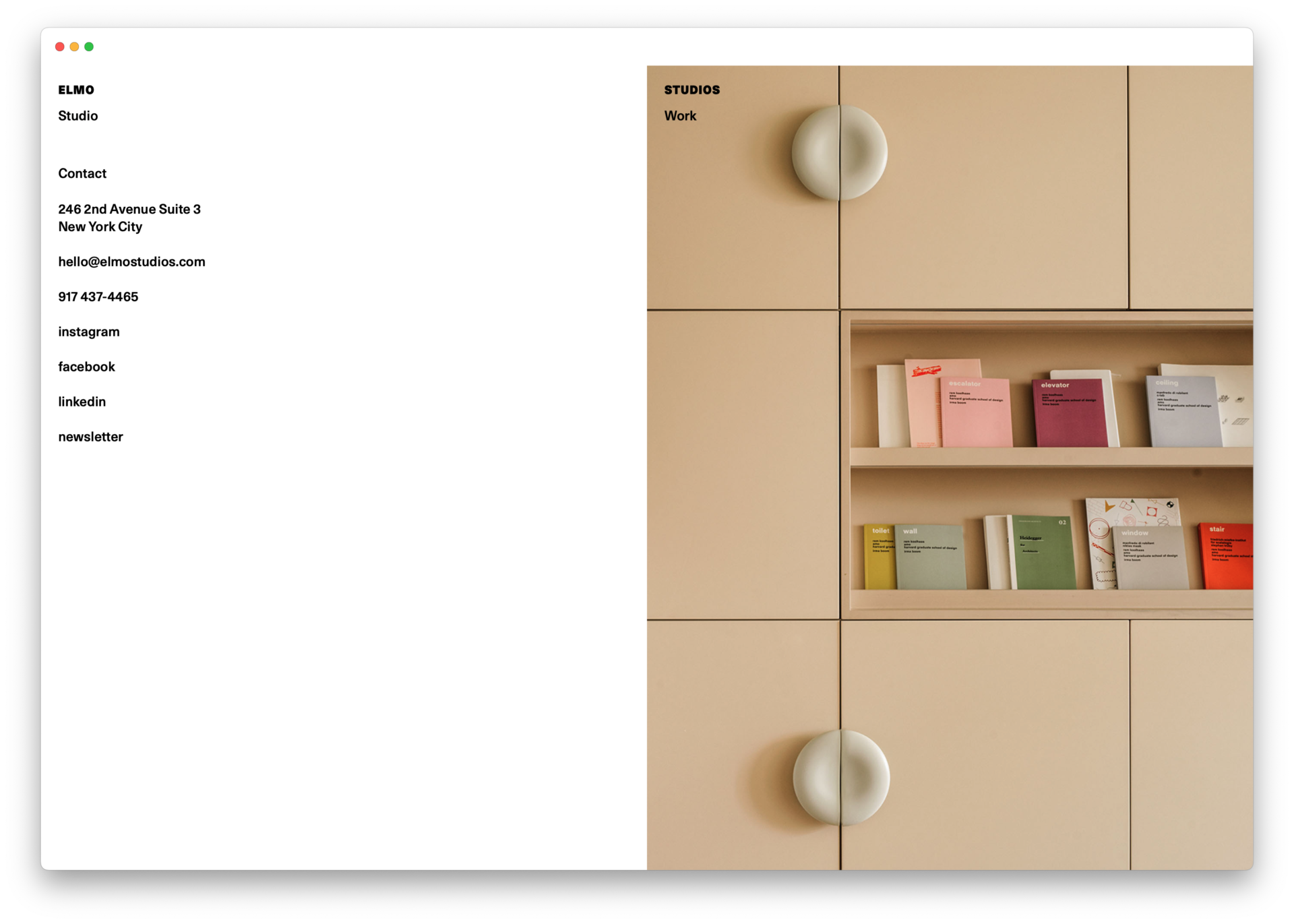
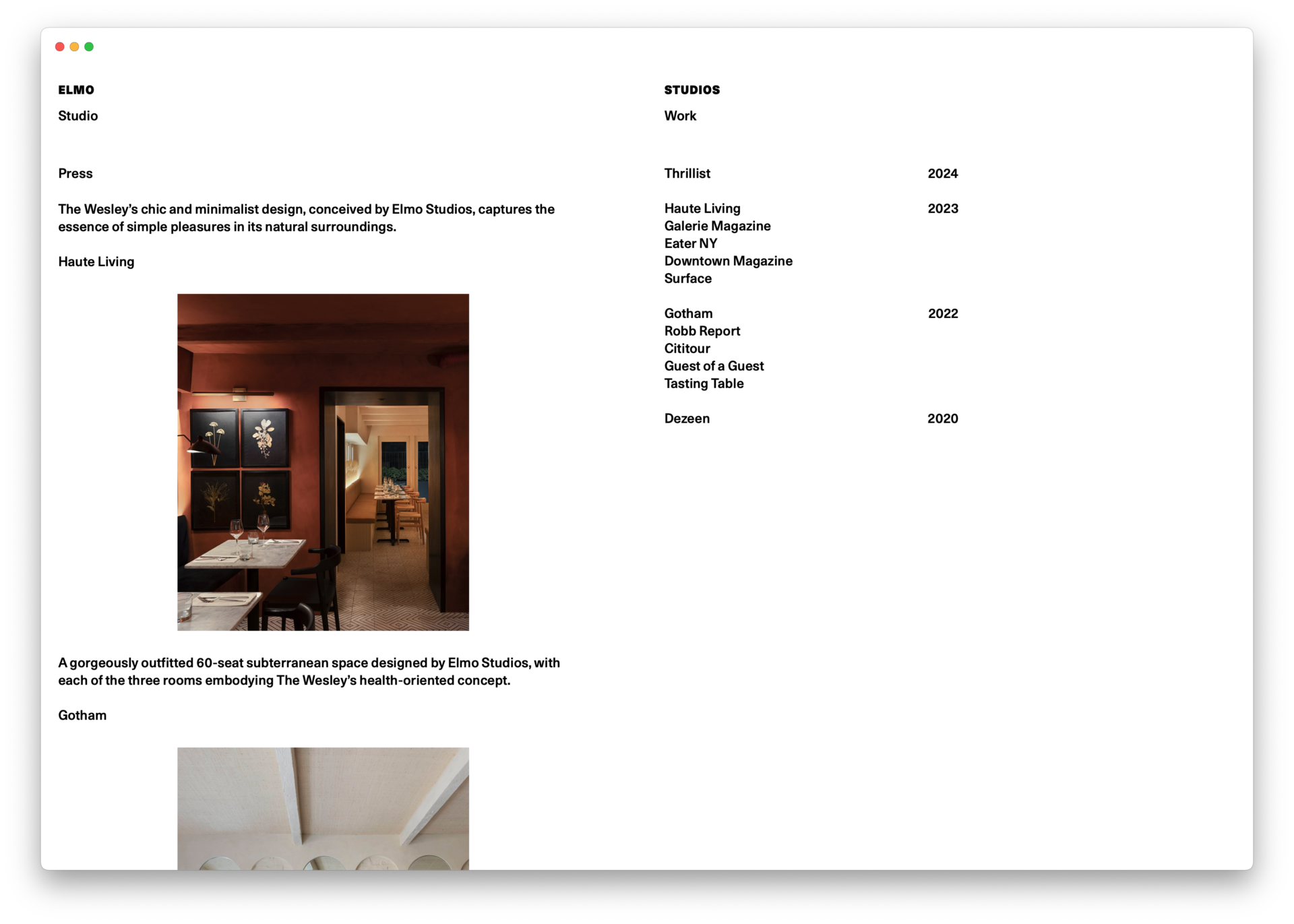
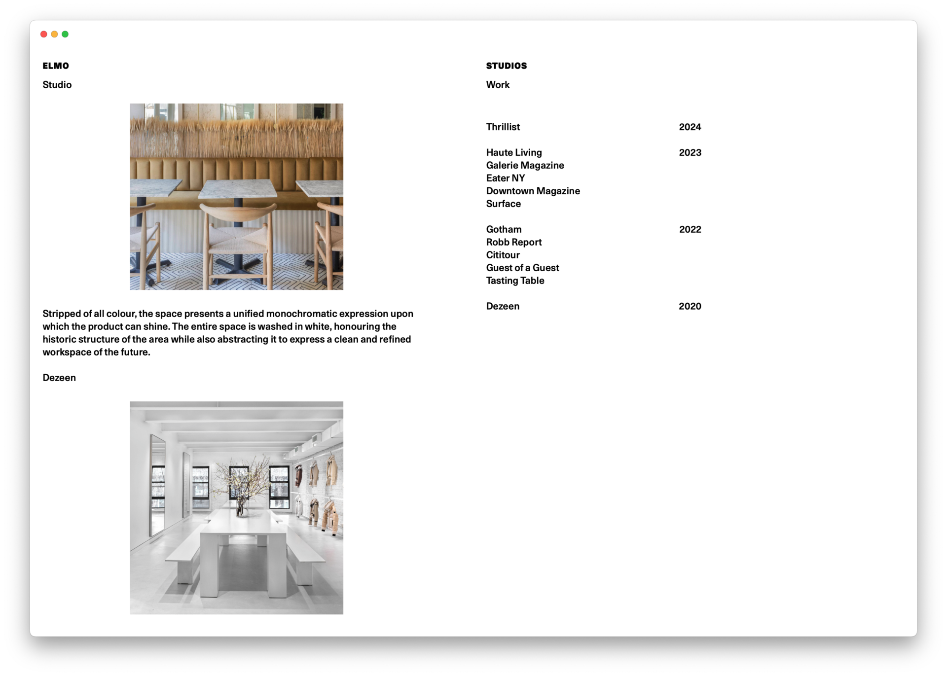
Meehan Spinat explored the visual effects of halving in the design of Elmo Studios new brand identity and website. Led by two partners, Elmo Studios is an NYC architectural and interiors practice whose bold play with light and dark registers a metaphorical duality. The wordmark is designed to be split, behaving in response to the underlying surface. The website, similarly, is designed as two halves, behaving dynamically per page. -
Identity system for The Politeia +
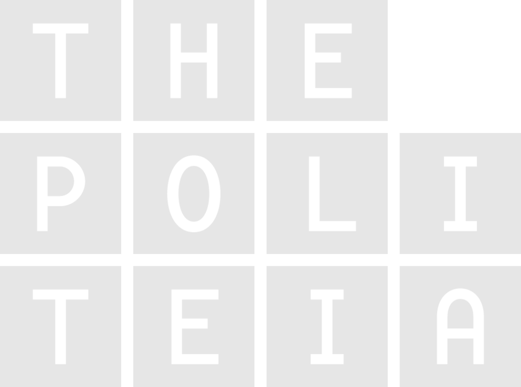
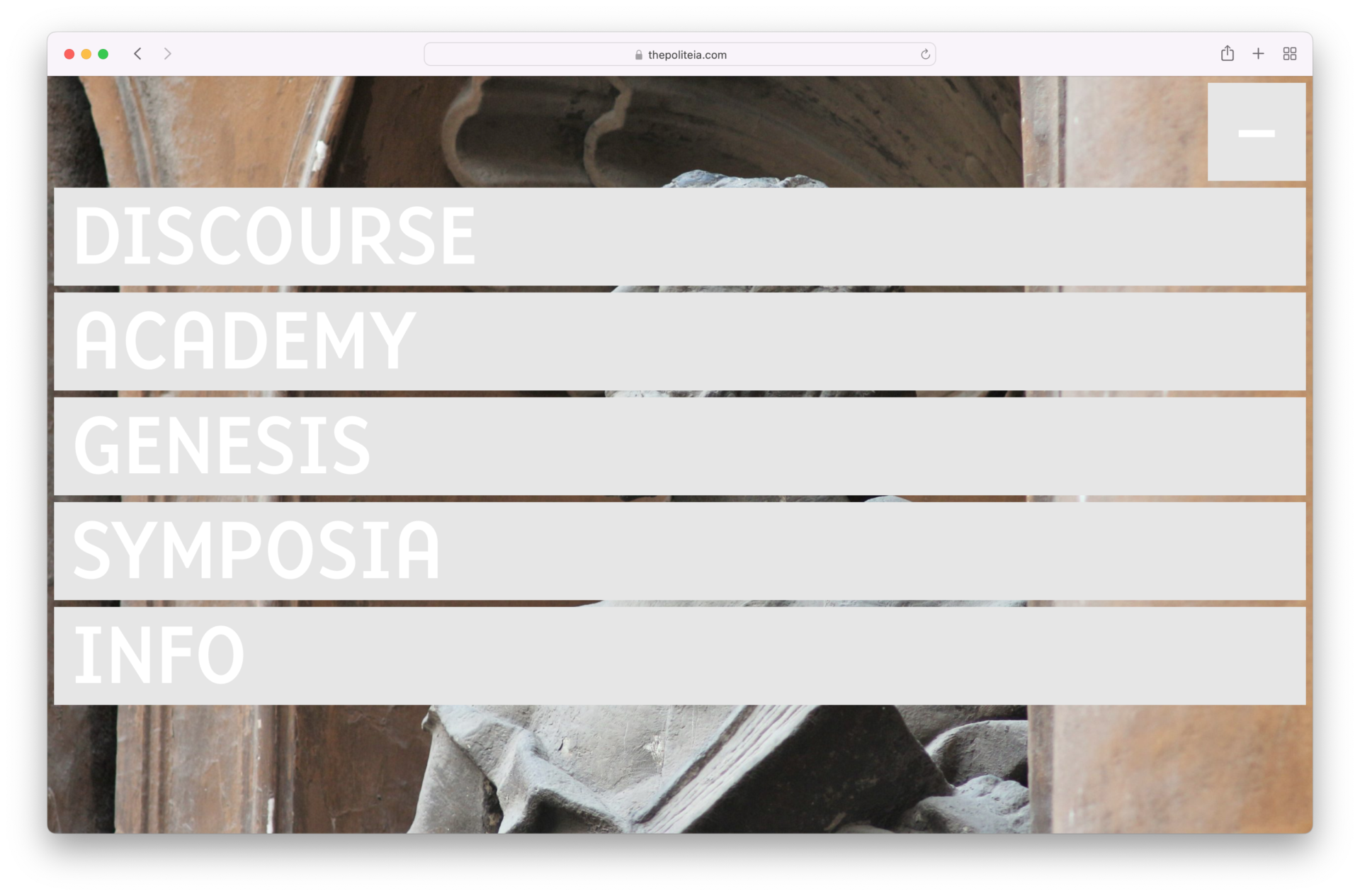
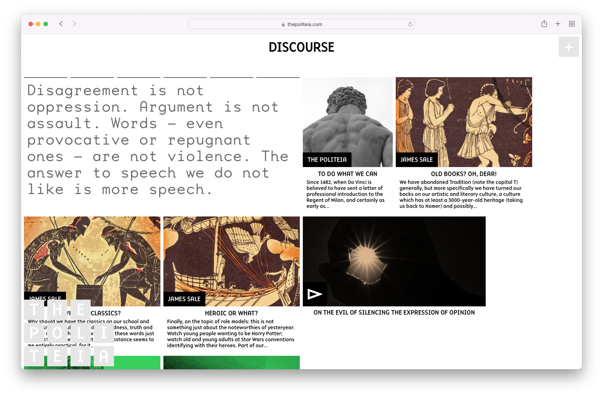
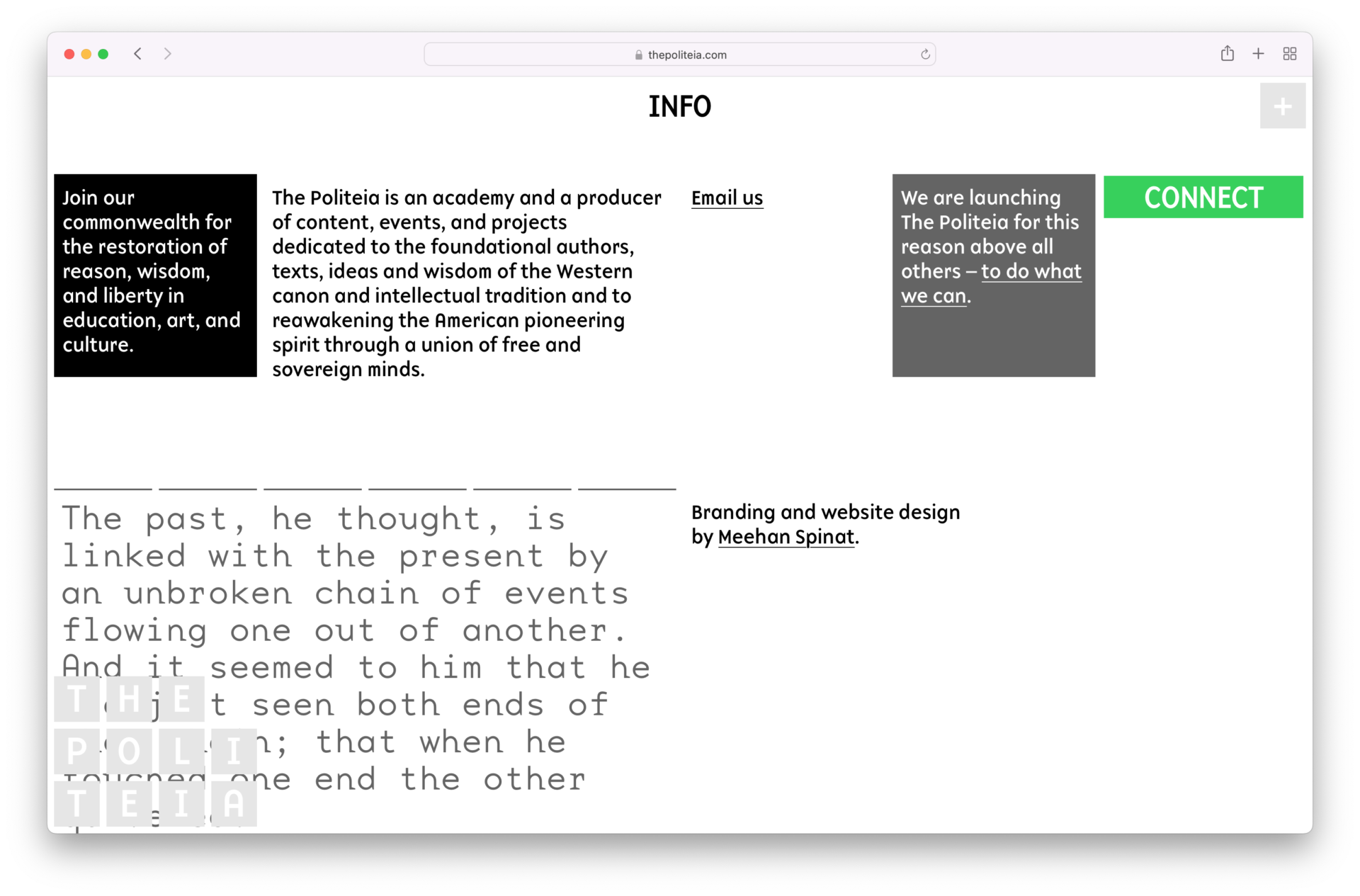
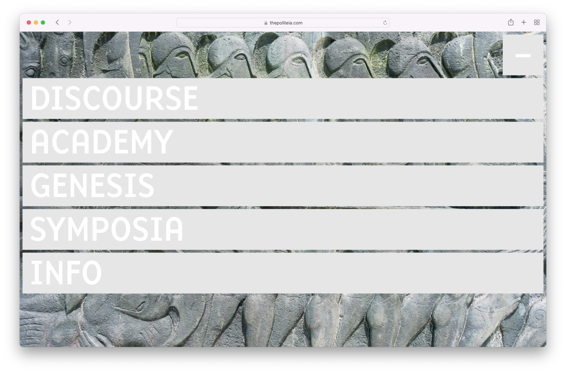
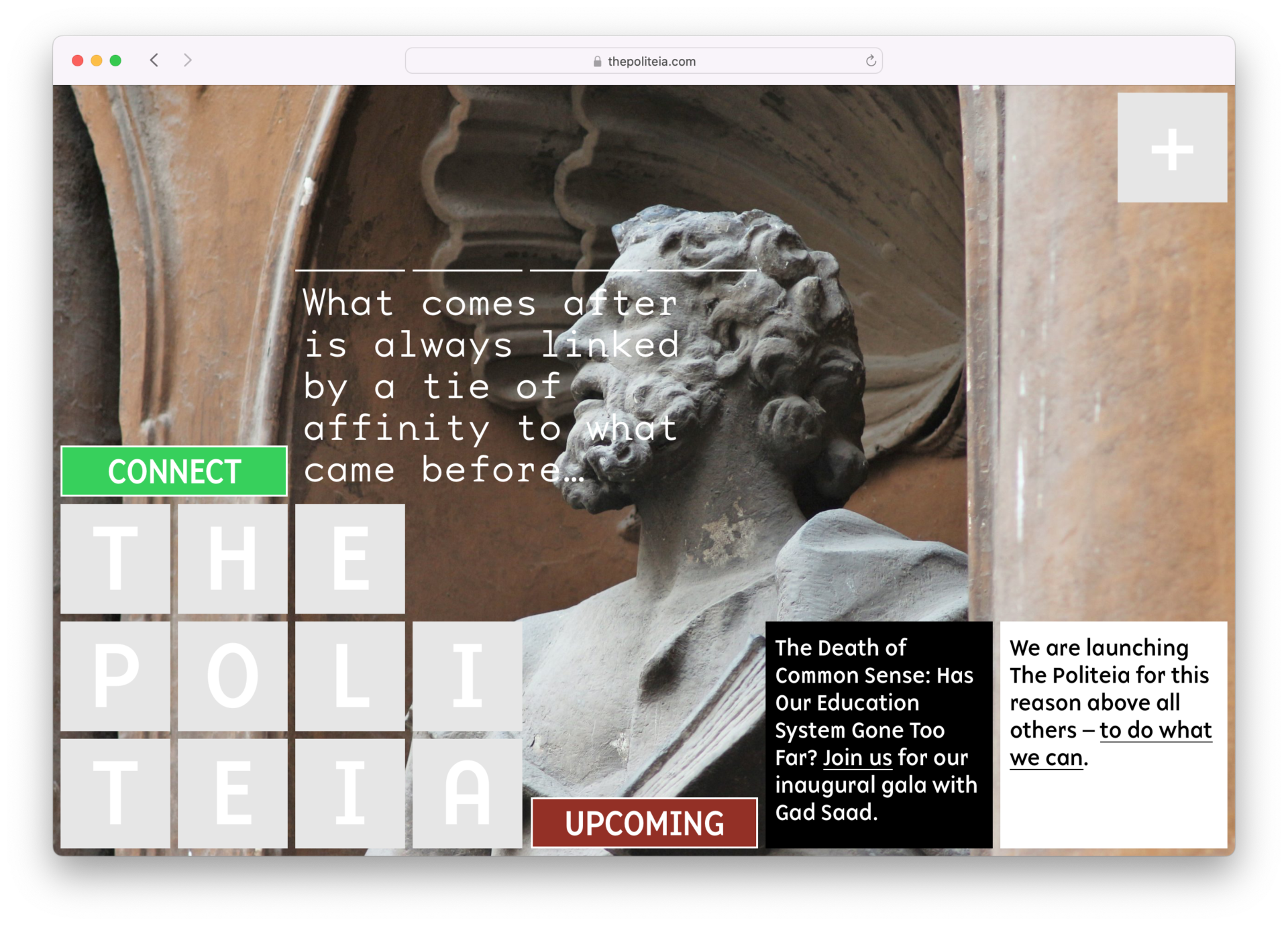
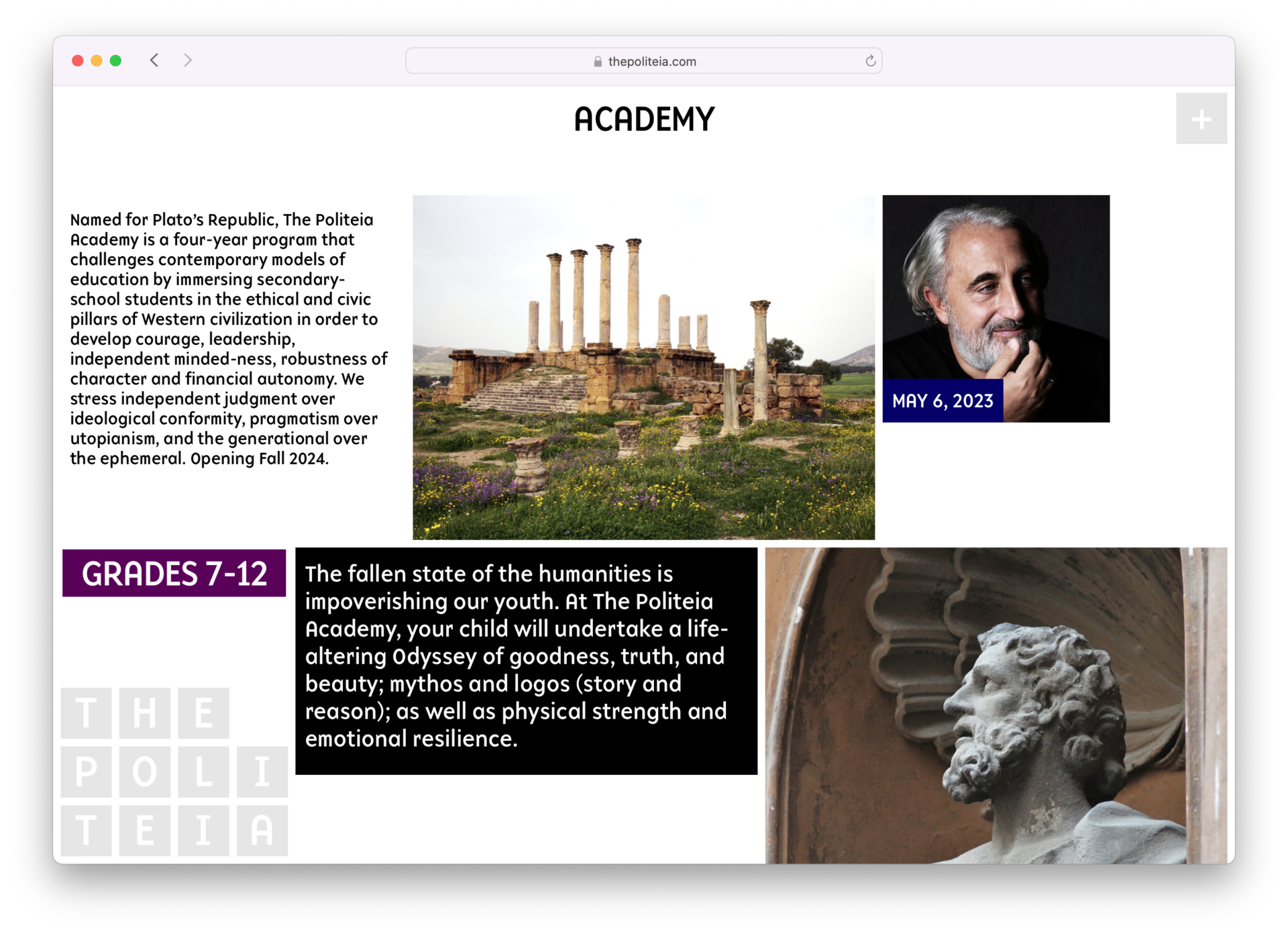
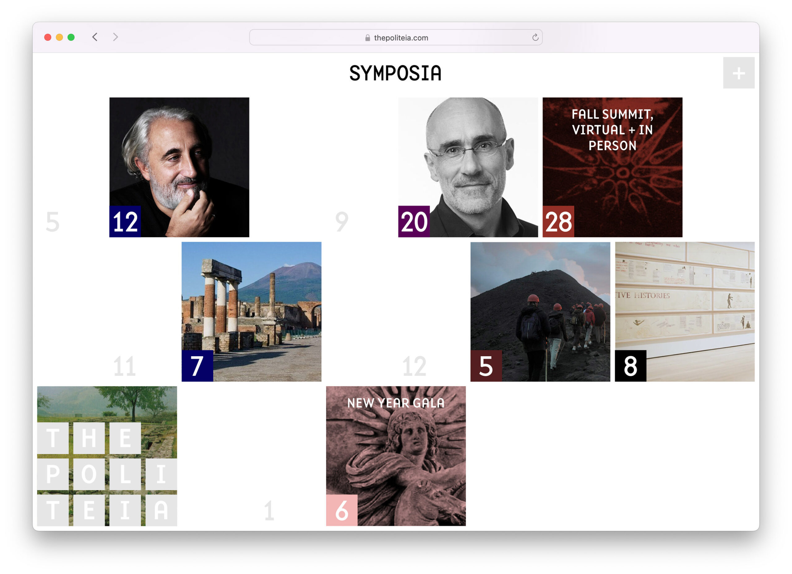
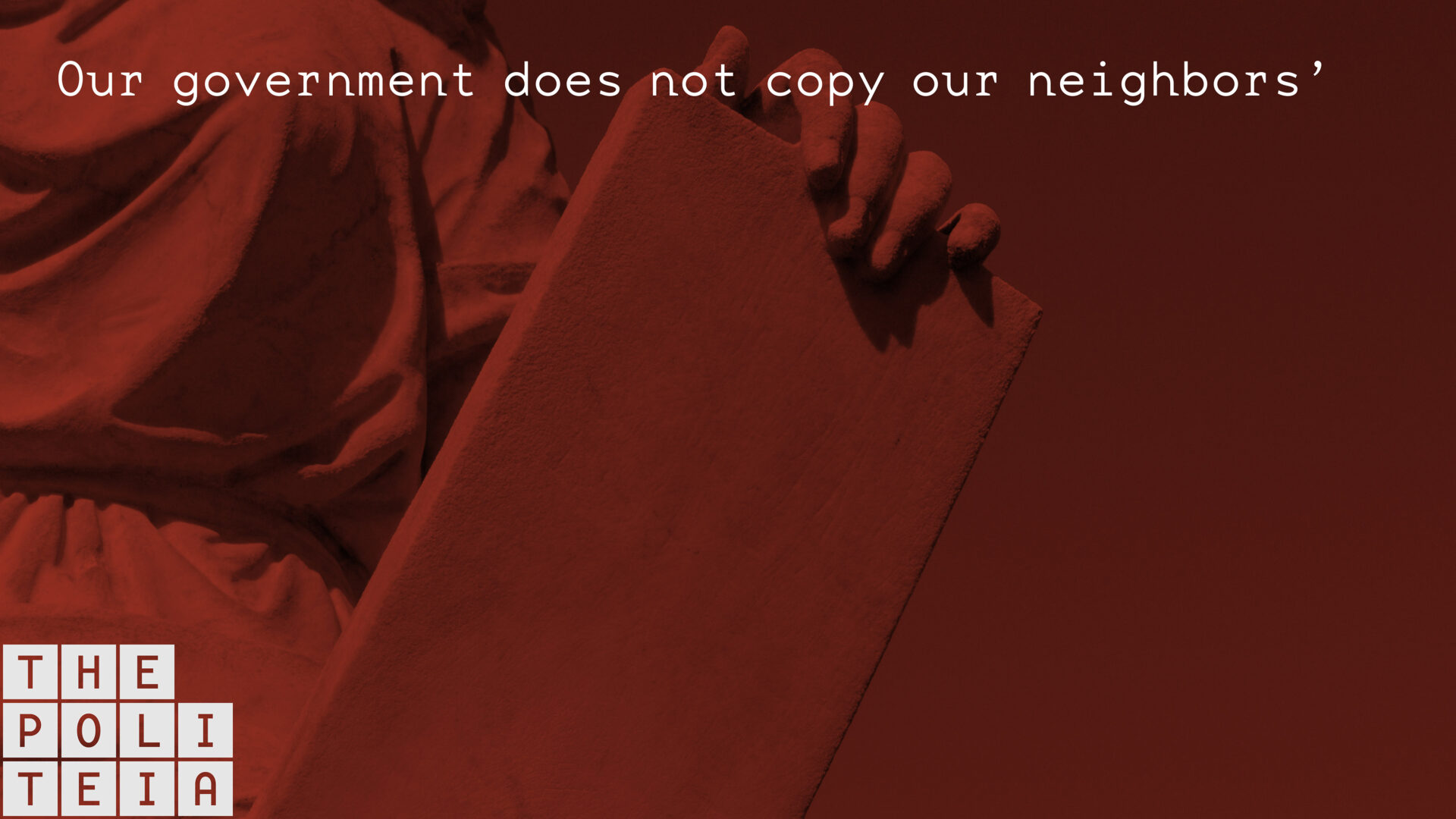
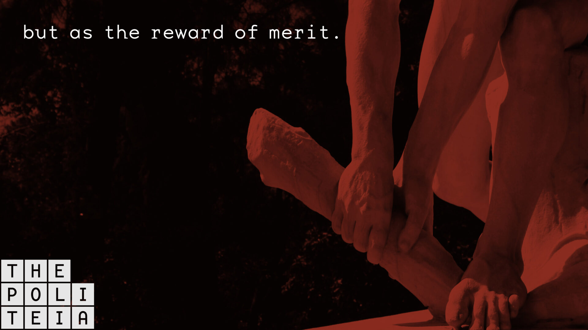
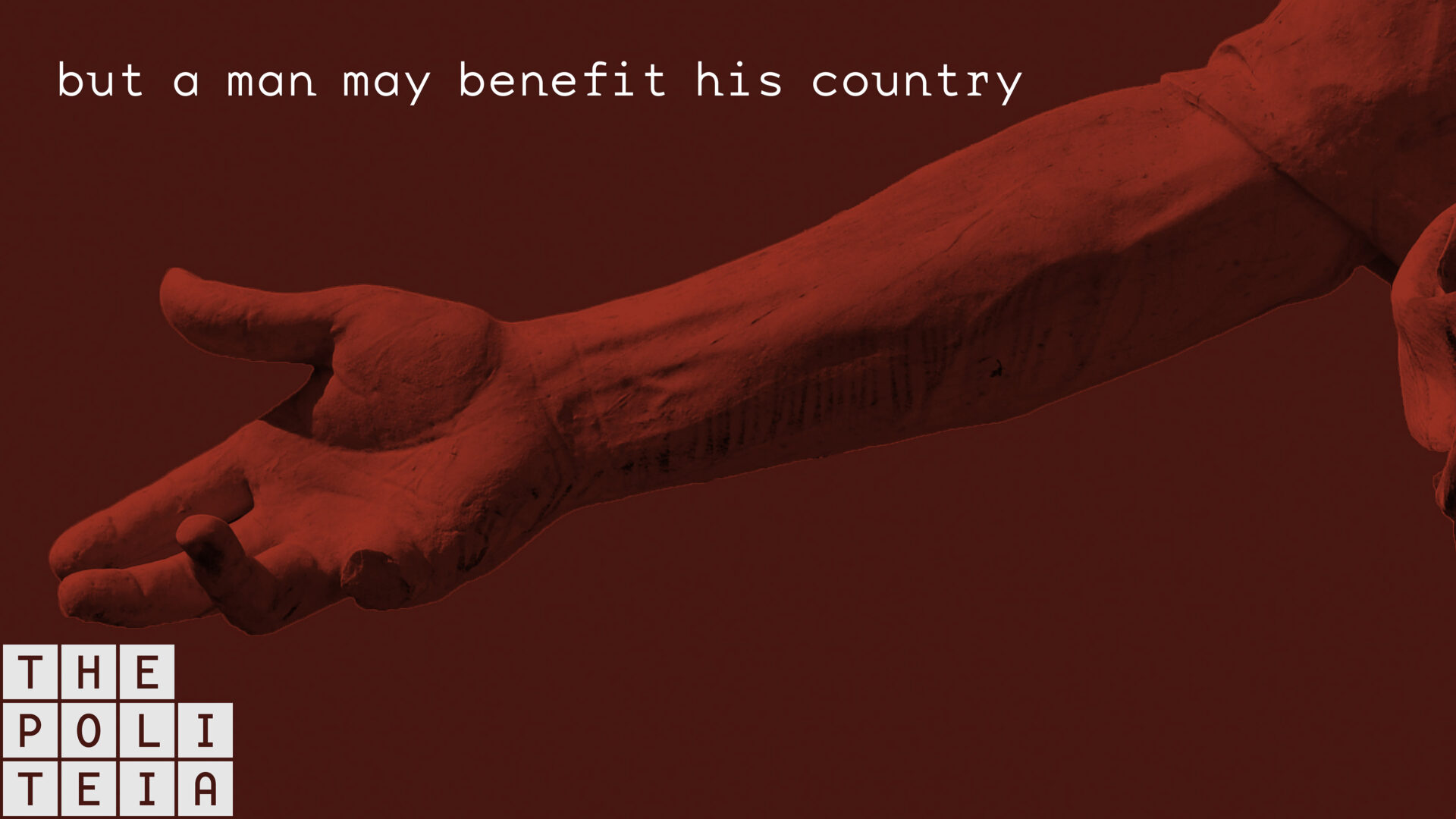
The Politeia’s visual identity system sprung from Greco-Roman artifacts in much the same way the budding institution and publishing platform yields from foundational texts of the western canon. The wordmark rests on the lowest datum, an inscribed monolith. The website is designed modularly, ready for regular additions and temporary announcements. Modeled after ancient Roman centuriation, typographically and chromatically varied content advances automatically, adhering to a rigid grid. The cumulative effect is a coherent and purposeful digital place, an online echo of civilization.
Meehan Spinat’s foundational visual work has led to continued collaboration. Work includes: visual identity system; website; content strategy for website and social media; motion graphics; and audio visual chime. -
Content Strategy for The Politeia +
With only the notion of communication along theoretical and pedagogical lines, Meehan Spinat developed a series of content modules to act as vessels for visual, literary, audio, and audio-visual content for The Politeia. Meehan Spinat considered the predilection of the publisher and the experience of the user, strategizing means of prolonging engagement, spawning delight, maintaining a living website, and answering audience expectation.
On the web, modules are based upon numbers of grid units and, though stylistically varied, they advance up and down the page with such regularity that the system is palpable and coherent. On instagram, Facebook, and Youtube, visual elements were tweaked to meet the parameters of each platform. -
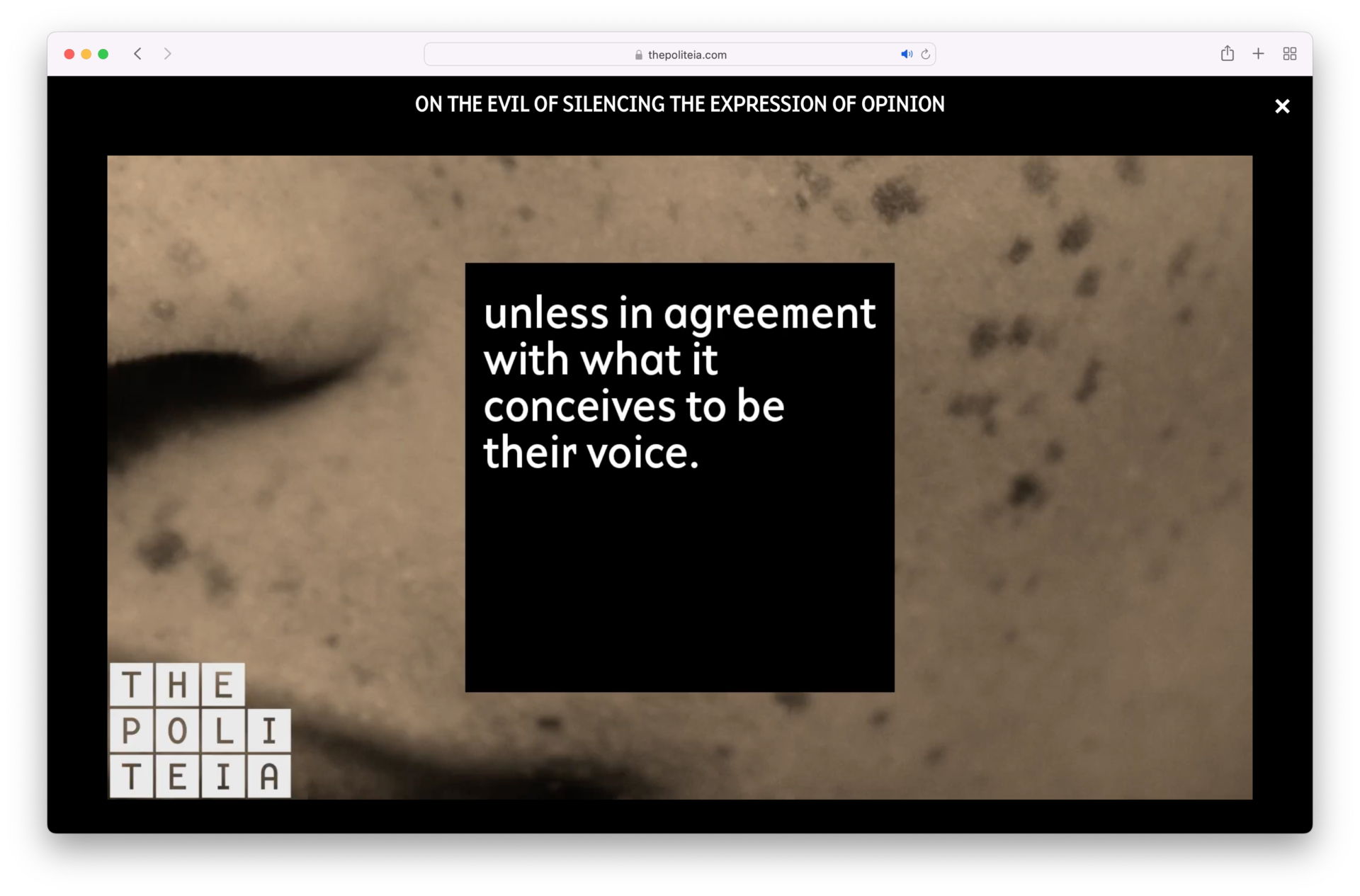
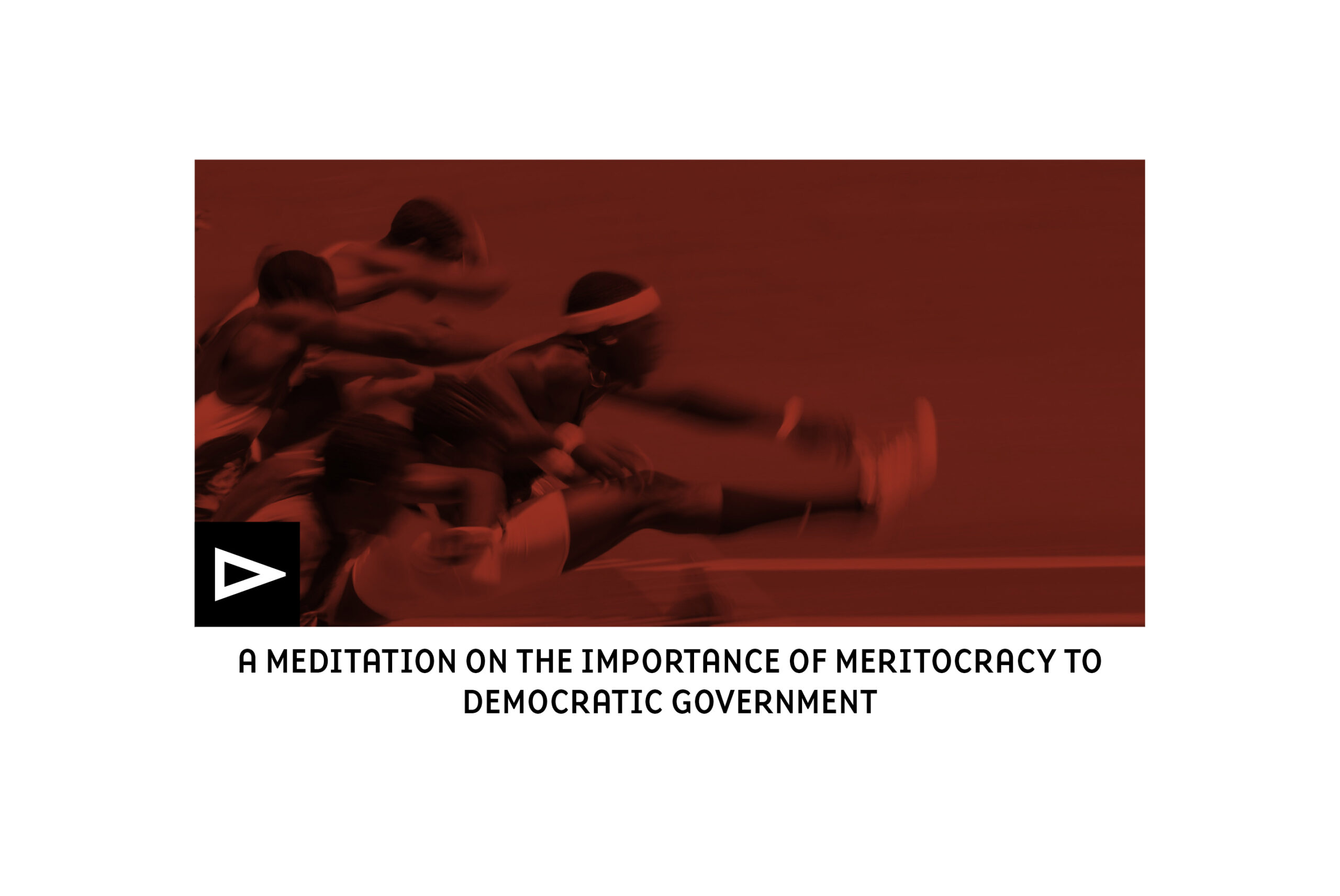
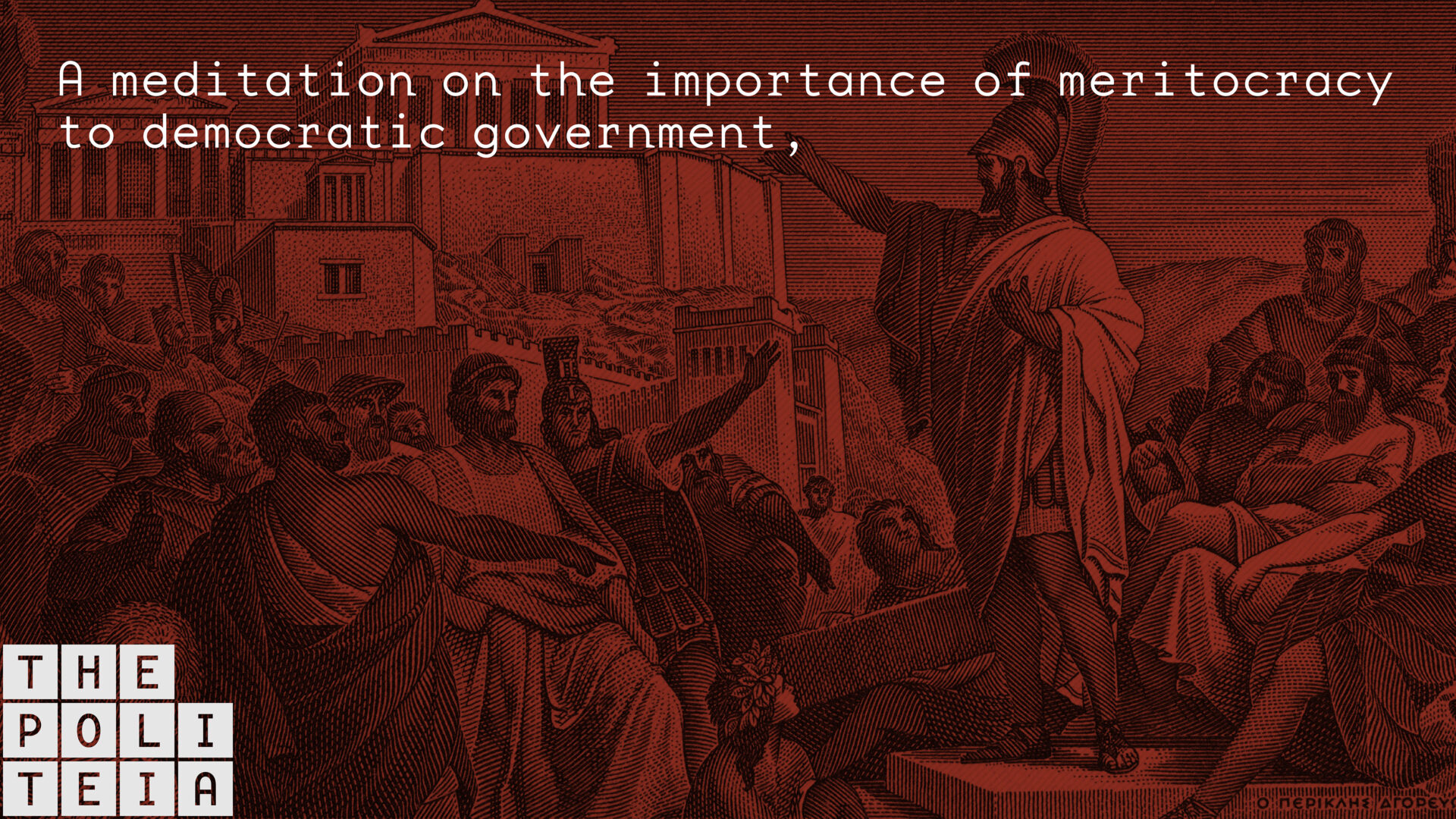
The Politeia videos: On the Evil of Silencing the Expression of Opinion, A Meditation on the Importance of Meritocracy to Democratic Government, and A Note on Society and Progress +
The Politeia commissioned Meehan Spinat to create a series of videos featuring historic texts as well as an audiovisual chime to brand the series. Meehan Spinat devised visual hooks, helping the viewer more readily intuit antiquated diction and syntax. Meehan Spinat designed subtitles; sourced and sequenced imagery to create a narrative arch; and created an audiovisual chime and credits. Each video is a self-contained narrative as well as a strong extension of the institutional brand. -
Herman Miller, prop styling +
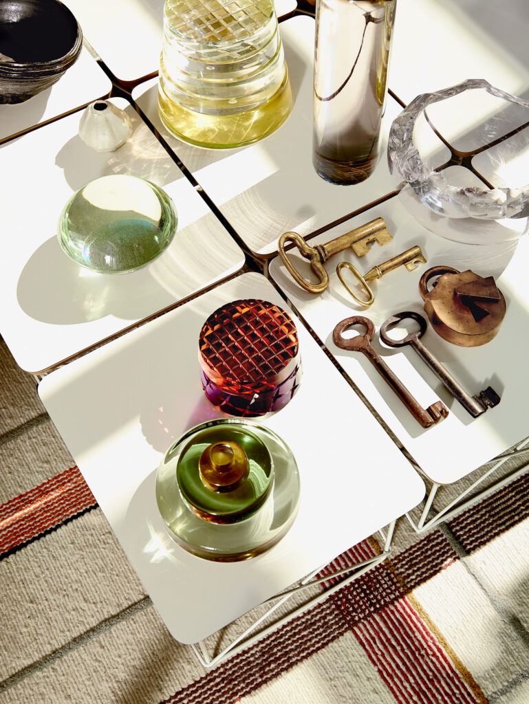
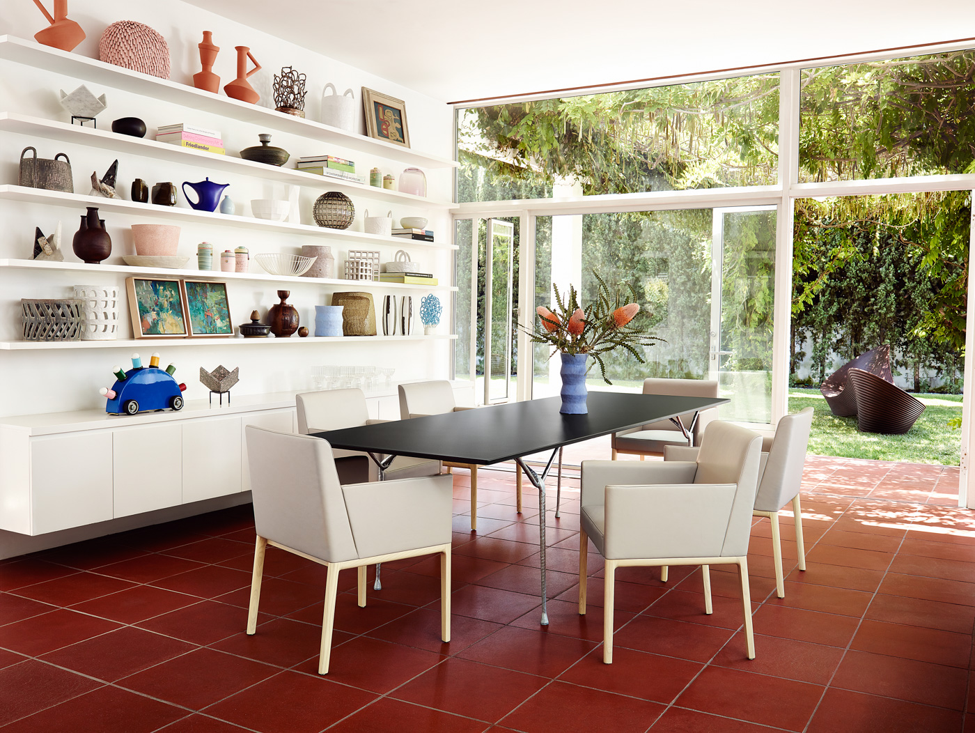
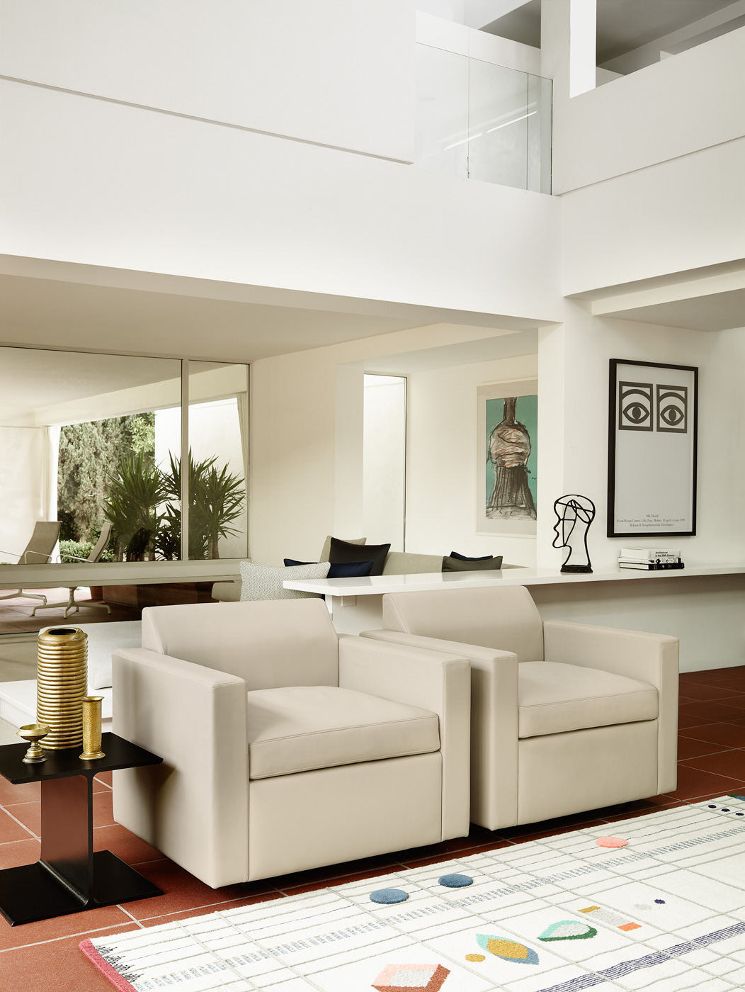
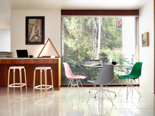
Prop-styling manifests the imagined lives of two world travelled creatives, residing in a Paul Rudolph House furnished with Herman Miller furniture. Curated and sourced objects and ephemera for a Palm Springs catalogue shoot, commissioned by the famed furniture company. -
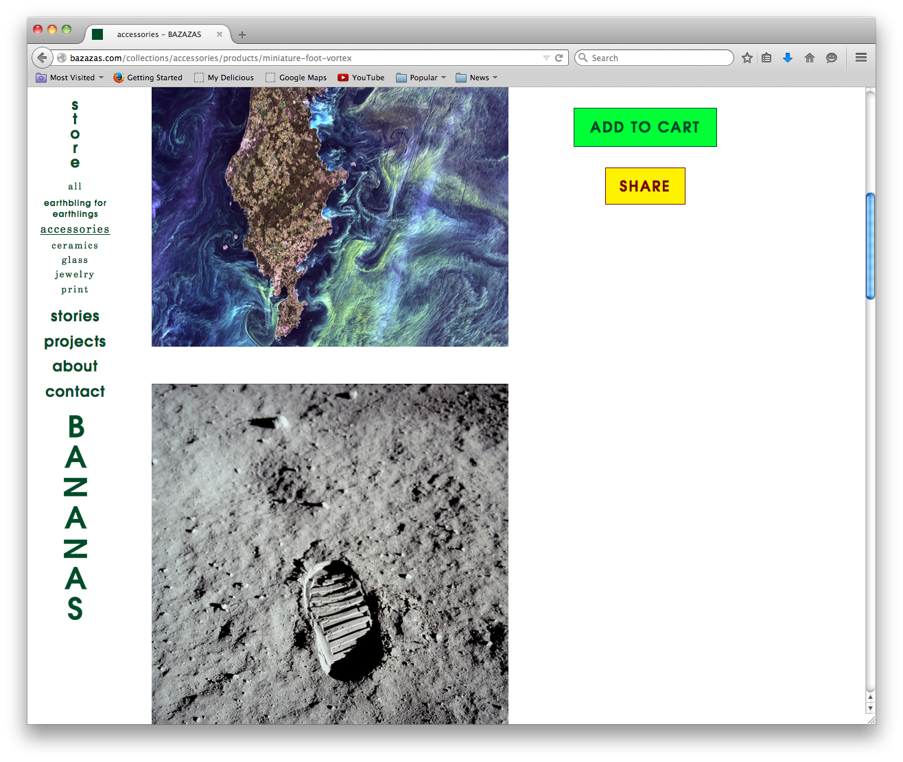
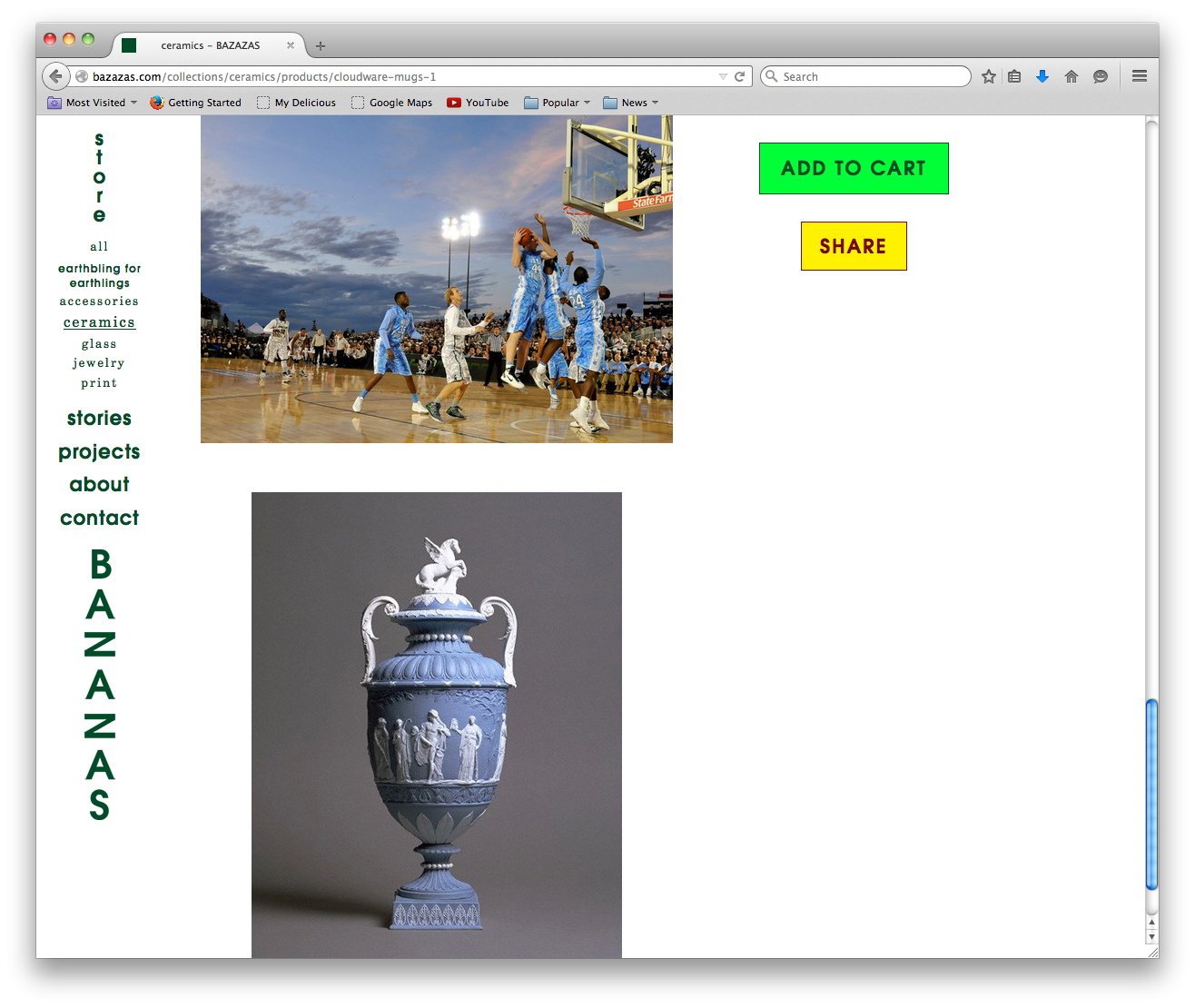
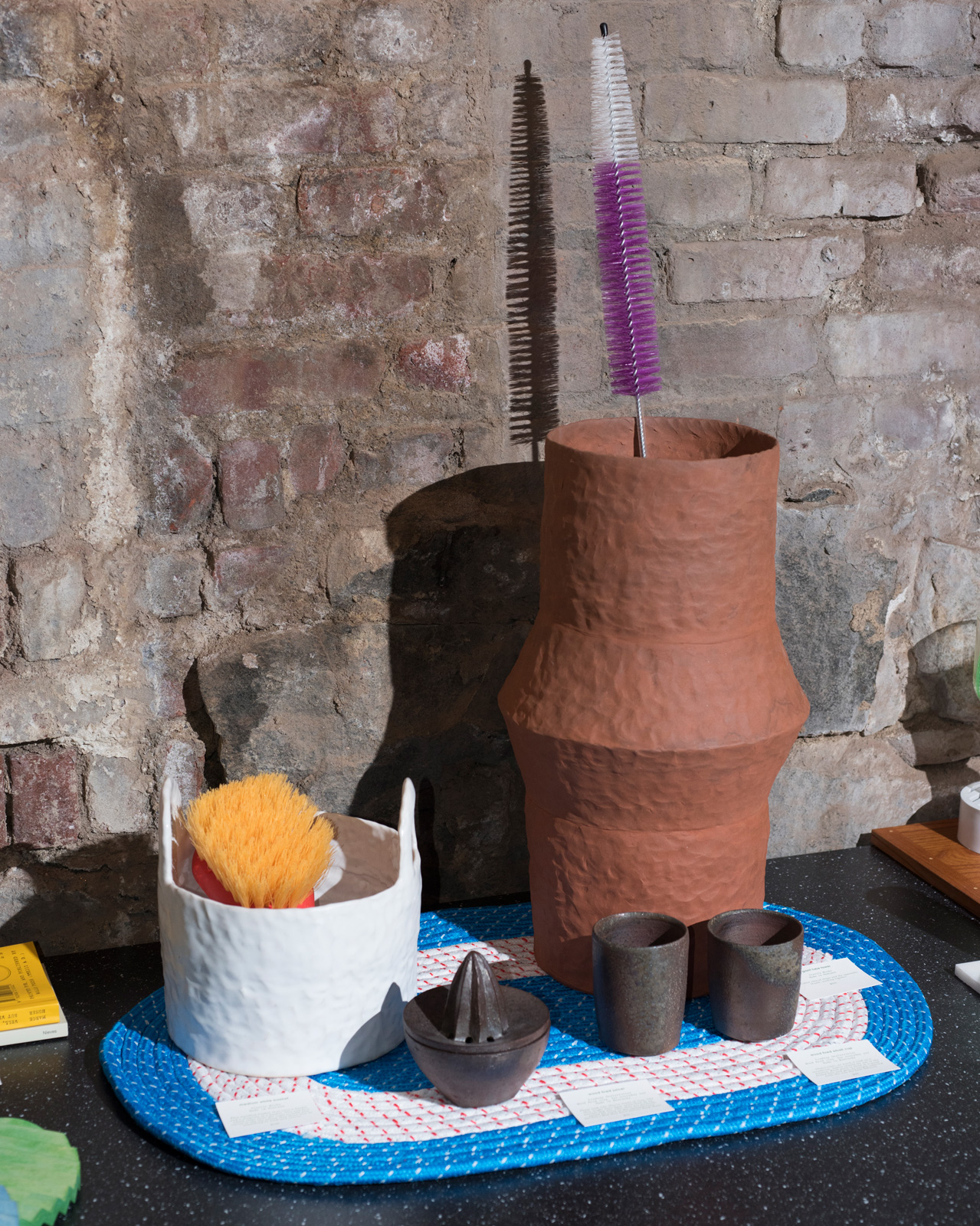
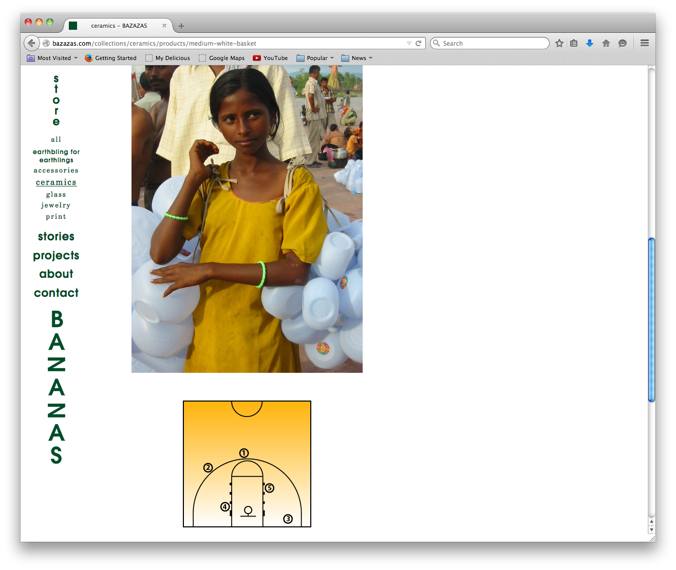
Bazazas, online and physical retail +
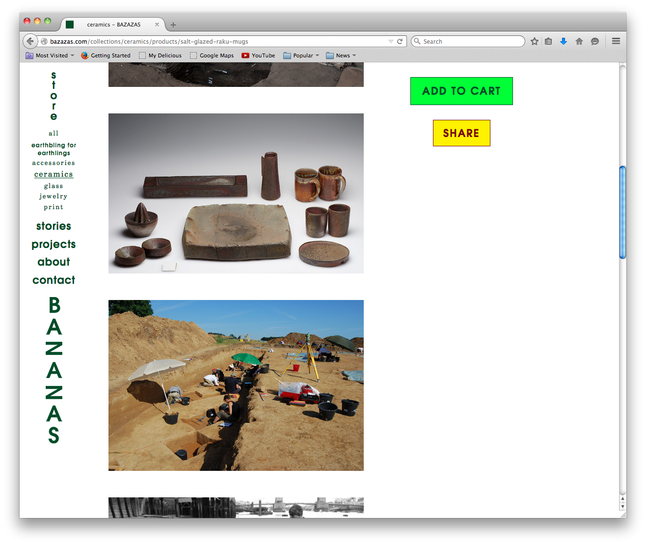
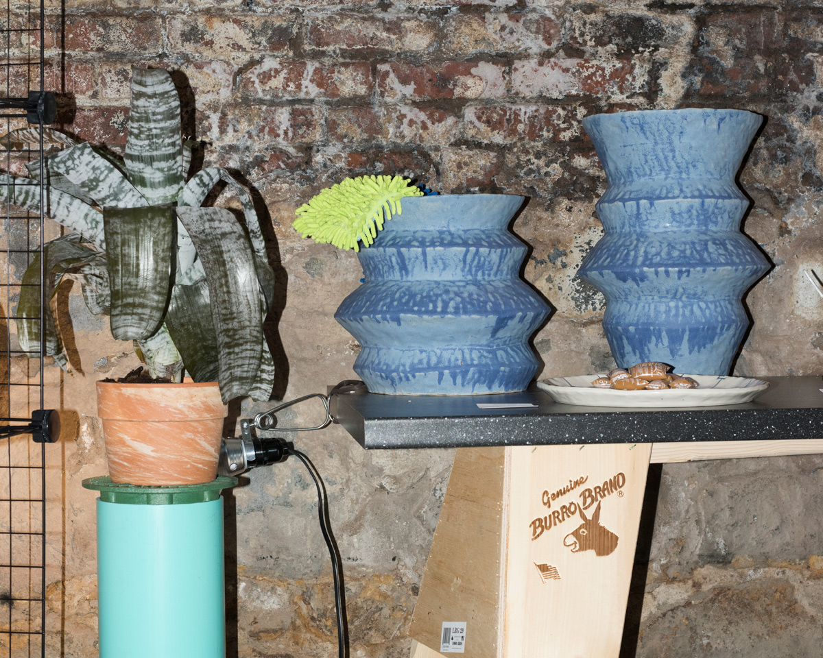
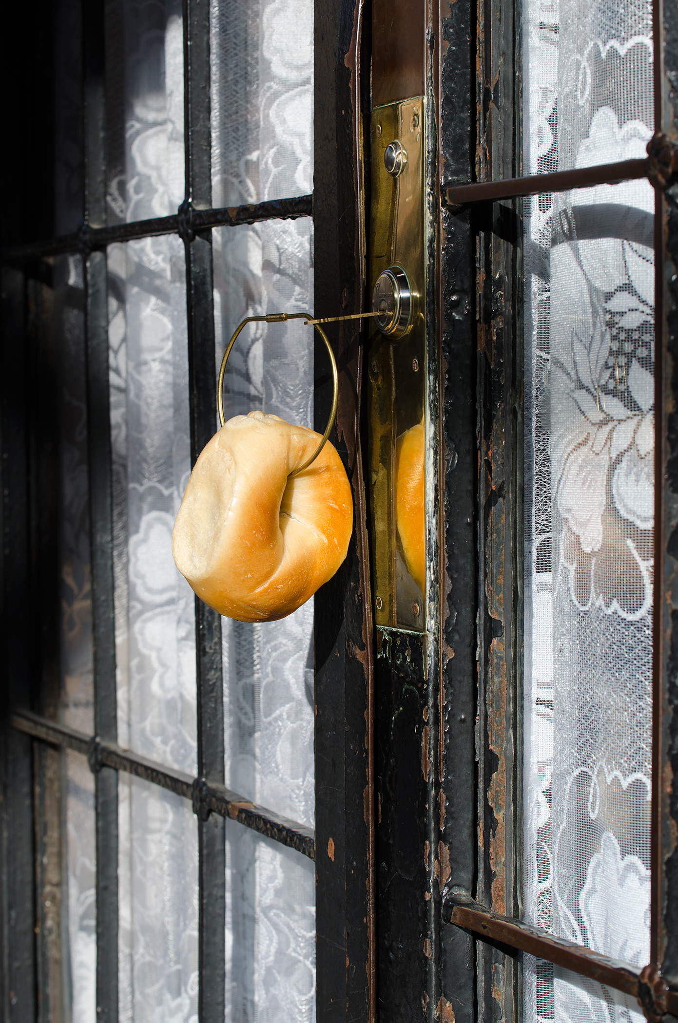
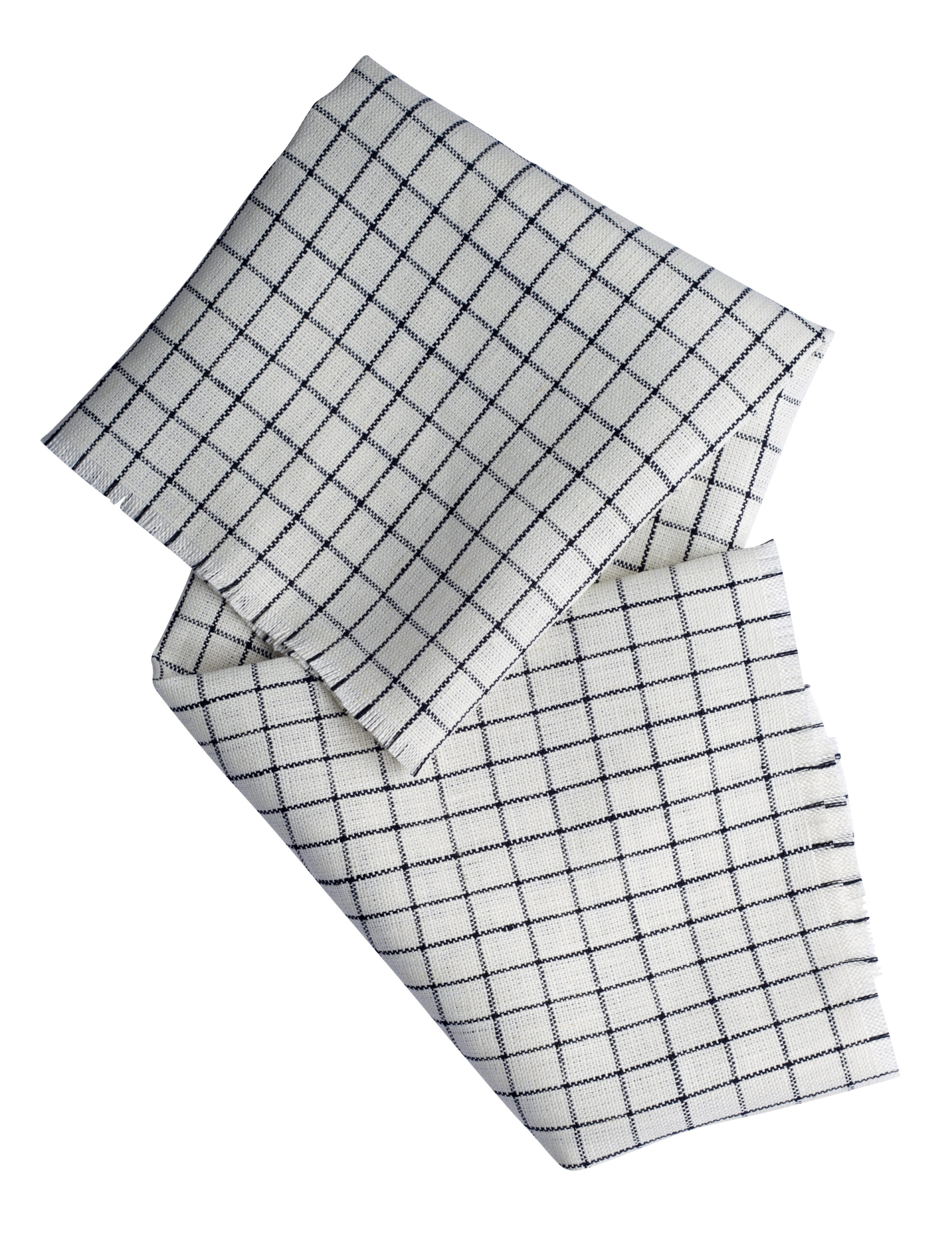
Bazazas—envisioned, art directed, and managed by Meehan and designer Scarlett Boulting from 2013-2016—was an experimental platform for everyday objects. Meehan and Boulting curated a collection, describing objects online and in physical installations throughout Brooklyn, highlighting form and material and foregrounding the unexpected within the everyday. They caught the attention of Herman Miller and Areaware, who commissioned art direction, and the New Art Dealers Alliance and New York Magazine. -
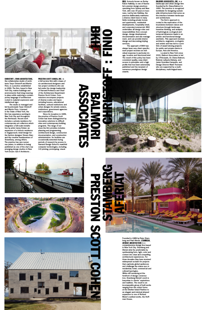
Christoff:Finio Architecture identity, website, and ephemera +
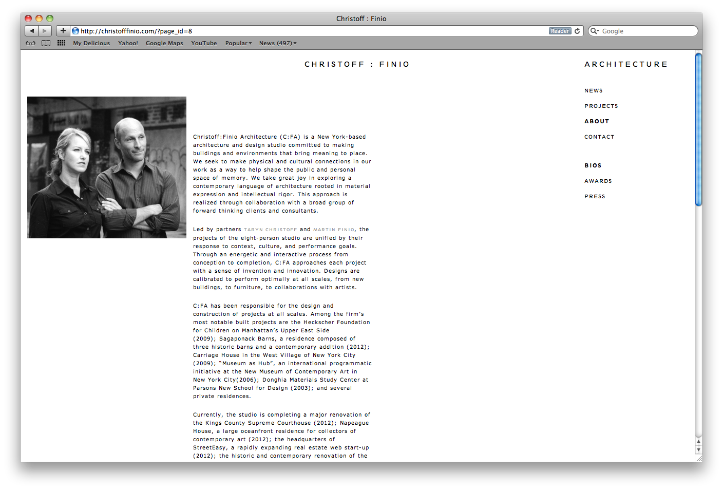
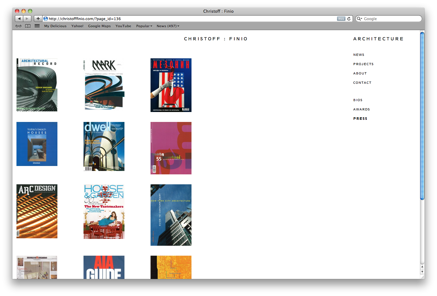
Meehan Spinat created a word mark and developed a refined language for typography across digital and print media for this dialed in Manhattan architecture firm. -
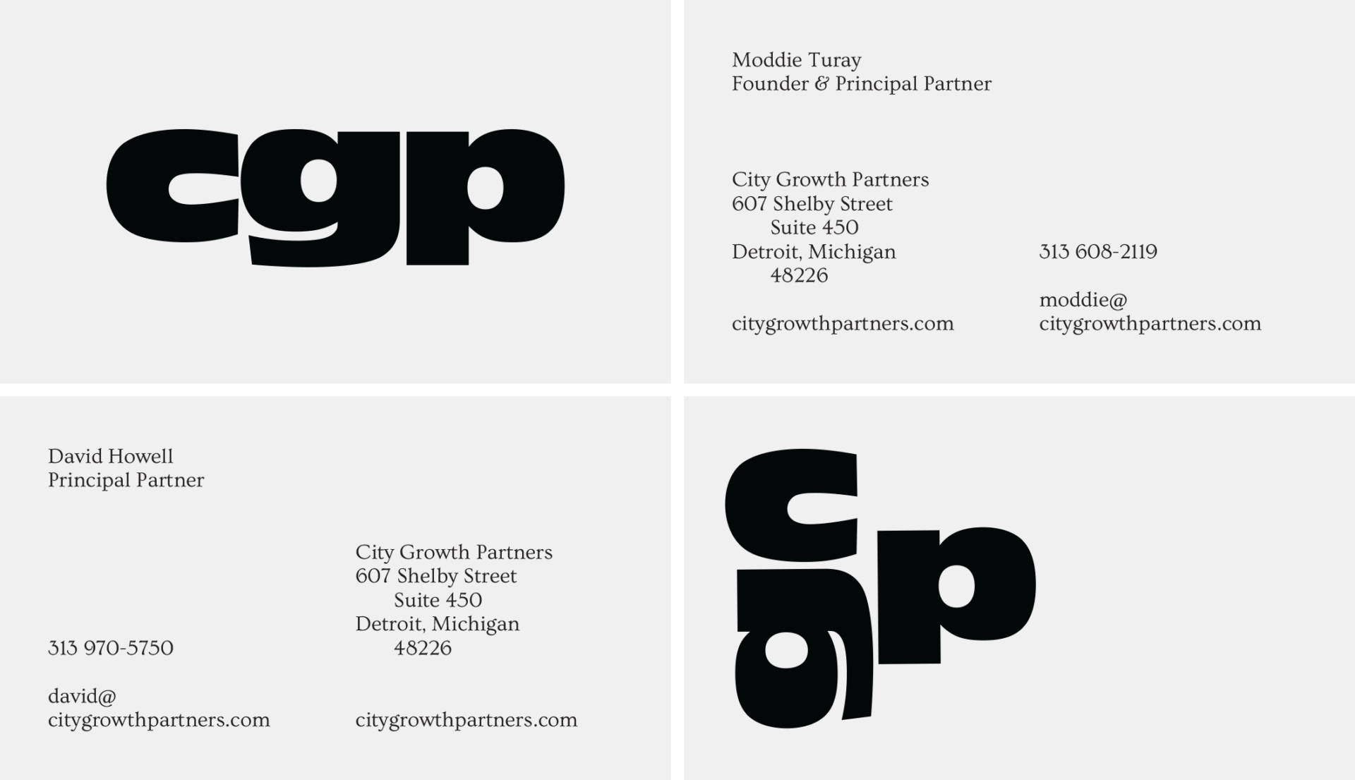
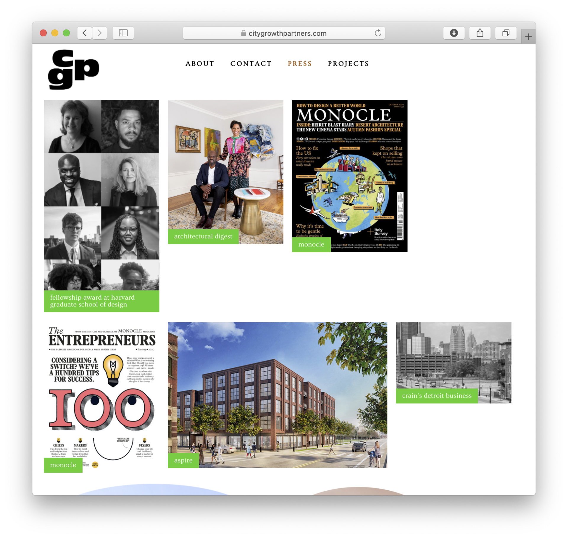
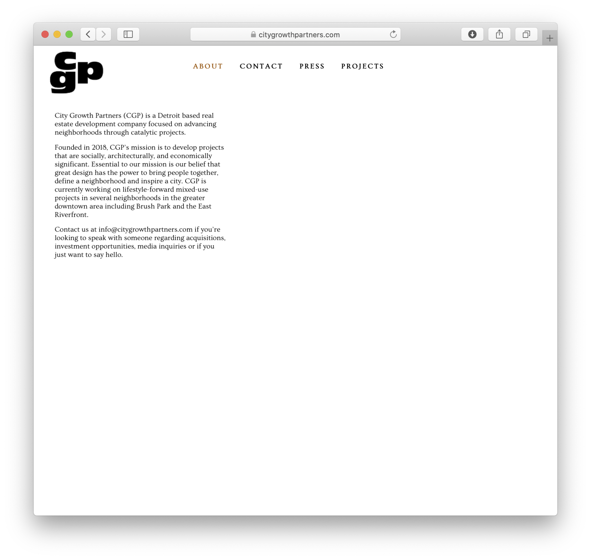
City Growth Partners, identity, content, and website +
City Growth Parner’s needed a visual presence, marketing collateral, and content to engage the surrounding community in large-scale, urban development projects. Meehan Spinat conceived a website that would double as a neighborhood bulletin board, simultaneously contextualizing CGP among prime culture creators and institutions and inviting community participation. The logo evolves across media, echoing the improvisational spirit of the website and web content. -
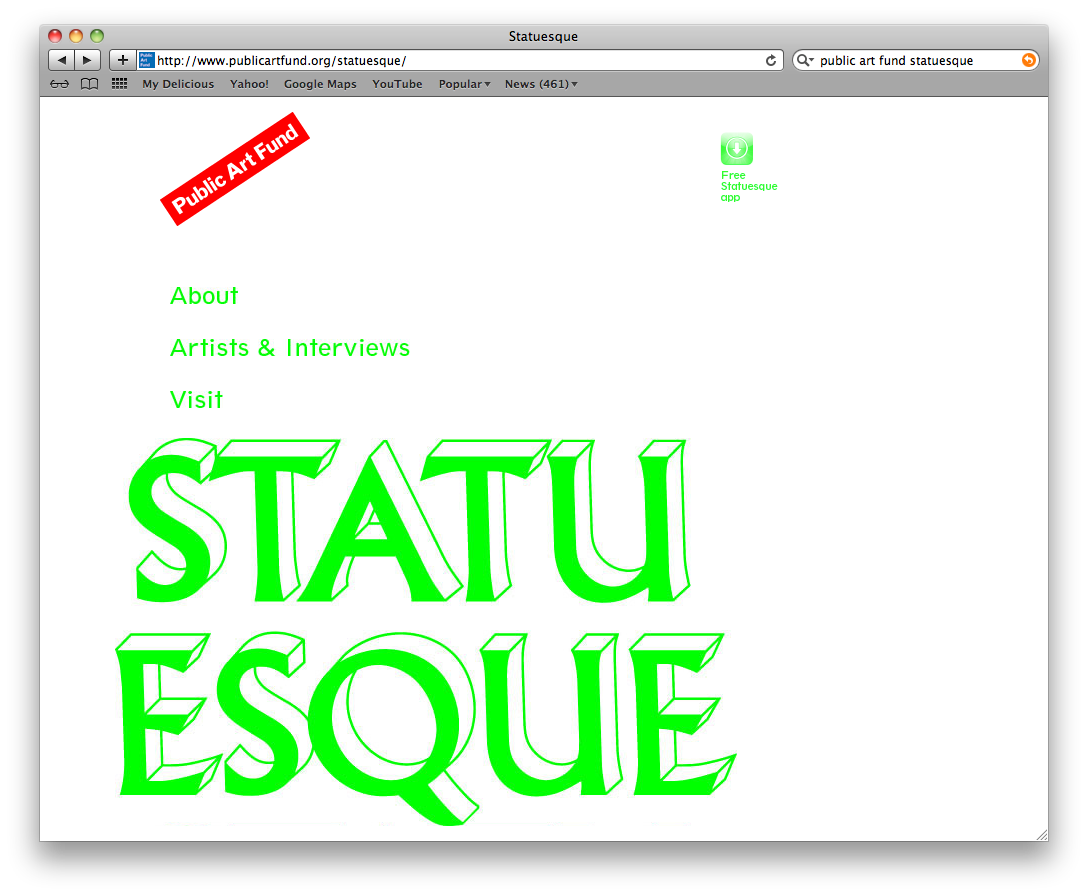
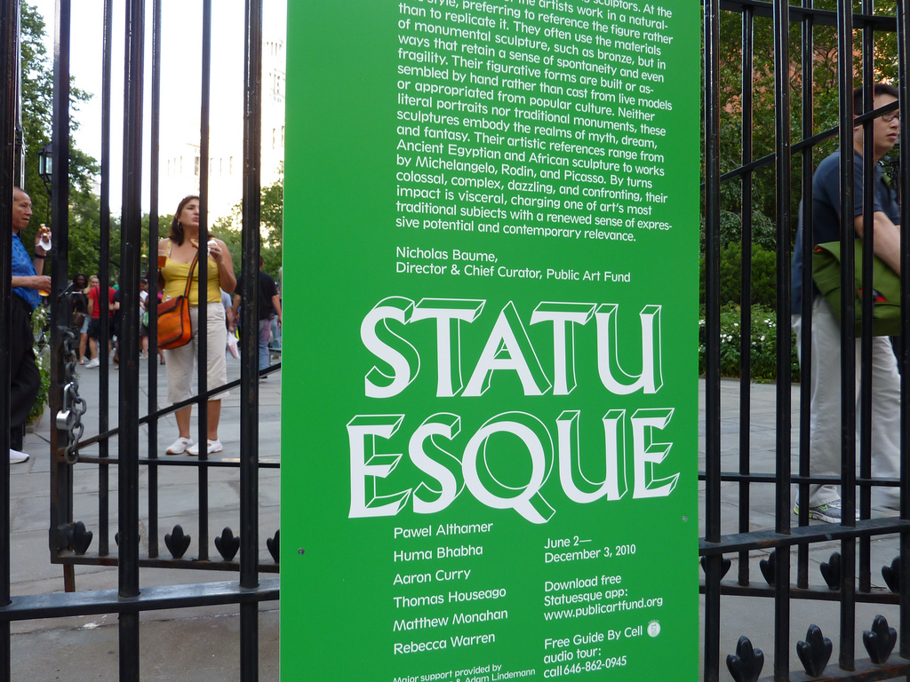
Public Art Fund identity, website, signage, catalogue, and printed materials. +
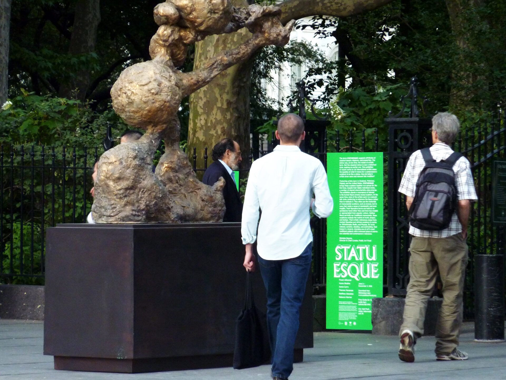
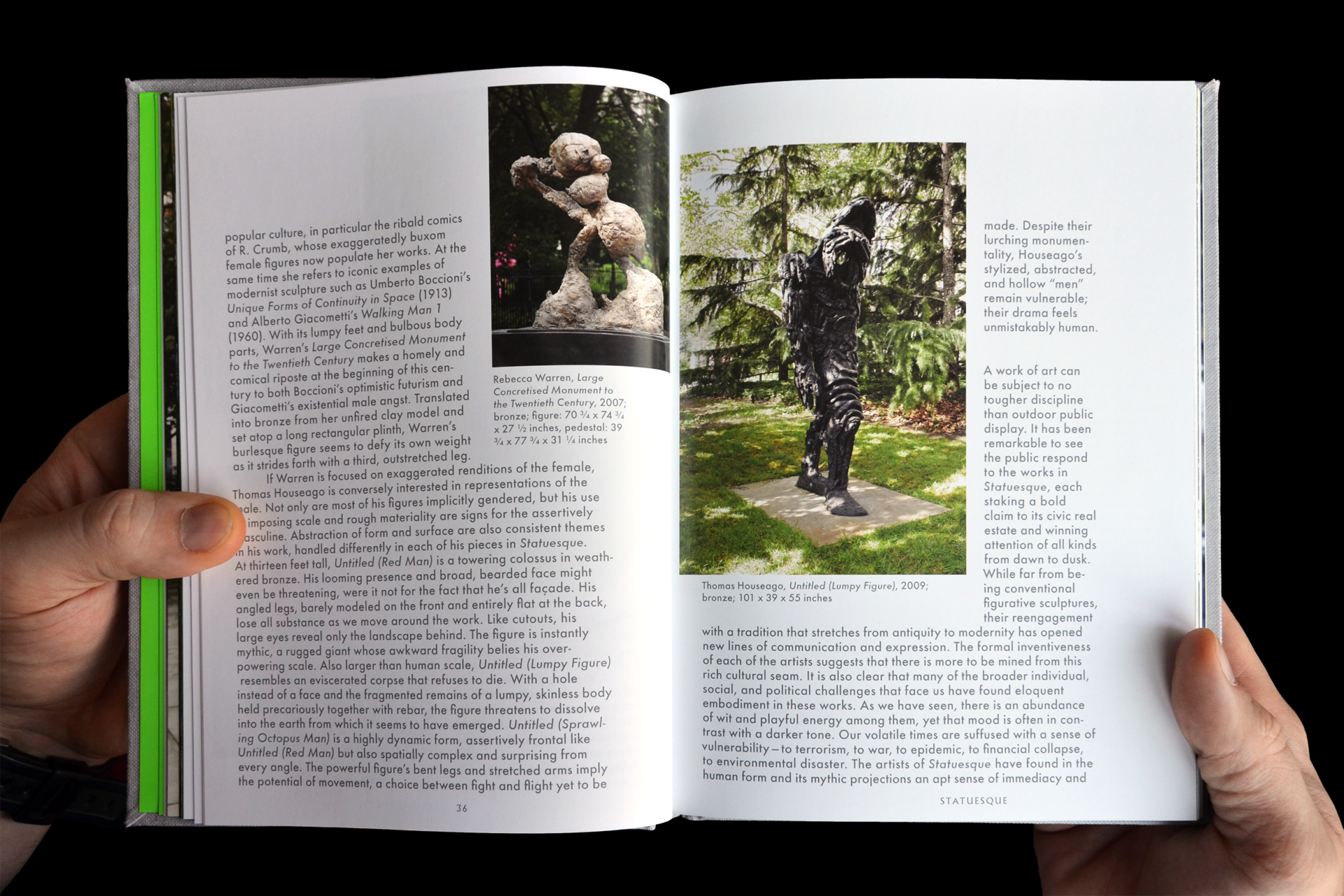
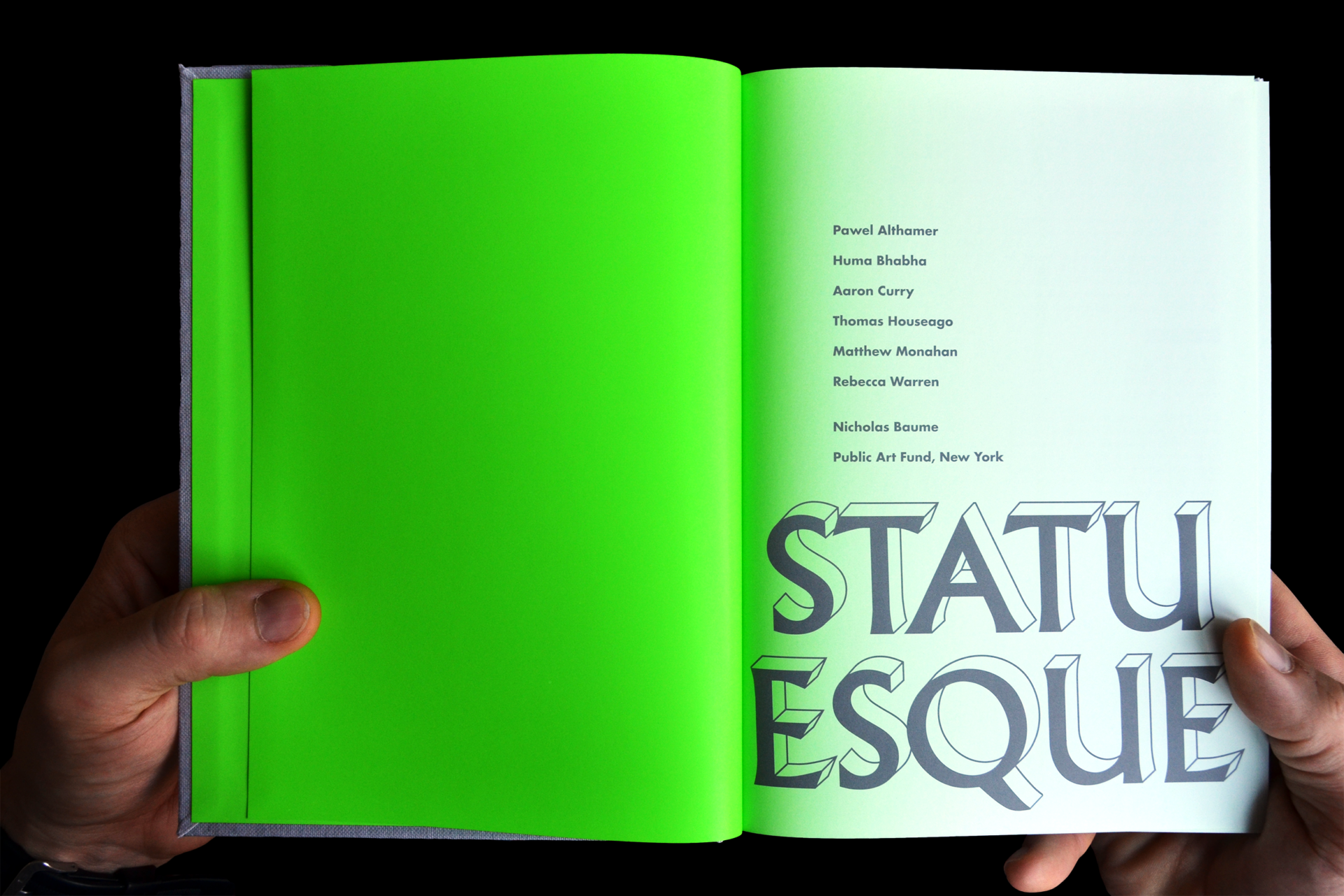
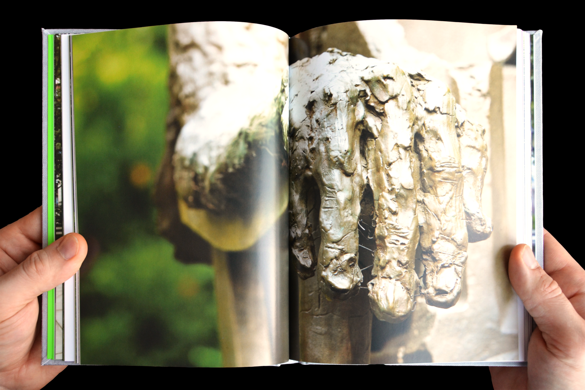
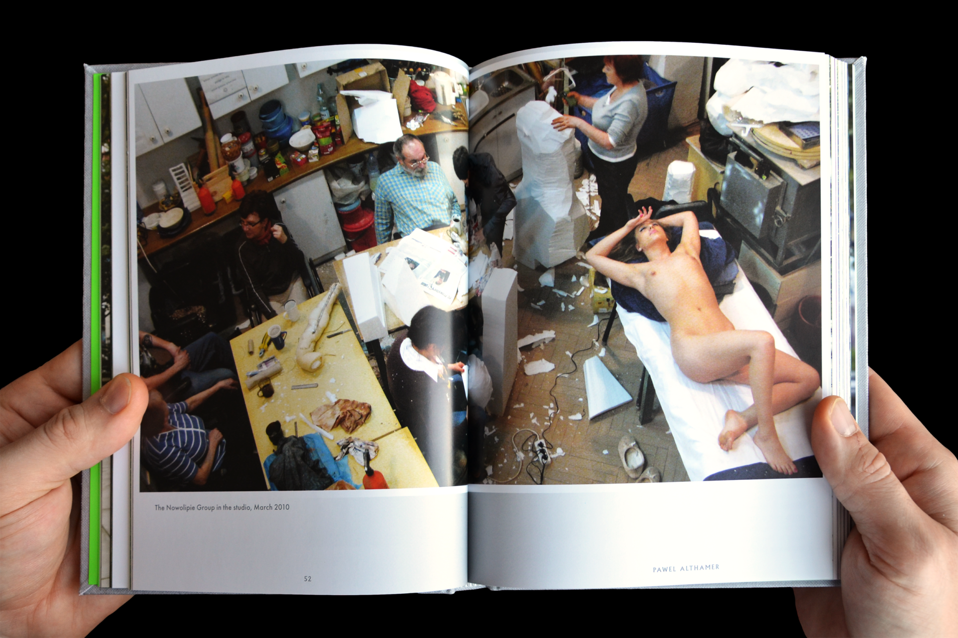
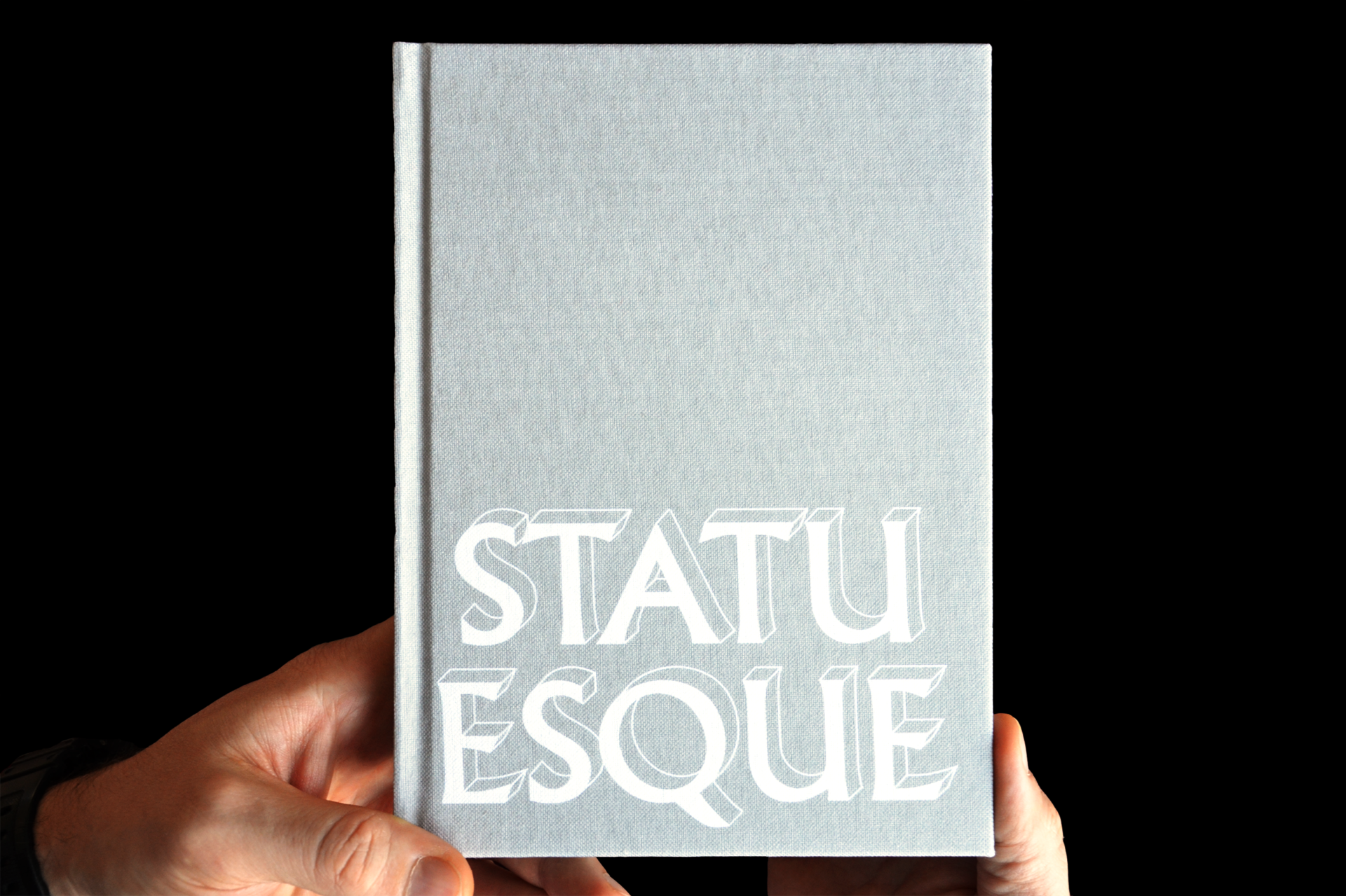
Statuesque was an outdoor sculpture show curated and produced by the Public Art Fund in Manhattan’s City Hall Park. The exhibition captured a resurgence in figurative sculpture. Identity, signage, way finding, website, catalogue, and art forum advertisements created a visual system knitting together the works of Pawel Althamer, Huma Bhabha, Aaron Curry, Thomas Houseago, Matthew Monahan, and Rebecca Warren. In collaboration with Linked by Air. -
Above the Fold, identity, web, marking collateral, print, digital newsletter, and teaser graphics +
We helped an entrepreneurial visionary give shape to his architectural talent agency from the ground up, designing a word mark, graphic identity, website, and marketing collateral. Later, as the audience grew, we created a printed mailer that unfolds into a larger poster and an email template for ongoing branded messaging and the physical and digital spheres. -
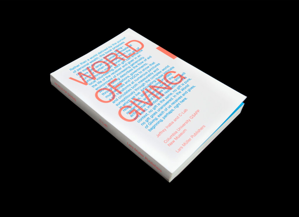
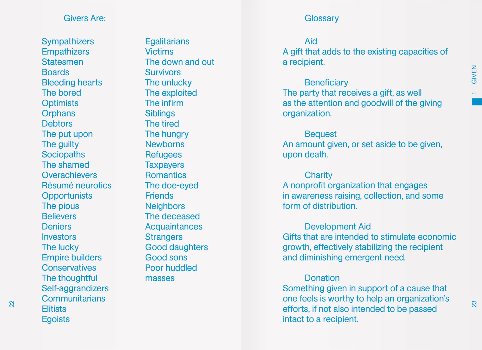
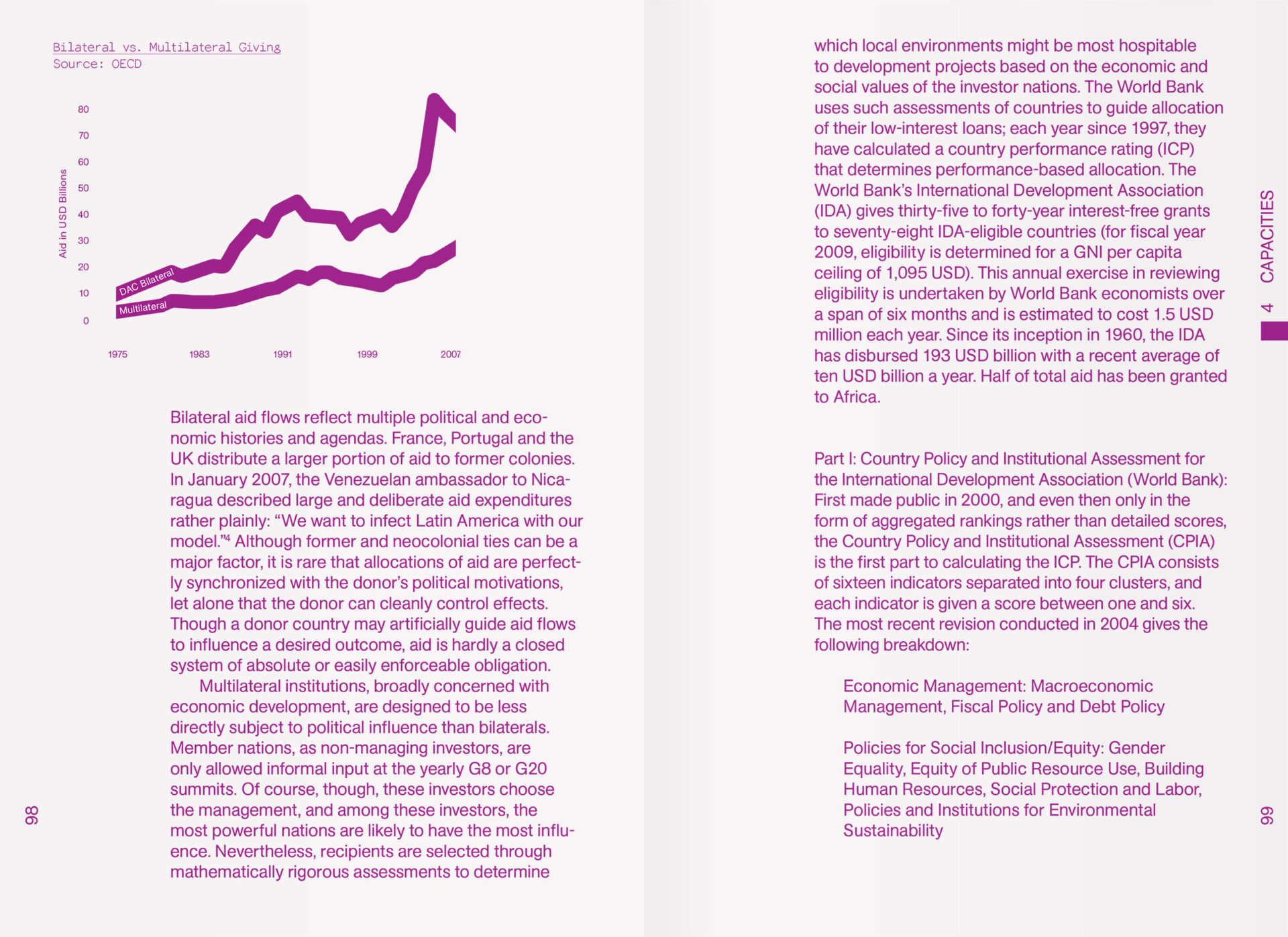
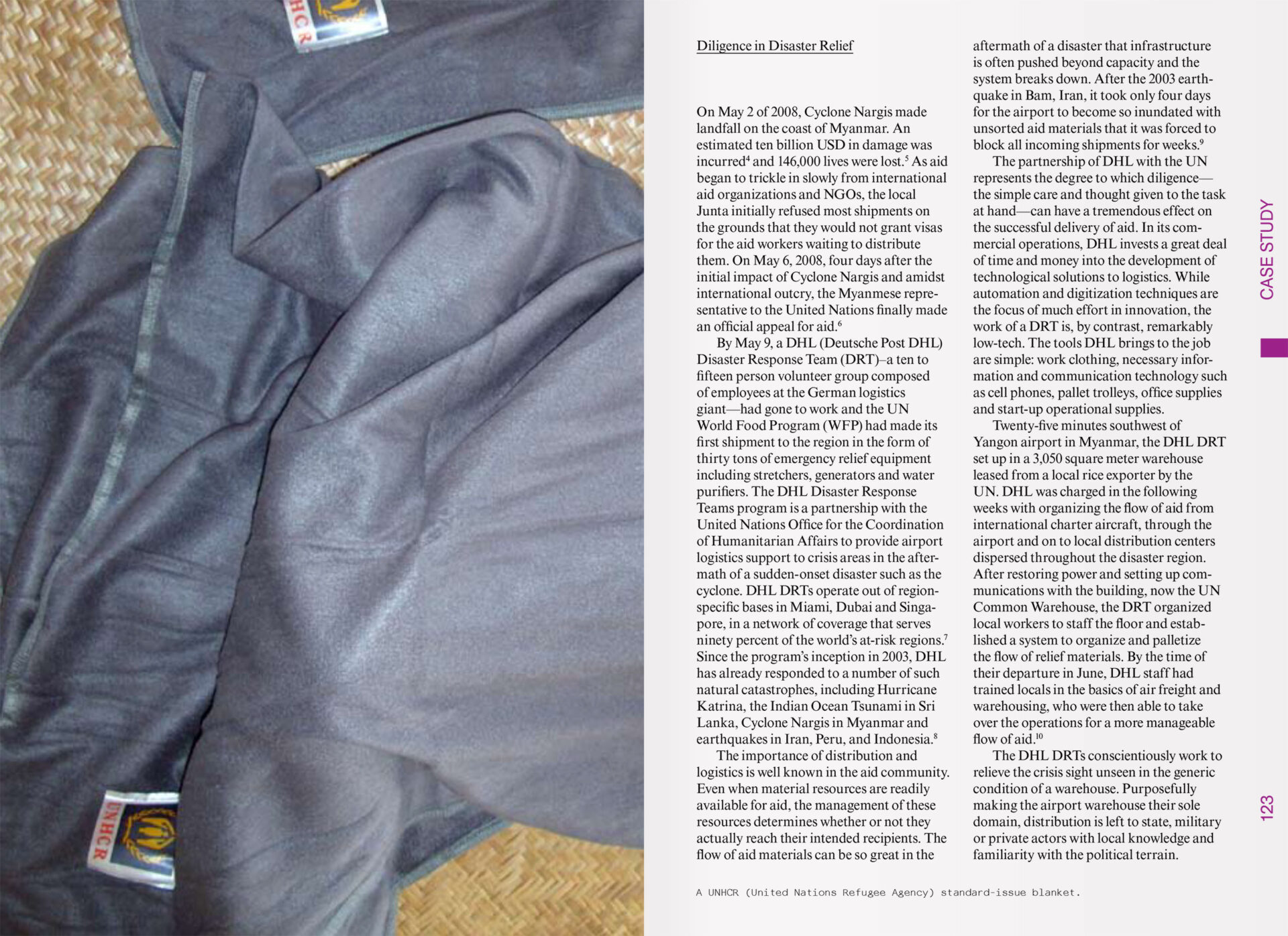
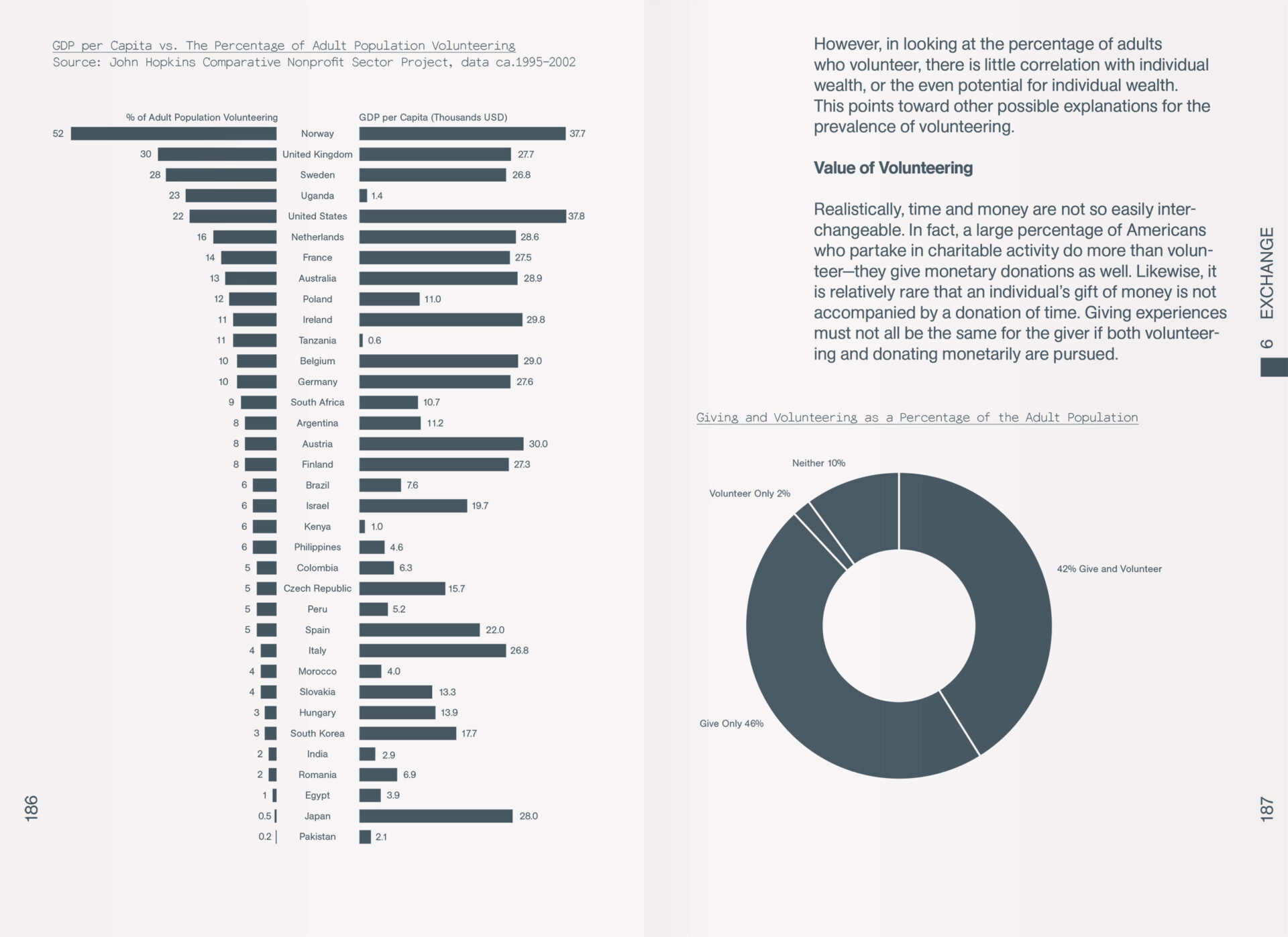
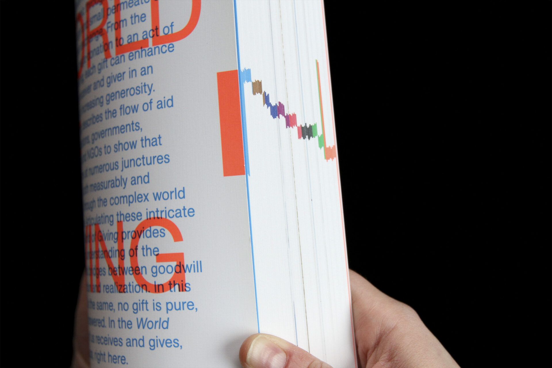
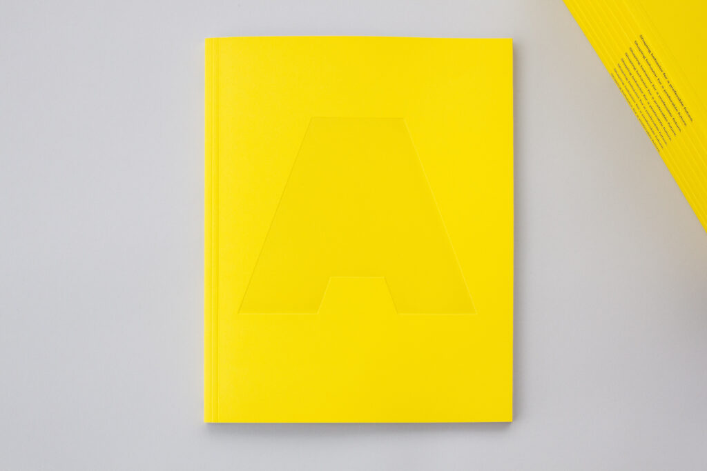
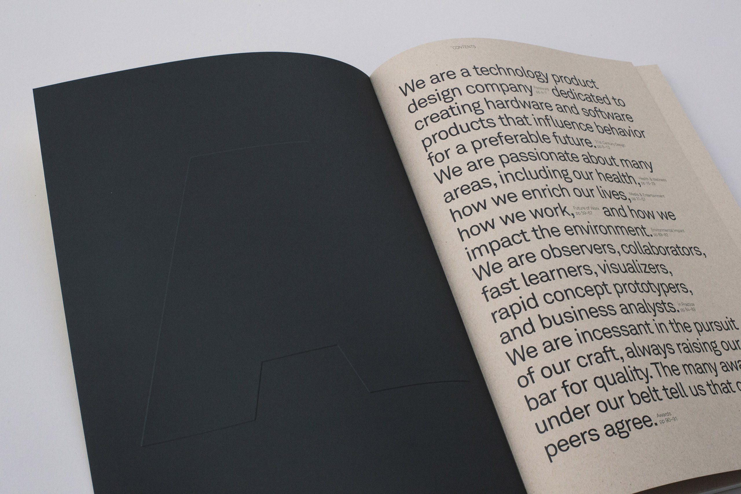
World of Giving book, published by Columbia University GSAPP, the New Museum, and Lars Müller Publishers +
Honored with an AIGA 50 Books / 50 Covers award and edited by Jefferey Inaba and C-Lab. The book investigates the motivations for why we give and offers examples of individuals, foundations, governments, multinationals, and NGOs that arise in global philanthropy. Responding to the authors’ desire to produce a visually rich reading experience out of text driven content, the book is comprised of eight chapters of content that roughly correspond to eight equally apportioned, color-coded divisions. The two parts flow in and out of phase with each other, resulting in color shifts mid-section, as the content expands and contracts into its final edit. By highlighting the give and take between the space allotted for the content, and the space actually required by the content, the book’s structure illustrates the dynamic relationship between supply and demand. Designed with Daniel Koppich. -
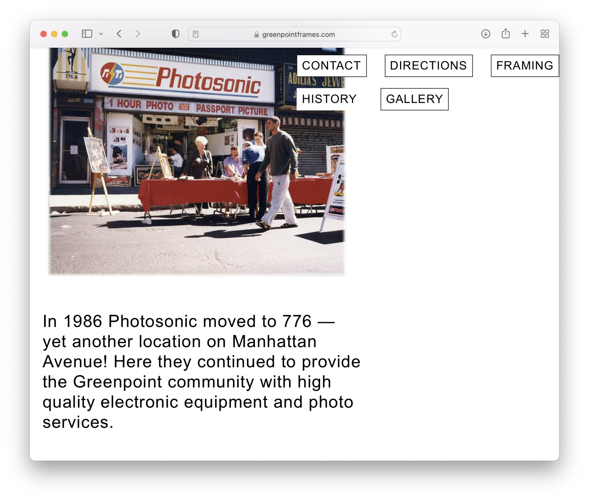
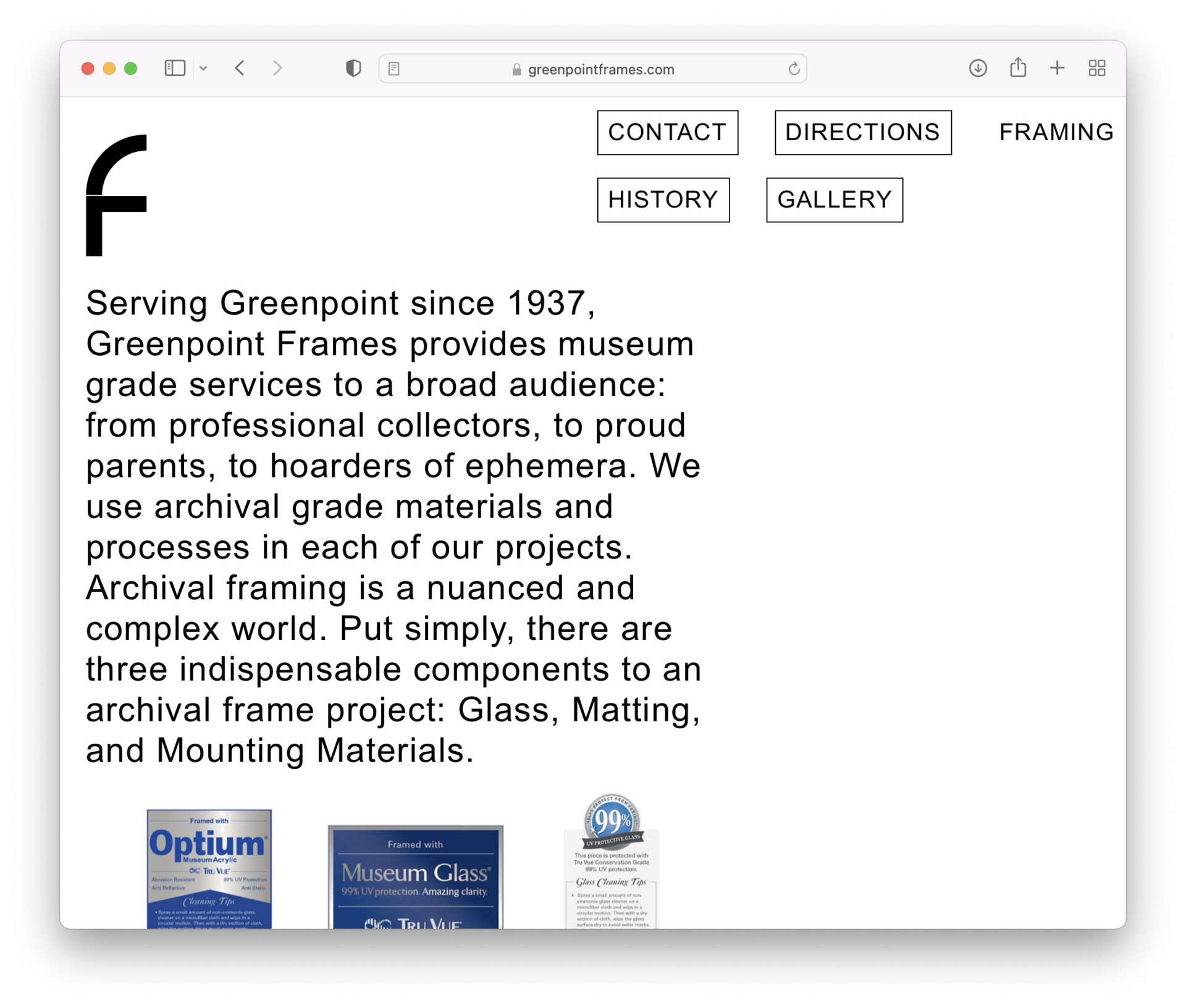
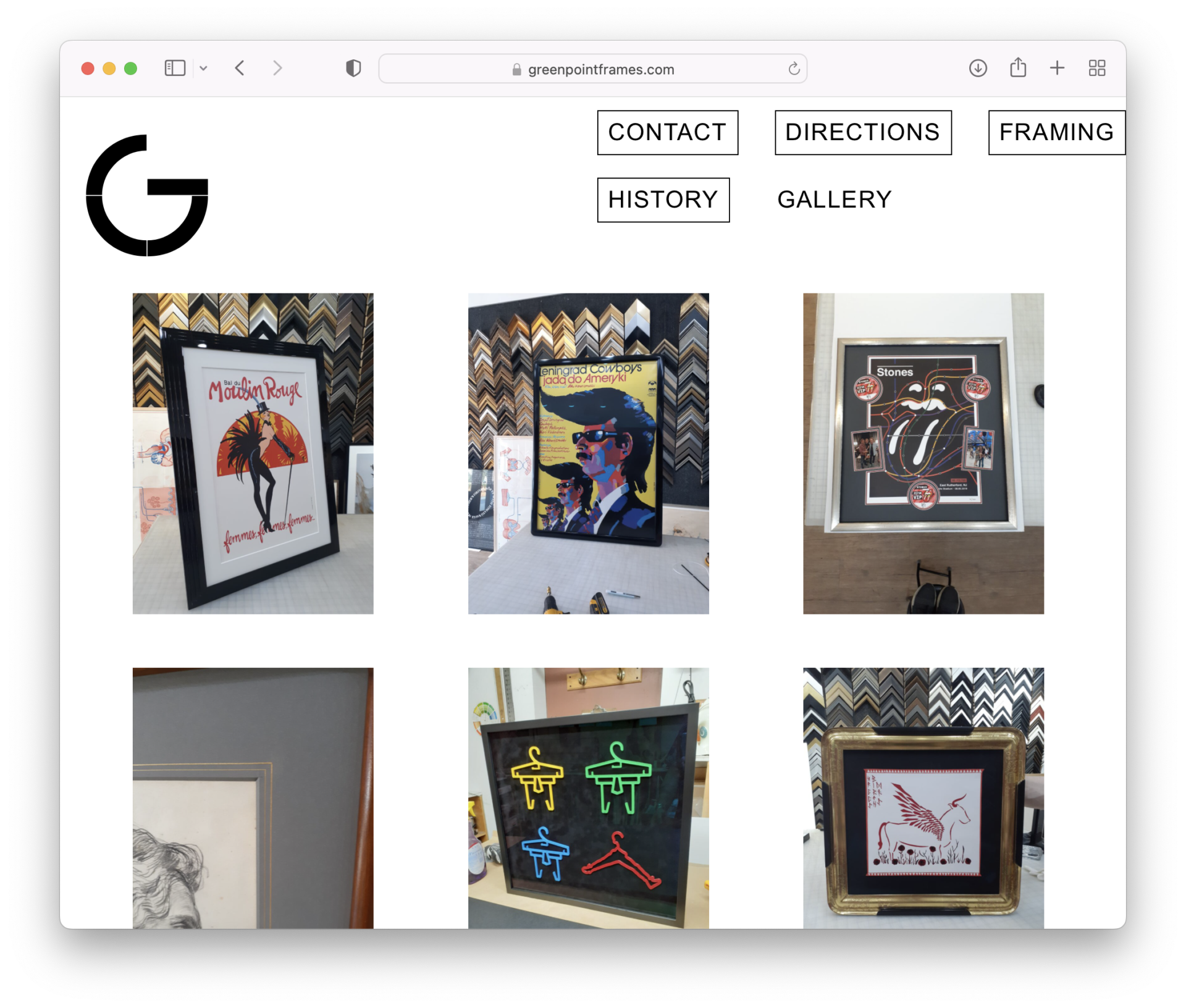
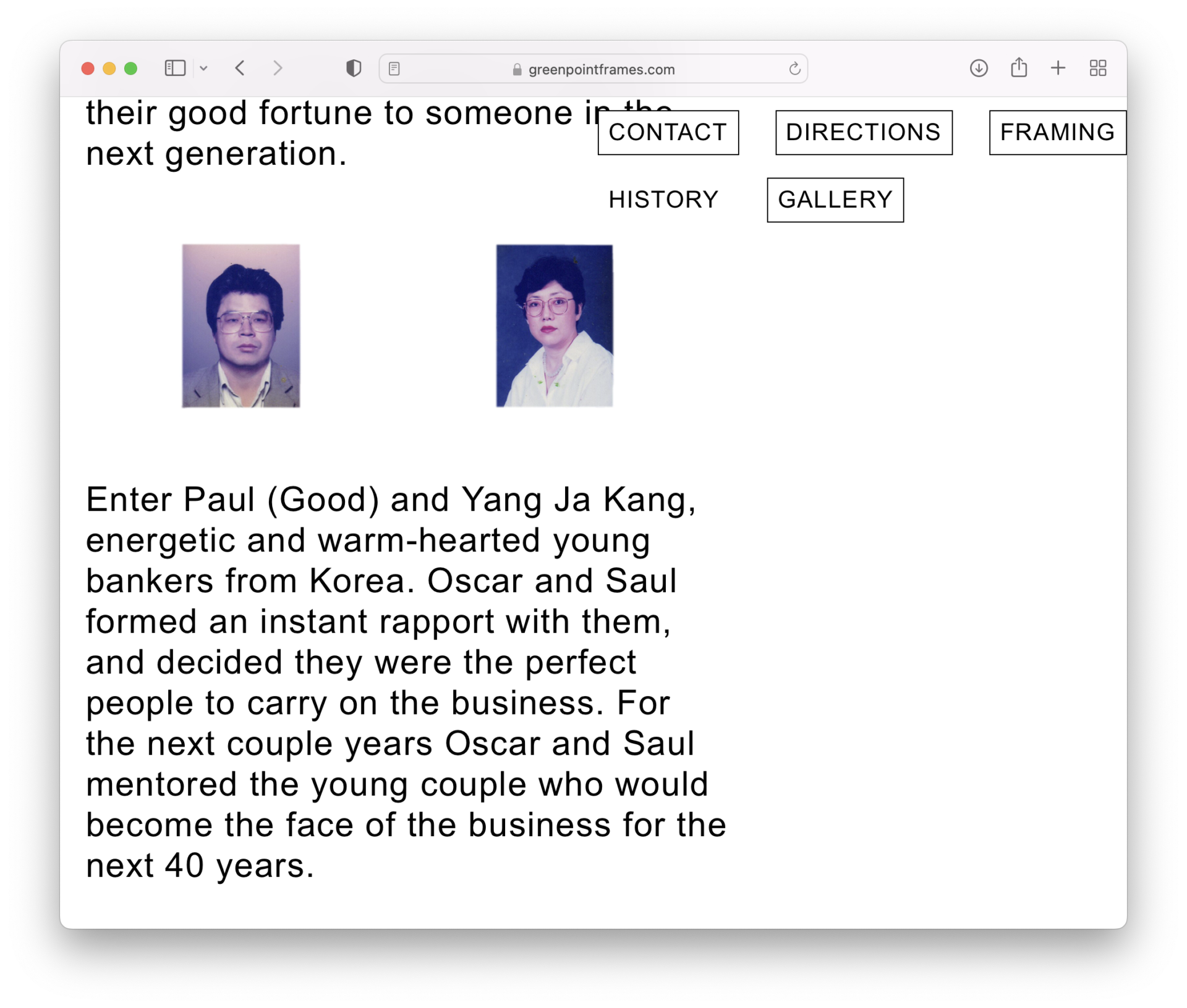
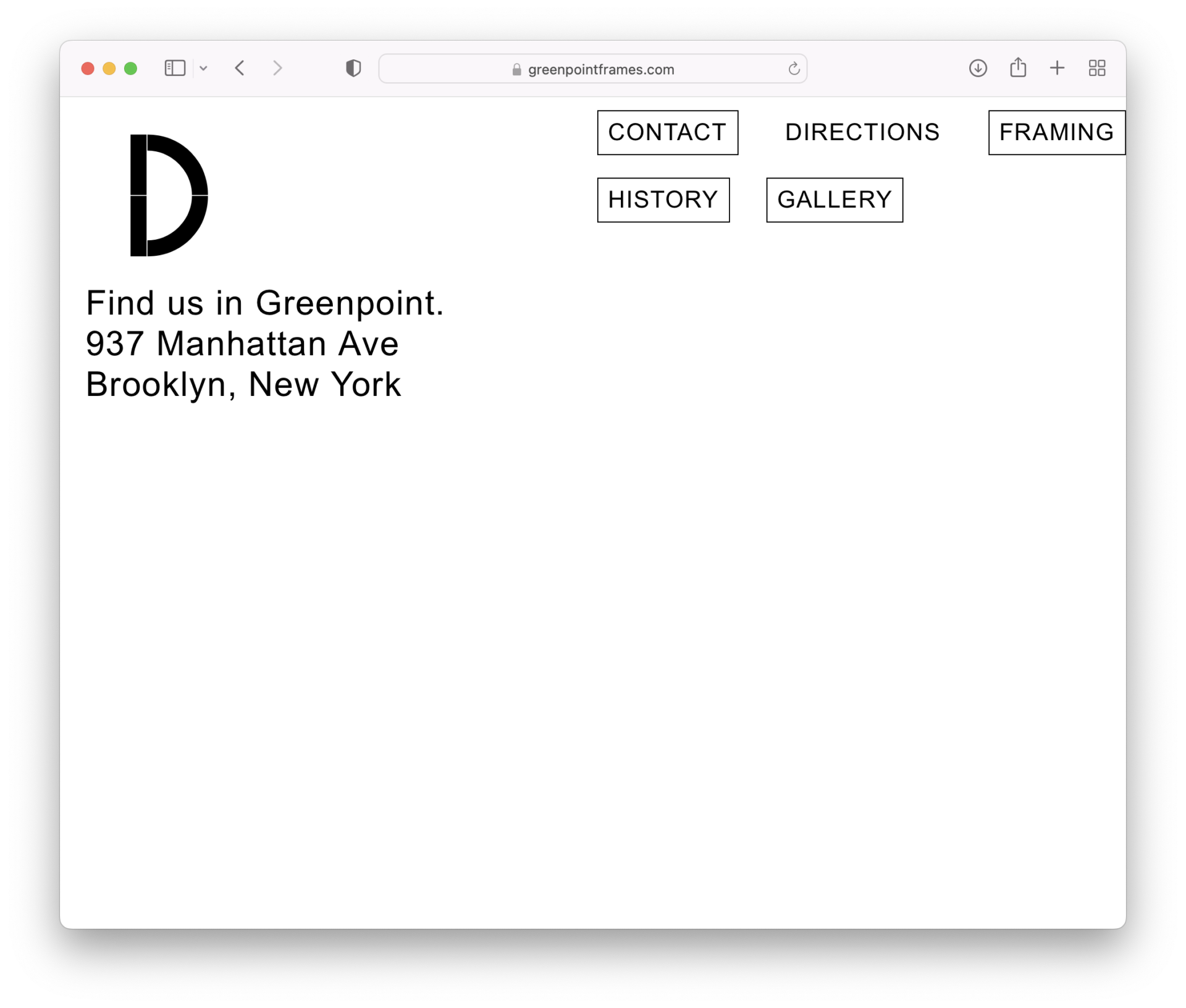
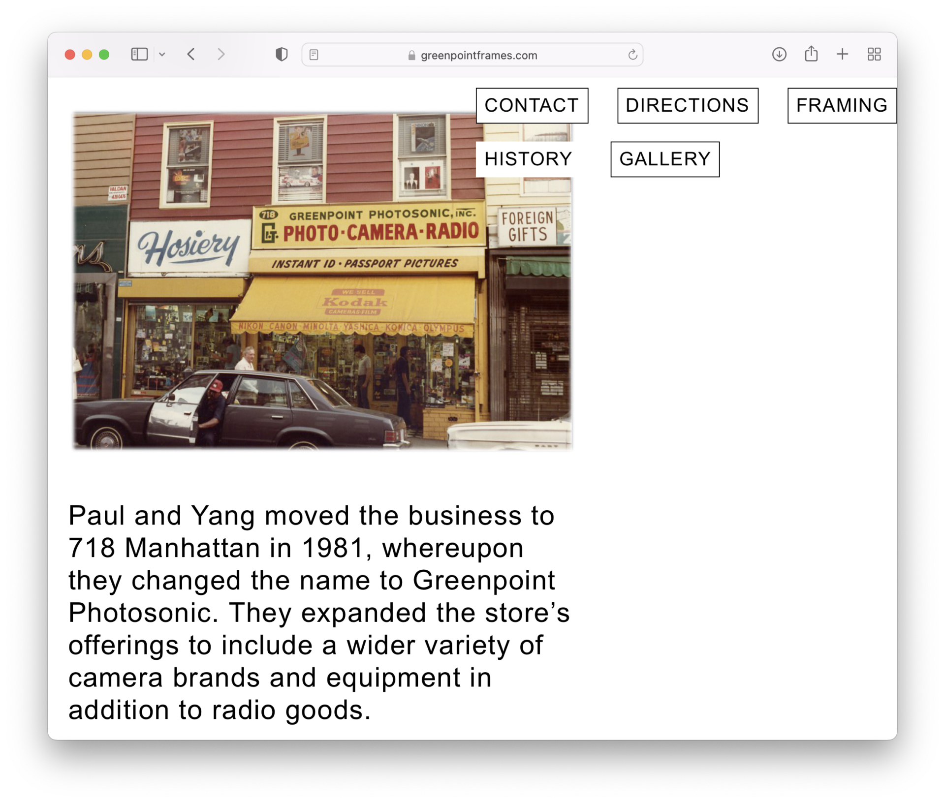
Greenpoint Frames identity, website, and storefront +
Proprietor Adam Collignon was looking to create a presence for his Manhattan Avenue custom framing shop—located on Greenpoint, Brooklyn’s prime thoroughfare—and online. We created a visual identity, using a modular typeface with a ready formal relationship to physical frame swatches, ripe for analogue riffing within the shop. A new website and awning grabs virtual visitors and passing pedestrians. -
Inquiries at info@meehanspinat.com.
